- “In Pew Research Center’s first survey in the UK after Brexit, 60% of British adults said they had a positive view of the EU, up from 54% the year before and the highest percentage in surveys dating to 2004”
Author: Snippet.Finance
Nomad Investment Partnership
- The partnership is an investment success story, outperforming the index by +14.3% per annum for thirteen years (2001 – 2014).
- Although all are worth your time, this is nice blog post that pulls out some of the most interesting quotes and ideas. There are many.
- “One trick that Zak and I use when sieving the data that passes over our desks is to ask the question: does any of this make a meaningful difference to the relationship our businesses have with their customers? This bond (or not!) between customers and companies is one of the most important factors in determining long-term business success. Recognising this can be very helpful to the long-term investor.”
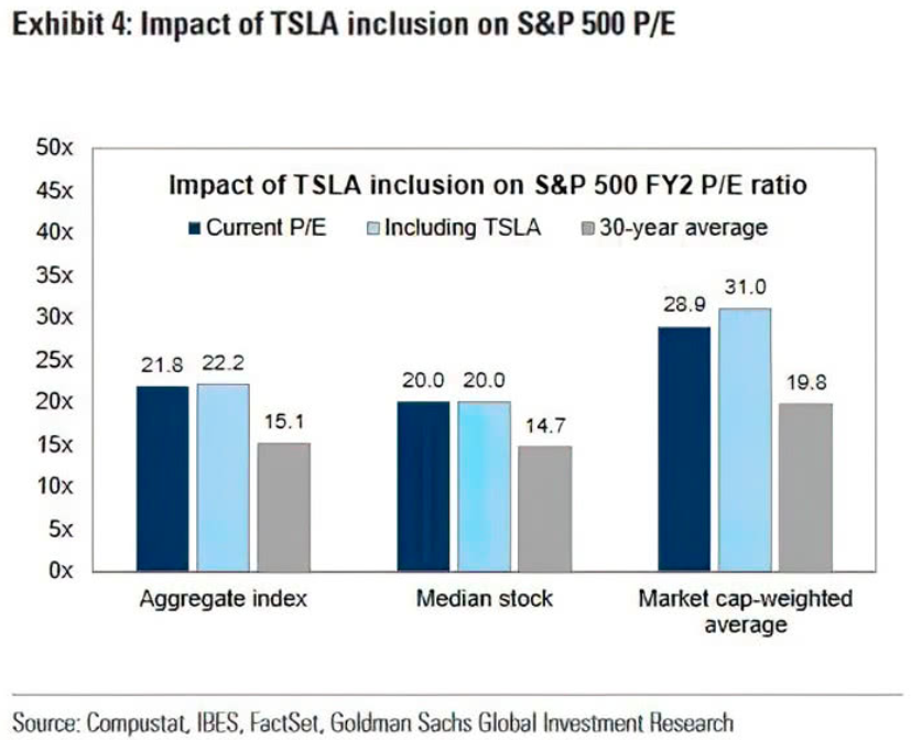
Tesla and SPX Valuation
- Inclusion of Tesla adds 2x turns to 2 year forward P/E of S&P 500 index.
52 Things – Snippet Edition
52 Snippets
A list of 52 things learnt since we started just over a year ago. Enjoy.
- Cable TV and radio have been speeding up songs and syndicated content (i.e. shows) by nearly 5% for years in order to sneak more ads in. [WSJ]
- Out of 43.6 billion bags checked-in each year by air travellers 25m get lost and 1.3m are never claimed, and many are purchased by a single company. [The Hustle]
- The National Cancer Institute’s comprehensive review found that there has been no benefit to public health from changes in cigarette design or manufacturing over the last 50 years. The yellow discolouration on filters is just cosmetic (caused by a change of pH) rather than an accumulation of tar. [The Times]
- In June 2019 Google passed a major milestone – for the first time the majority of searches on google.com resulted in no click at all. [SparkToro]
- This has meant over the past 24 months Wikipedia has lost billions of organic monthly visitors to Google. [Hacker Noon]
- 26% of Americans say they get their news on Youtube. [Pew]
- According to Google engineers from a 2010 study there are an estimated 129 million books written (of varying quality) and it would take 353,425 years to read them all. Yet if you were to read the sum of all knowledge in antiquity, captured by the entire contents of the library of Alexandria, it would only take 1,370 years. [The Millions]
- In September 1958 Bank of America mailed a pre-approved credit card to every resident of Fresno, California and gave birth to the credit card industry. [WNYC]
- In 1949, after 50 years of drilling, analysts estimated that just 47 million barrels remained in the Kern River oil field. Instead the next 40 years saw 945 million barrels removed. In 1989 analysts again estimated Kern reserves at 697 million barrels. By 2009, Kern produced more than 1.3bn additional barrels. [The Atlantic]
- 300,000 people read full novels on Instagram. [FC]
- Ultra-wide band, which sits in Apple phones today, can pinpoint objects in space within a 30cm range compared to 1 meter for bluetooth allowing “GPS at the scale of your living room”. [Wired]
- Academics also engage in clickbait – papers have become shorter while features, that attract busy readers, like titles and abstracts, have gotten longer. [The Gradient]
- Plants are becoming junk food because of climate change. Studies show that the ratio of carbohydrates to minerals has been steadily going up so the concentration of key minerals like calcium, magnesium, potassium, zinc and iron has dropped by 8% points on average. [Politco]
- Jeff Bezos is spending $42m to build a clock on his ranch that can tell time accurately for 10,000 years. [The Atlantic]
- Since 2012, some 18m Americans have health insurance that didn’t before. [Deutsche Bank]
- A one year of increased longevity has the same effect on happiness, measured by word usage in books and newspapers, as 4.3 percentage points of GDP growth. [Economist]
- China consumes four cups of coffee per year per person, compared to 300 in the US. [Starbucks]
- For a period in 2018 “nearly 22% of all ads seen by U.S. Apple device users on Facebook’s ad network came from TikTok and its Chinese counterpart Douyin”. [The Margins]
- Some birds have penises, but most, around 95%, do not. Rather than having penetrative sex, they mate through a cloacal kiss. Most birds of both sexes have a cloaca — a chamber inside their anus into which their digestive, urinary and reproductive tracts all flow — and reproduce by touching assholes. [Grow]
- It took 50 years for the telephone to reach 50 million users, a feat that Pokemon Go achieved in 19 days. [Des Jardines]
- In the US people spend on average the same amount of time listening to audio as watching video, yet the former industry is one-tenth the size of the latter. [Hollywood Reporter]
- More UK funds are managed by a man named Dave than by women. [Bloomberg]
- Chess players make more mistakes on polluted days: “We find that an increase of 10 µg/m³ raises the probability of making an error by 1.5 percentage points, and increases the magnitude of the errors by 9.4%.” [Marginal Revolution]
- A man in his early 20s will tip a female Uber driver 8% more on average than they would a male driver. [NBER]
- Regulation has meant that while in 1983 a dishwasher cycle lasted 67 minutes and used 15 gallons of water today it takes 135 minutes but uses only 3 gallons. The resulting clean is much worse. [AIER]
- Jio’s huge investment in a 4G only network in India has led to a 82x increase in mobile internet speeds and 95% collapse in price. [JIO]
- From 1991 to 2017 the mortality rate of cancer has dropped 29% saving 2.9 million lives. [US Cancer Society]
- Pokemon is the highest grossing media franchise of all time at $92bn, outpacing Star Wars and Mickey Mouse. [Visual Capitalist]
- According to VW you have to drive an electric Golf for 120,000 kms before it breaks even in terms of carbon emissions when compared to a diesel Golf. [VW]
- In 2000, pre-IPO, Google had $19m of revenues, that number is $162bn today. [themarketear].
- For 2020, the Census Bureau Geography Division was able to employ satellites to verify 65% of addresses which meant that they only needed to hire 40,000 employees to verify the remaining ones. In 2010 this task required 100,000 people. [Calculated Risk]
- The founders of Pinterest used to go to Apple stores on the way home and change all the computers to say Pinterest, and stand around saying “Wow this Pinterest thing it’s really blowing up”. [Lenny’s]
- In 1993 Germany ran a trade deficit of $20bn. Today it has a surplus of $200bn (inflation adjusted). This is largely due to the creation and adoption of the Euro. [Conrad Bastable].
- In 1965 the average CEO made 20x the pay of a worker in their company. Today they make 278x. [Snippet].
- The FDA approved a bedside MRI which, at $50,000, costs 20 times less than traditional systems, runs 35 times less power and weighs ten times less than the normal 1.5 ton MRI machines. [Health Imaging].
- It costs just $10,000 to open a Chick-fil-A franchise and requires no net worth at all, the company foots the entire bill to open one. The catch is 15% royalty and 50% of profits. [The Hustle].
- Bracken Cave, in Texas, is home to 20 million breeding Mexican free-tailed bats, similar to the human population of Mexico City. In some places there are 500 bat pups per square foot on the wall. [Rational Optimist].
- China consumes more concrete in any two years that the United States did the entire 20th century. [IEEE Spectrum]
- Netflix spends more on content than all of the UK, Spain, France, Italy and Germany. [Benedict Evans]
- In social media networks, 90% of users just read content, 9% of users contribute a little content, and 1% of users contribute almost all the content. Gives a false impression of what ideas are popular or “average.” [Collaborative Fund]
- Airbnb founders turned to selling themed cereals to survive. The cereals were called “Obama O’s, the Cereal of Change,” and “Cap’n McCain’s, a Maverick in Every Box.” – a throwback to their first success housing delegates of the Democratic National Convention in 2008. It was also what got them a spot on Y Combinator. [Pando]
- In 1900 roughly 800 per 100,000 Americans died each year from infectious disease. By 2014 that was only 45.6 per 100,000 – a 94% decline. [Collaborative Fund].
- Sewage concentrations of SARS-COVID-2 RNA can predict new cases in an area by seven days and hospital admissions by three days. [Redburn]
- On average a banking relationship in the UK lasts 17 years, longer than most actual relationships. [Built for Mars]
- Emissions increase substantially, as much as 60-80%, because of ride-hailing apps when compared to a world without them. [JPM]
- Nigeria will be the third largest country by population in 2100. Five African countries will be in the top 10. [Statista]
- Billboard Top 10 music tracks have changed a lot – It now takes more producers, more songwriters, and a whopping 60% have a featured artist when compared to 2000. [MIDiA]
- Why are Brazilians so good at soccer? In Brazil there is a culture of playing a pickup game, a version of soccer that is played in a much smaller space and with fewer players. The players did all the things you need to be good at soccer, but they did them significantly more often, because there was more ball contact per person. Just because that’s a different game than soccer doesn’t mean people won’t learn soccer skills. They had way more ball contact than someone who went through the British system, by the time they entered the Premier league, for instance. [Alex Danco]
- 27% of undergraduates received a first in 2018/2019 academic year. In 1994/95 only 7% achieved that grade. [ONS]
- In 1880 the average American would have lived and died never having encountered a single manufactured candy. Today the average American ingests more than nineteen teaspoons added sugar every day. [New Yorker]
- In 1970 60% of revenue made on the Las Vegas Strip was related to gambling. Today that is just 34% with Rooms and Food/Beverage being the biggest part of the mix. [Morgan Stanley]
- We breed and kill at least 80 billion animals per year for food and at least 115 million per year for research. Fishing kills 1-3 trillion animals per year. Building and vehicle collisions kill at least a billion animals per year. This year, more than 300 birds were injured or killed in collisions with a building in North Carolina in a single night. [Aeon]
The Brain
- This story of how brains evolved, while admittedly just a sketch, draws attention to a key insight about human beings that is too often overlooked. Your brain’s most important job isn’t thinking; it’s running the systems of your body to keep you alive and well. According to recent findings in neuroscience, even when your brain does produce conscious thoughts and feelings, they are more in service to the needs of managing your body than you realize.
- Interesting thought for investors.
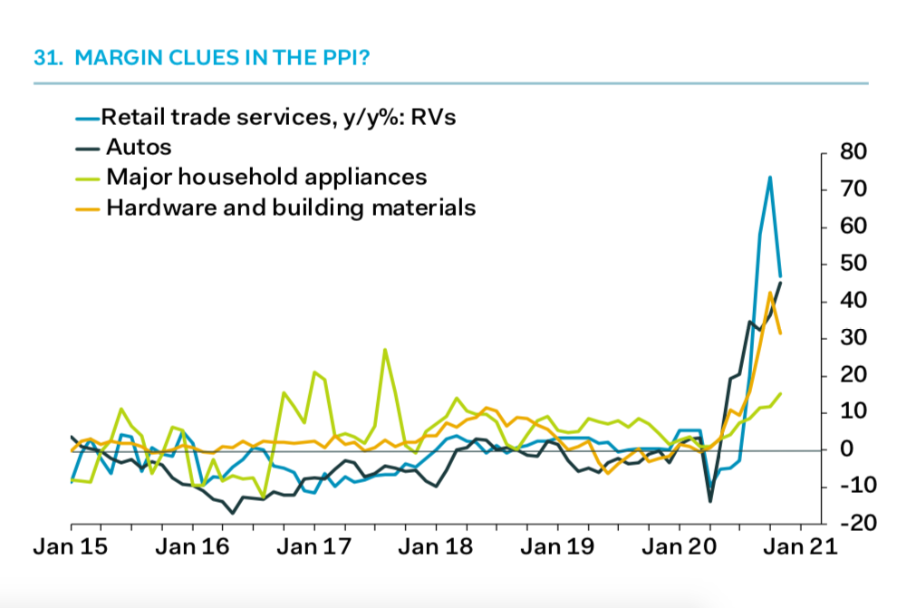
PPI Squeezing Margins
- Chart suggesting that certain industries might see margin compression from spike in purchasing price index (PPI).
- Source: Pantheon Macro.
Christmas Competition 2020

- Test your investing skill and win a prize!
- The inaugural Snippet Finance Christmas competition is live.
- Think you can predict the stock market? Think you know which stocks will outperform? Give it a shot.
- The overall winner gets a bottle of champagne. The overall loser gets a wooden spoon.
- Get your colleagues/friends involved – simply enter your company name and we will tell you how you ranked within your group.
- Enter the competition HERE.
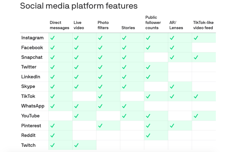
Social Media
- Social Media companies are all starting to look the same.
- Innovation is meant to be about new ideas?
A year of Snippet
- Time lapse of all the charts posted on snippet since we started a year and a bit ago.
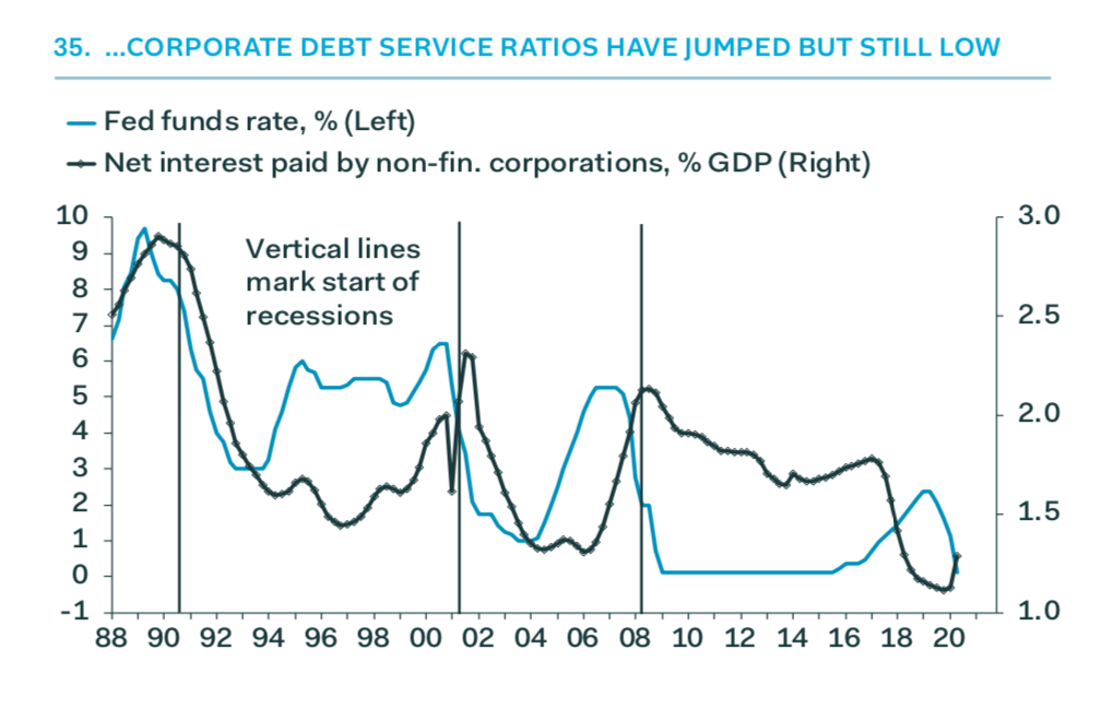
Corporate Debt Service
- Corporate debt service ratios, despite an uptick, are near very low levels.
- Source: Pantheon Macro.
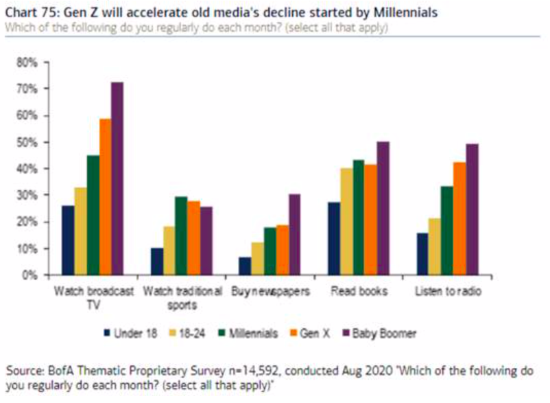
Gen Z and Media
- Generation Z is now more likely to read a book than to listen to radio or watch a traditional sport and as likely to watch broadcast TV.
- h/t Redburn.
NBA and Start-Ups
- Just as in tech companies, many sports franchises are trying to answer a basic question: what do the numbers today tell us about the possible outcomes of tomorrow — and what (or who) do we need to get to a winning outcome?
- In basketball and tech in particular, a deeper understanding of efficiency — both in how to measure it and how to leverage that to build winning teams — and usage has changed the game in the last decade.
- A great piece applying NBA sports metrics to Start-ups.
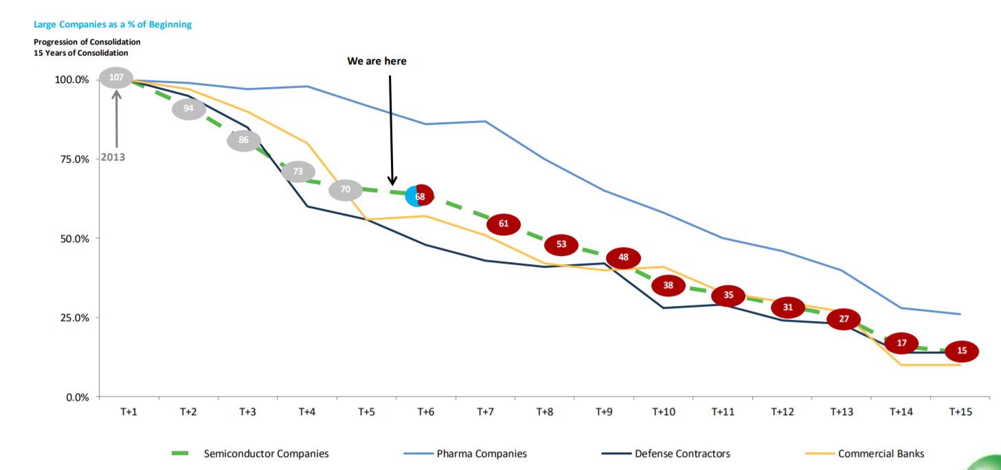
Semiconductor Consolidation
- Interesting chart suggesting semiconductor firm consolidation has a long way to run when compared to other industries.
Gundlach Slides Dec 2020
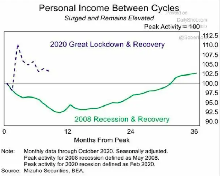
- Latest webcast slides from Jeffery Gundlach always worth a flick.
- This interesting chart perhaps explains why the US economy has been so resilient this time around.
India and Jio
- Jio’s 4G network has dramatically transformed Indian mobile internet both in terms of both speed (82x) and cost (-95%).
- Perhaps one of the greatest contributions by any single company to bringing technology to the greatest number of people?
Magic Mushrooms
- A fascinating read on the journey of psilocybin from Mexico to the stock market, via western consciousness, politics and the lab.
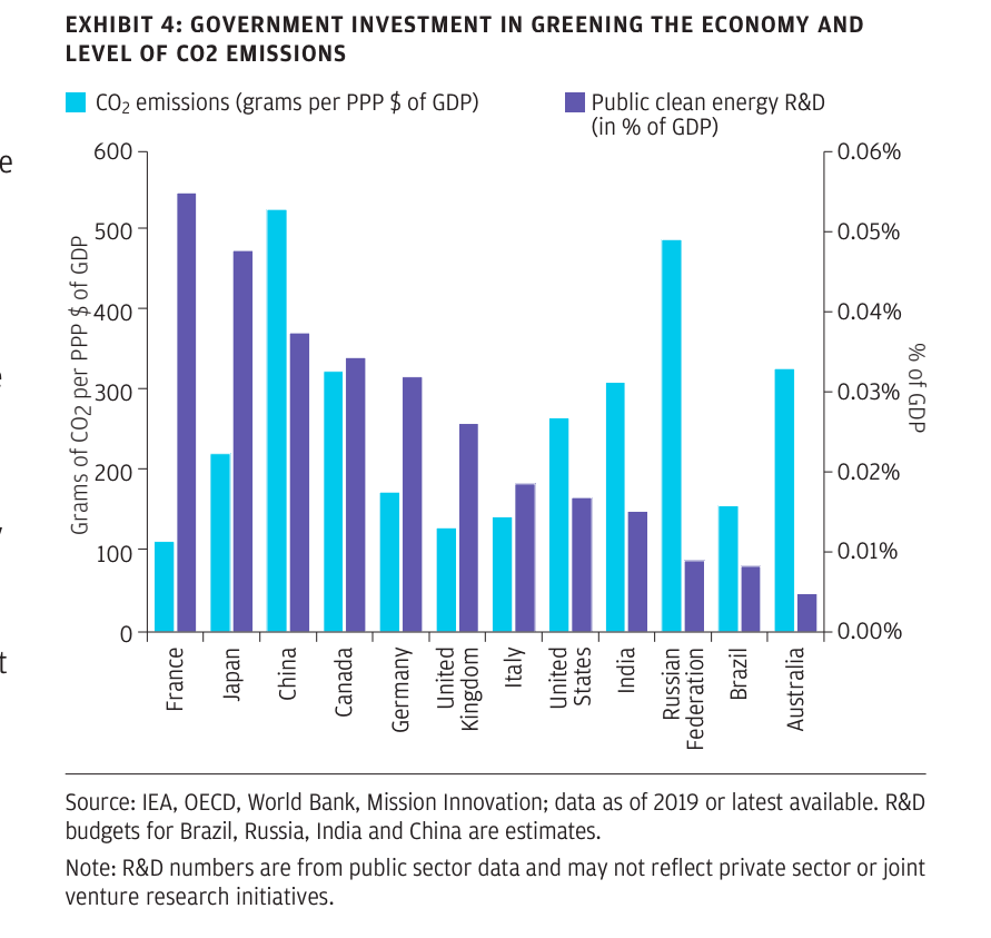
Clean Energy Investment
- Nice chart showing CO2 emissions (blue bars) by country against how much that country spends on public clean energy R&D (% of GDP, purple bars).
- Source.
52 Things 2020 Edition
- We previously covered this brilliant list of 52 things learnt for 2019 and 2018.
- Here is the 2020 edition – full of gems. A few choice examples:
- Most cities plant only male trees because it’s expensive to clear up the fruit that falls from female trees. Male trees release pollen, and that’s one of the reasons your hay fever is getting worse.
- For VC companies in 2004, the average time from first contact to funding was 90 days. Today, it’s just nine days
- Car safety laws in the US make it more expensive to have three children — women in states with mandated car seats are 0.7% less likely to have a third child. The safety measures may have saved 57 car crash fatalities each year, but caused 145,000 fewer births since 1980.
- Developing and launching the iPod in 2001 took just 41 weeks, from the very first meeting (no team, no prototype, no design) to iPods shipping to customers.
- References to each found in the link.
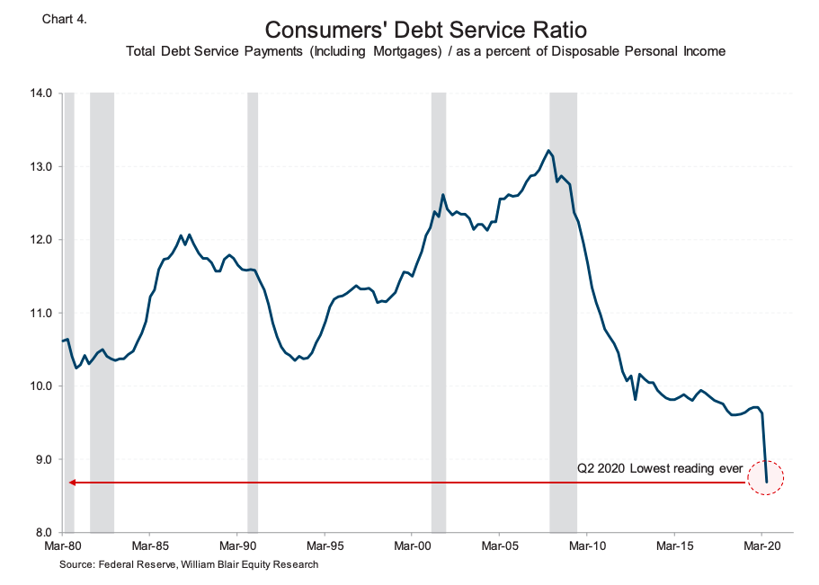
Consumer Debt Service Ratio
- Lowest reading ever of the debt service ratio, positive for consumers.


