A great presentation and separate post about a huge eCommerce business you probably haven’t heard of, founded only in 2015.
Its success is down to a team buying feature, social integration, gamification and live streaming.
These features have led to a daily active user (DAU) to monthly active user (MAU) ratio, a measure of engagement, of almost 50% – the highest, by some margin, among peers.
How to get attention: If you want to get famous for making big non-consensus calls, without the danger of looking like a muppet, you should adopt ‘the 40% rule’. Basically you can forecast whatever you want with a probability of 40%. Greece to quit the euro? Maybe! Trump to fire Powell and hire his daughter as the new Fed chair? Never say never! 40% means the odds will be greater than anyone else is saying, which is why your clients need to listen to your warning, but also that they shouldn’t be too surprised if, you know, the extreme event doesn’t actually happen.
Recession watch: … So the best approach is to emphasise the dangers of recession but claim this is at least 18 months away. If it happens sooner, you can say you correctly warned about the dangers. If there is no recession you can simply postpone your forecast and hope nobody remembers.
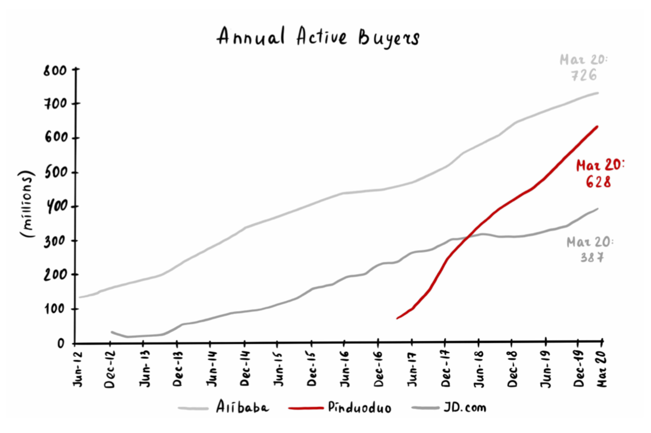
Loeb’s Third Point Capital Q2 Letter – where he discusses adjusting his process/strategy towards more quality compounders – with rationale for recent purchases (BABA, JD, AMZN etc) supporting this.
Klarman’s Baupost Group Q2 Letter – where he discusses his eight impacts of the pandemic on the future.