- Nice table showing all the US stock bear markets since 1929.
- 11 without economic recessions and 17, more severe bear markets, with recessions.
Macroeconomics
Snippets on the big picture.

Valuation
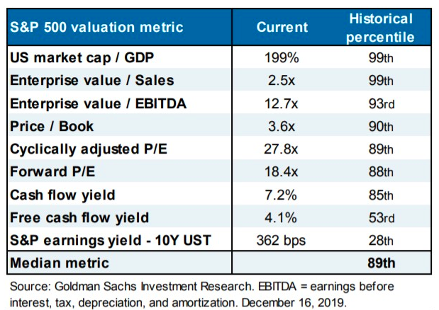
- On every measure valuation in the US Stock market is towards to top of historic ranges.
- The stand out is Free Cash Flow yield.
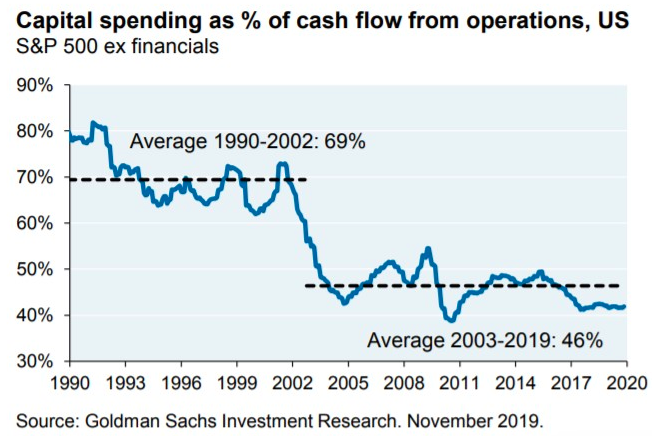
- However, as we saw here, capital spending has reset structurally lower which explains this discrepancy.
Capital Spending
- Capital expenditure in the US looks to have moved structurally lower (as a % of cash flow) in the early 2000s and remains so to this day.
US Imbalances pt 2.
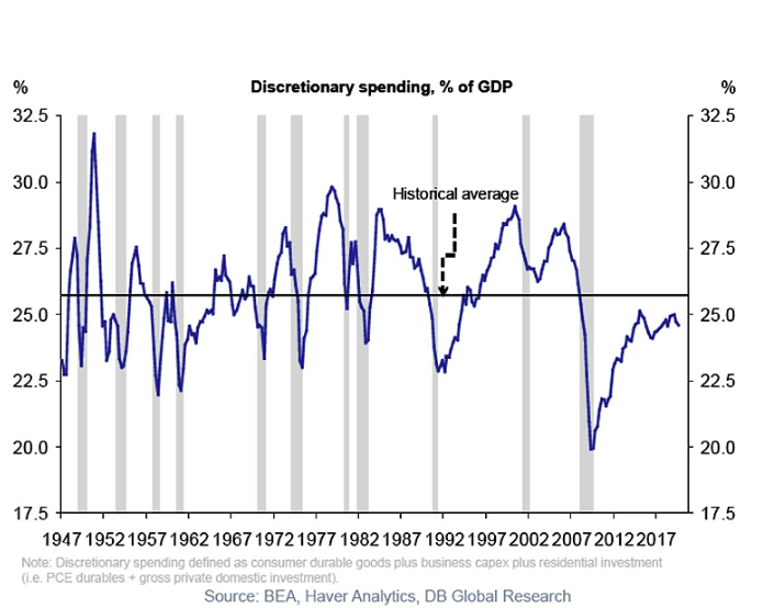
- Discretionary Spending as % of GDP for this expansion is still below historic average.
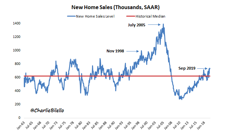
US Imbalances pt 1
- New home sales data shows little exuberance.
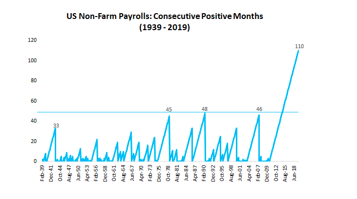
US Payrolls
- Another way to visualise the length of the recent expansion – number of months of consecutive positive payrolls.
Iran
- We have written before about Iran here.
- This is a really interesting article on Operation Ajax.
- It involves the 1953 overthrow of a democratically elected prime minister in Iran by the US and UK.
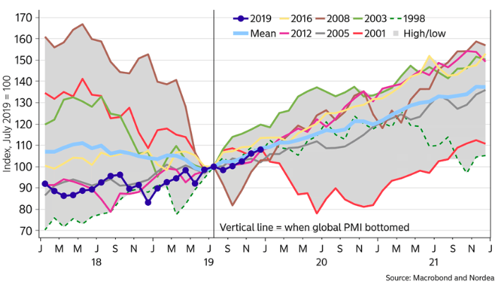
Equities and PMI
- Equities often continue to rise after a major bottom in global PMIs.
Magnus on China
- George Magnus long article on China in 2020 and beyond.
- “China is certain to experience slower economic growth in the years ahead, but the bigger surprise may be that, in US dollar terms, this narrative could be a factoid because of a fault-line that leads to a precipitous fall in the Yuan.“
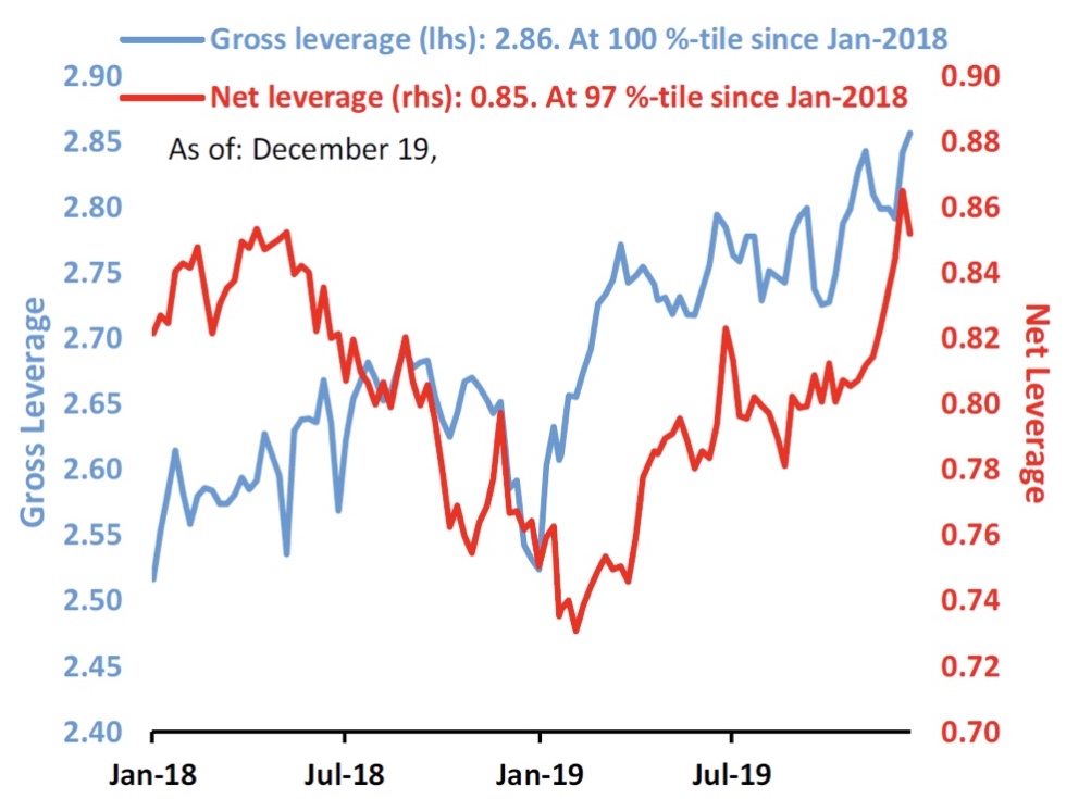
Hedge Fund Gross
- Hedge fund gross exposure is at 2 year highs.
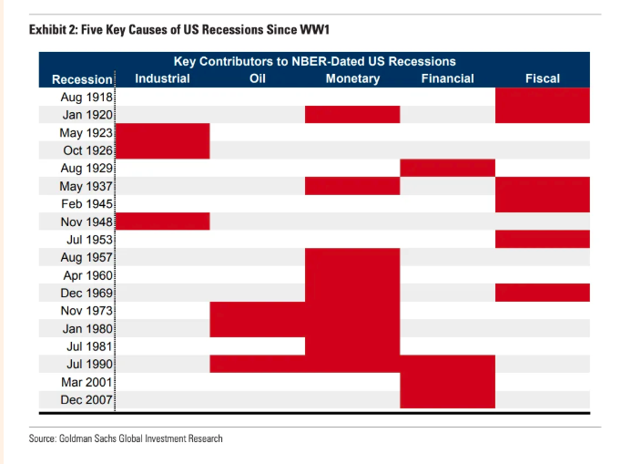
Causes of US Recessions
- Great table from GS Research showing the main causes of US Recessions since World War I.
- “A review of the last century of US recessions highlights five major causes: industrial shocks and inventory imbalances; oil shocks; inflationary overheating that leads to aggressive rate hikes; financial imbalances and asset price crashes; and fiscal tightening.”
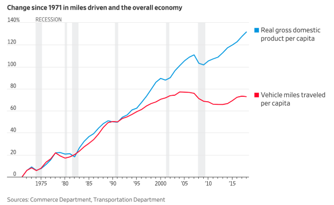
Driving Less
- Miles driven used to match economic growth but this started to diverge since the 1990s in the US.
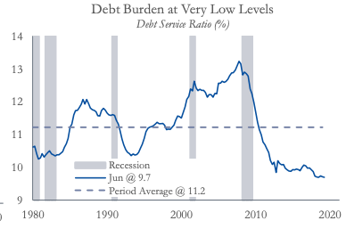
Household Debt
- US household debt burden is at very low levels.
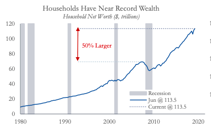
Household Wealth
- US household wealth is at record levels up 50% since the last peak.
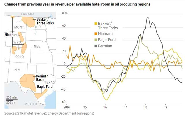
US Oil Patch Struggling
- Interesting chart showing hotel room rates year on year in oil producing regions of the US.
- Shows clearly how investment is coming out of those markets as drillers focus on cash flows.
- This hurts periphery services likes hotels.
- h/t 361 Capital
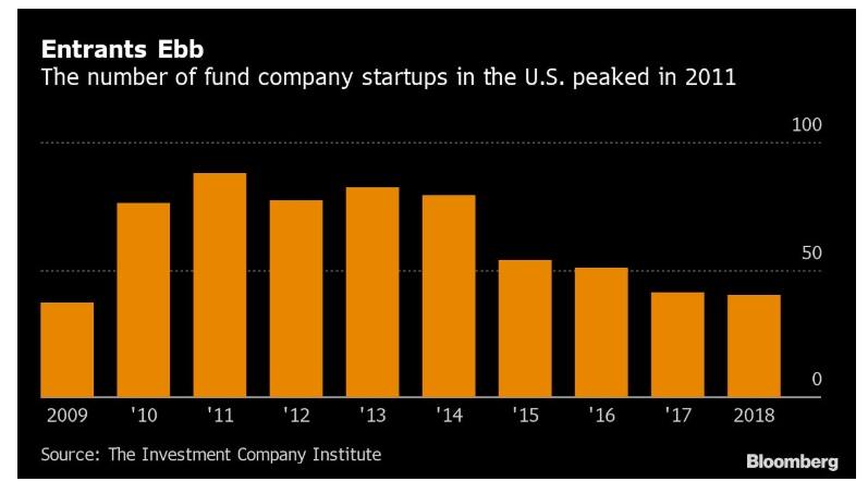
Fund Launches
- The number of new US investment fund launches peaked in 2011.
- Suggests an industry under significant pressure.
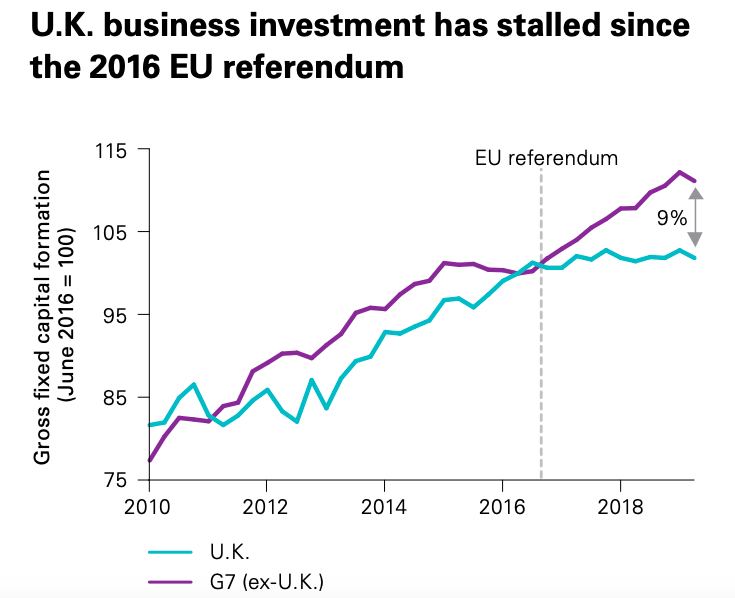
Brexit and the UK
- Interesting chart showing how investment has stalled in the UK after the 2016 vote for Brexit.
- Now that we have a clear political majority and mandate could investment start to return?
- There is a 9% gap to make up which is very substantial.
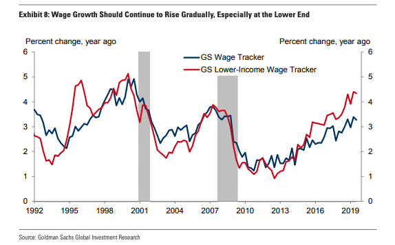
Wage Growth Continues
- Wage growth in the US continues apace – a solid late cycle sign.
- It is also seen in the low income portion of the wage curve.
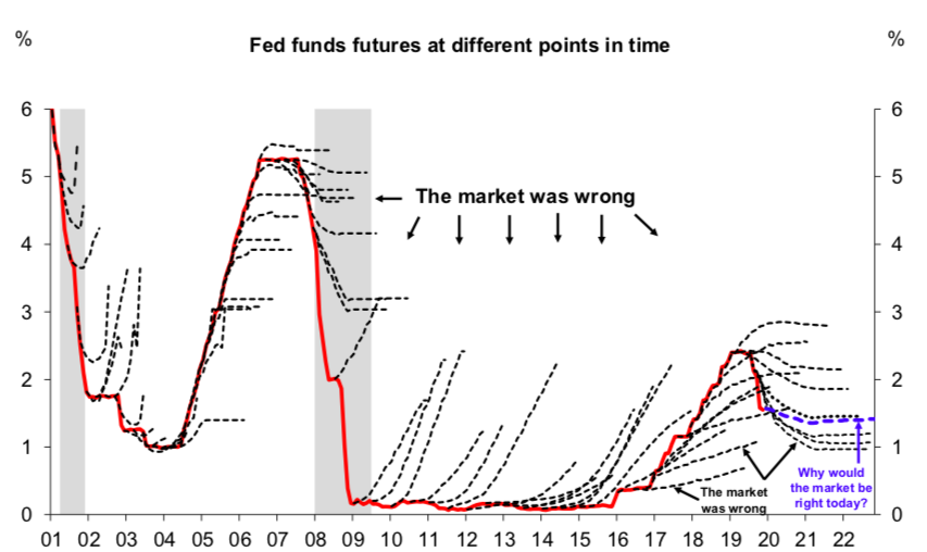
Markets Get the Fed Wrong
- The market almost always gets the Fed wrong.
- Dotted lines are predictions in a given year of the Federal Funds rate and the red line is the actual outcome.
Wealth Distribution
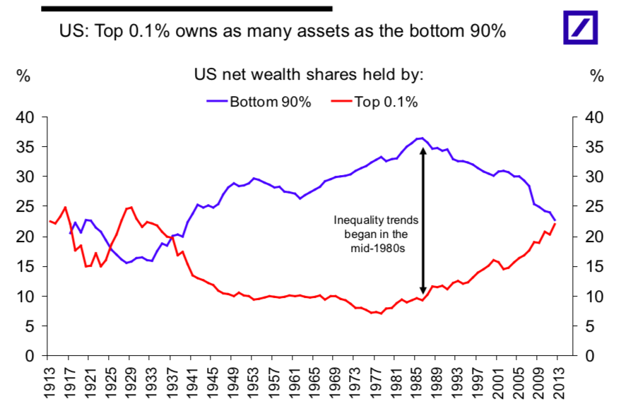
- Amazing chart showing how in the US the top 0.1% of the net wealth distribution own as much as the bottom 90%.
- This trend in income inequality started in 1980s and is likely to have ramifications across society.