- Neat chart showing the percentage of companies that have net cash.
- Japan leads the way (as it has done since 2008).
- Interesting to see EM moving up.
- Source: Blackrock Outlook.
Stocks
Interesting, and often contrarian, Snippets on individual companies and the stock market.

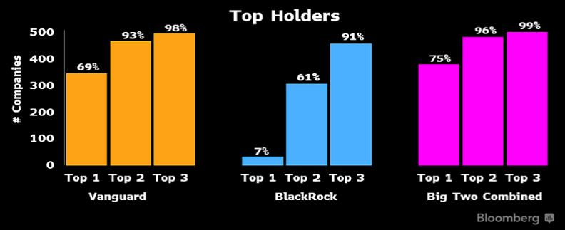
Passive Domination
- Chart shows the extent the biggest companies are owned by Blackrock and Vanguard.
- h/t Callum Thomas (do check out his excellent Chart Storm).
Flaring
- Flaring natural gas is a hot topic right now, and not just because Russia is using it as a political weapon.
- Interestingly Chevron has decided to link some incentive pay to a target to reduce flaring by 25-30% vs. 2016 levels.
- Flaring is really bad – not only because it creates CO2 but because it often doesn’t do a good job leading to methane escape (a greenhosue gas that is 80x worse than CO2). Though this appears to be getting better.
- In some ways gas is flared because it is a “trapped asset” and this latest piece from Byrne talks a lot about innovative solution for non-tradeable assets. In the case of gas building data centres next to them.
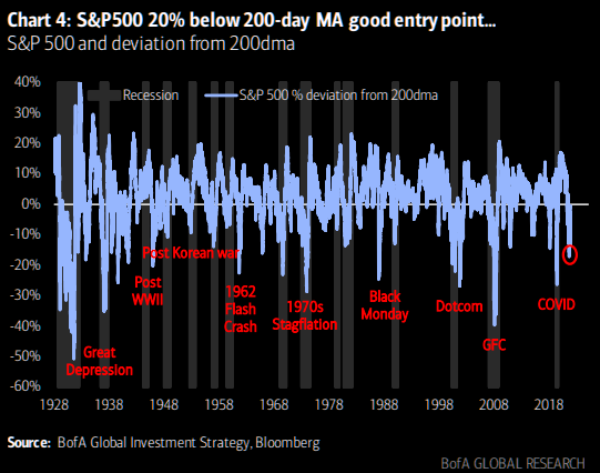
Buy Signals
- These charts can often be very useful in thinking where we are in the inevitably rhyming cycles.
- From Hartnett (Merrill Lynch Strategist) via themarketear.com.
- “His reasoning regarding the oversold entry level is basically buying some 20% below the 200 day moving average: currently at 3374. This has worked over the past century (except 1931/37/74 and 2008). He adds: “…monster undershoot requires monster credit event & recession”.”
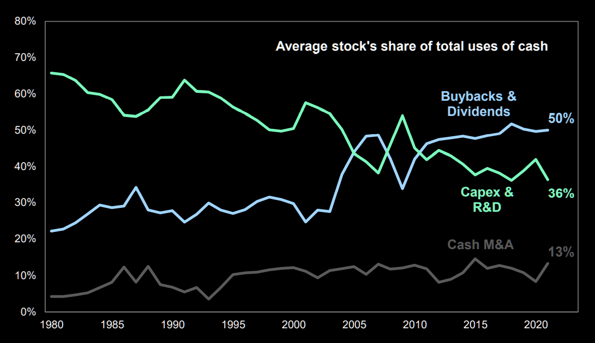
Uses of Cash
- Buybacks have come to dominate how the average company uses its cash.
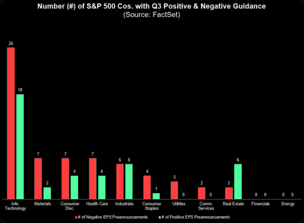
Preannouncements
- “41 SPX companies have issued positive EPS guidance for Q3 2022”
- This is higher than what we saw in for Q1 and Q2.
- Likely down to companies struggling to “model” inflationary environments.
- h/t The Market Ear.
The Coming Semiconductor Revolution
- “The future of semis will be designing ever more specific chips for ever more specific uses. This change will take many years to play out, but the transition has already begun. This is going to upend the semis industry to the same degree that consolidation over the past 20 years has.“
- A must read here.
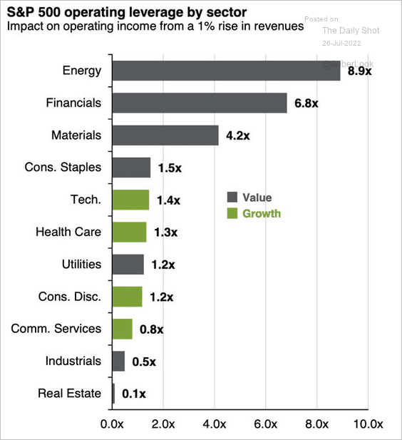
Operating Leverage by Sector
- Operating leverage, especially in these inflationary times, is an important metric to watch.
- This is a useful chart of leverage by sector.
- h/t Daily Shot.
Aladdin
- Intriguing transcript call from a former director suggesting Aladdin could be spun-off from Blackrock [To read follow this link and get a free two week trial of Stream].
- Alladin is big (2021 the Technology Services Business at BLK, which is mostly Aladdin, delivered $1.3bn of revenue) and appears to be a winner takes all business (more data means it is better at doing its job).
- This was a brilliant (paywalled) history of Alladin for those interested.
Challenger Banking
- “I couldn’t help reflecting that there was a fine balance between the stringent requirements of the regulator and what our potential investors would like to see. For the PRA [Prudential Regulation Authority] we needed to be people who had done it all before, who knew how the committees and governance processes worked, and who were fully aware of our responsibilities to look after our customers’ money. On the other hand, for the private equity (PE) world we needed to appear as hard-headed business people who were going to sweat the assets and run a traditional high-return banking business. Meanwhile, any potential venture-capital investors would be on the lookout for a bunch of smart people who wanted to change the world. We just needed to fulfil each and every role somehow! Or rather, some people on the team would have to be all three people on the same day, while others picked a side and stuck with it.“
- Brilliant condensation of the tensions of a startup bank by Boden, the founder of Starling (h/t Net Interest)
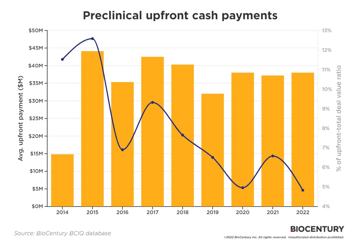
Preclinical Upfronts
- Interesting dataset showing that, despite a fairly constant $ amount of upfront payments, its % of a total biotech licensing deal’s value has fallen to a low for pre-clinical assets.
Shorting Startups
- Derivatives and shorting have made their way into the private market.
- Selling interest increased to 80% of open order interest at Caplight, while the buy side has dropped to 20%, according to Javier Avalos, CEO of the private-market derivatives marketplace. It was previously fairly even or a 60/40 split, he said. “We basically saw the demand side of the Caplight marketplace go away for the past few months,” he said.
- One interesting aspect of tech is how circular it is, making it prone to downside leverage – “Tech, unlike other sectors, disproportionately sells to itself.”
- “The circularity goes beyond VC investments,” he added. “Today major tech companies incubate their own customers at a pace and scale not seen in any other industry.”
Jumia
- Nice profile of the African Amazon – Jumia.
- Despite the odds (54% of African startups shut down between 2010-2018) Jumia has made it to its ten year birthday.
- It has been listed since 2019 – the shares hit a peak of $63, but are languishing now at $8.
- It trades on 1.2x EV/Sales now and is forecast to grow sales 30%.
- Africa is very unique and it is worth reading a few expert calls on Jumia (two weeks free sign up here).
Litigation Financing
- A large alternative asset class you probably haven’t heard of is litigation financing – “transactions in which a third party provides capital (debt, equity, or a hybrid) to one of the parties to a legal claim (a plaintiff or law firm) in exchange for a financial interest derived in part from the outcome of the claim.“
- This is an excellent comprehensive up to date paper on this sector. The full paper is here and a great summary is here.
- The asset class is estimated to boast 20%+ returns and has grown to a dedicated AuM of $12bn.
CRO Outsourcing
- Outsourcing in the biotech and pharma industry continues unabated, boosting contract research organisations (CRO) like IQIVIA, Labcorp etc.
- Interestingly, consolidation has been a big feature of the industry, and this Stream expert call (sign up for free two weeks to access) suggests more is to come.
- Source.

How Monzo Grew
- Interesting first hand account of how Monzo grew from nothing to 1 million users in three short years.
- Tom credits – a great product (compared to competition) that was a delight to use, a brightly coloured card, and network effects – “if you had 3+ friends on Monzo when you joined, you had a 70% chance of being a WAU [weekly active user] by day 90, versus only a 50% chance if you didn’t have any friends on the platform.“
Open Access Research
- Strikes me as a very important move by the US towards “open access” academic research.
- By 2026 all US federal agency funded research must be free to read immediately on publication.
- This has been talked about for a very long time.
- In a recent transcript from Stream by AlphaSense (sign up for two free weeks here), a former Elsevier Director, argued the effect on RELX business will be a “small negative” as they will find ways to charge for ancillary parts of research (reviews, data etc). The hit to smaller publishers will be worse.
- h/t Ben Evans.
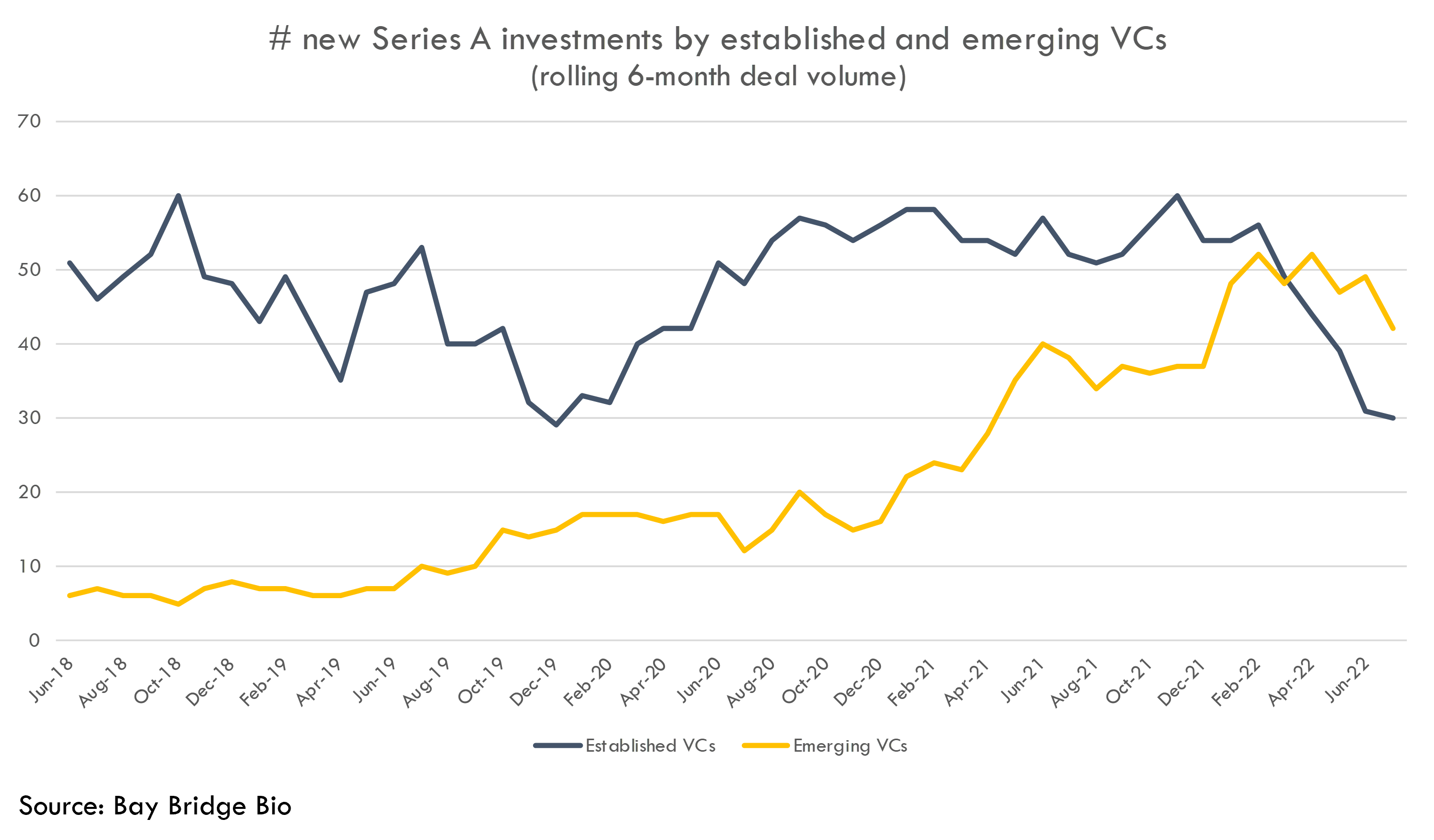
Biotech VC
- The venture landscape has changed in general, and this is also true in Biotech.
- A new crop of VC investors in the sector have been taking share from more established players in Series A funding markets.
- These comprise techbio, crossover and corporate VCs.
- What is interesting is the downturn has actually seen them stand their ground.
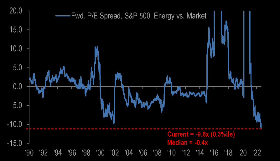
Energy Stocks
- The Energy sector continues to see upgrades and as a result is the cheapest it has been vs. the market.
- It is worth remembering that the energy sector was nearly 25% of the US market in 1980 and 15% in 2008. Today it is just under 5%.
- h/t themarketear.com.
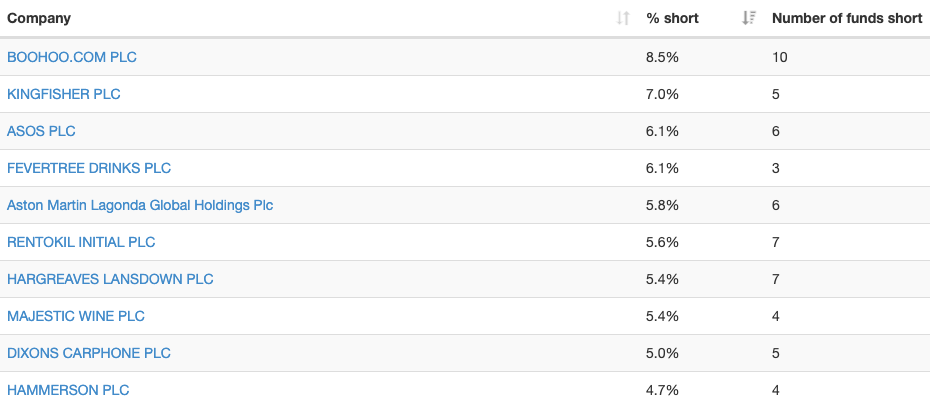
UK Most Shorted Stocks
- Always interesting to check in to see what the top most shorted stocks are in the UK.
- Six of the top ten are directly or indirectly exposed to UK consumer.
- NB – Regulation requires any funds short more than 0.5% outstanding to disclose daily, and this handy site makes the raw FCA data more presentable.