- Chart shows time spent online on the top 1000 properties by UK Consumers.
- Google and Facebook dominate.
- Source: CMA Report.
Stocks
Interesting, and often contrarian, Snippets on individual companies and the stock market.

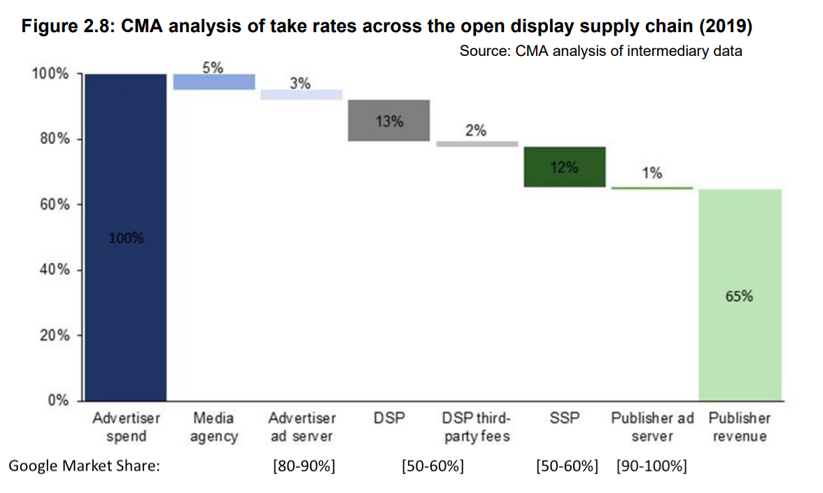
CMA Report on Online Market
- CMA have published an in-depth report on competition in online platforms and digital advertising in the UK.
- The dominance of these platforms is clear – as the chart shows Google has market power in the entire vertical chain which takes 35p for every £1 of advertising spend.
- Lots of interesting charts inside – some to come in future snippets.
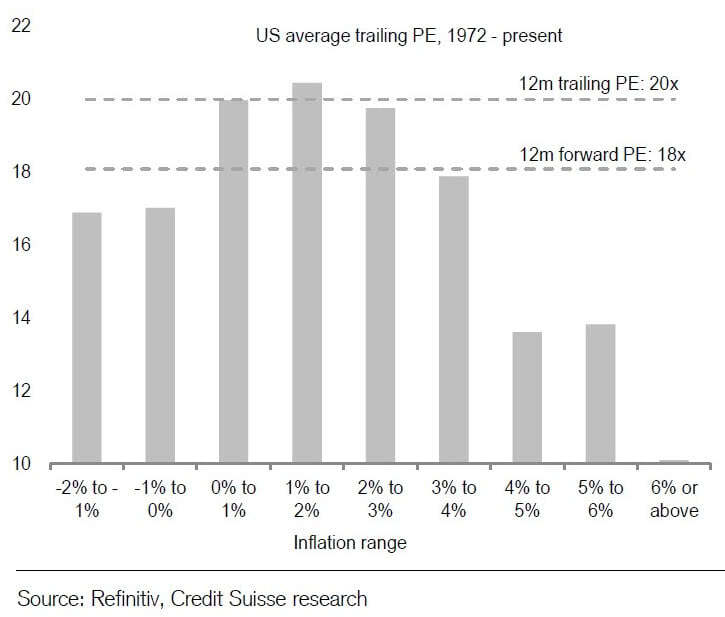
P/E and Inflation
- Useful long-term chart plotting stock P/E ratios against inflation rates.
- Despite doing well as an asset class during inflation, stocks actually command the highest rating (18-21x P/E) when inflation is 0-3%.
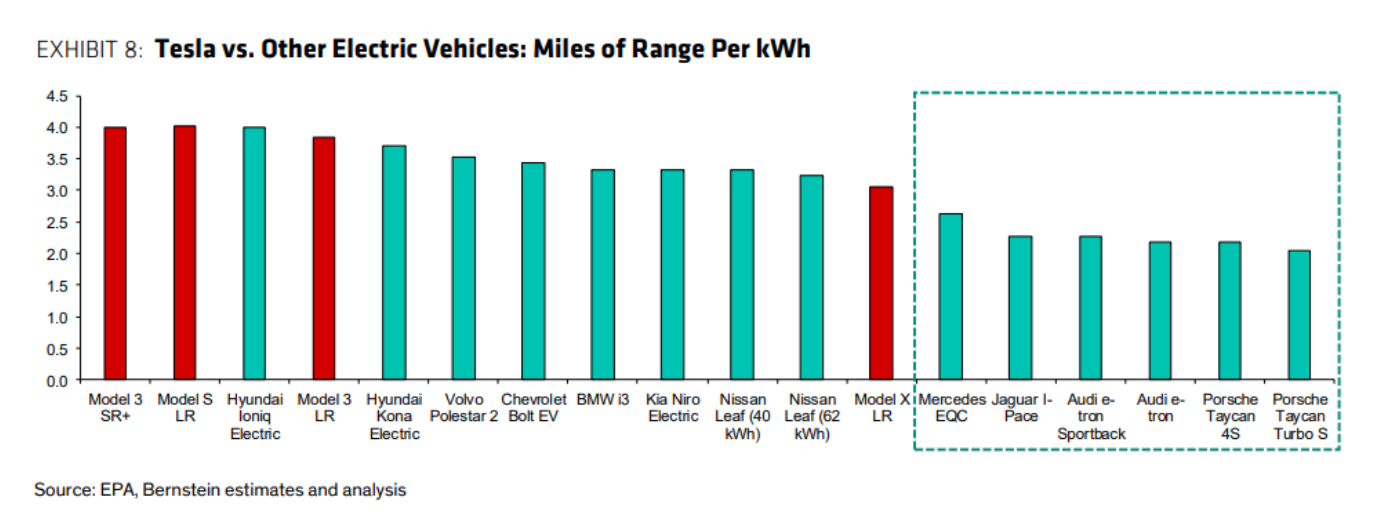
EVs and Tesla
- A chart that is one possible explanation for Tesla’s dominance.
- When compared to direct competitors like Jaguar, Mercedes, Audi and Porsche, Tesla models 3 and S have almost 2x the efficiency which translates directly into savings.
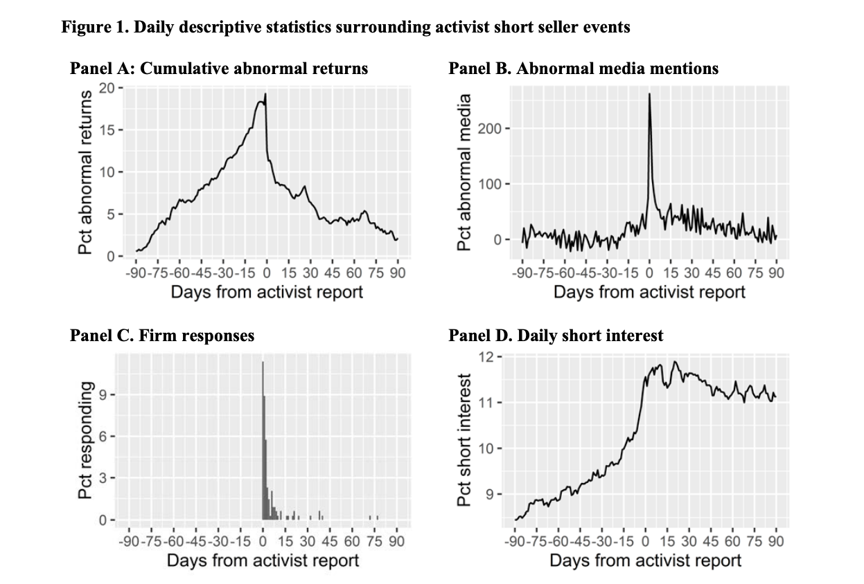
Activist Short Sellers
- Insightful FT Alphaville post on short reports (“activist short selling”).
- It builds on a recent paper where “two academics studied corporate responses to 351 short-reports published on US-listed companies between 1996 to 2018 in an attempt to discover if a company’s reaction is as important as the market’s when a report is released.”
- It seems that companies that launch internal investigations as a response have the worst outcomes – 383% higher chance it is a fraud.
- Some interesting charts attached.
Hotel Loyalty
- The largest hotel brands have built up loyalty programs to counter online travel agents like Expedia.

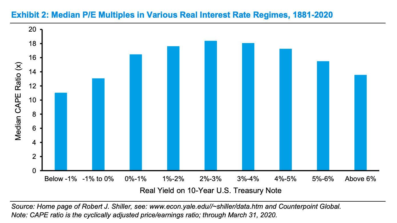
Equity Valuation and Interest Rates
- A great historic (1881-2020) chart showing median cyclically adjusted P/E multiples (CAPE) during various interest rate regimes.
- There is a balance – low interest rates mean future cash flows are worth more discounted but are associated with weaker growth.
- The chart suggests a goldilocks principle – highest P/Es associated with real interest rates in the middle of the range.
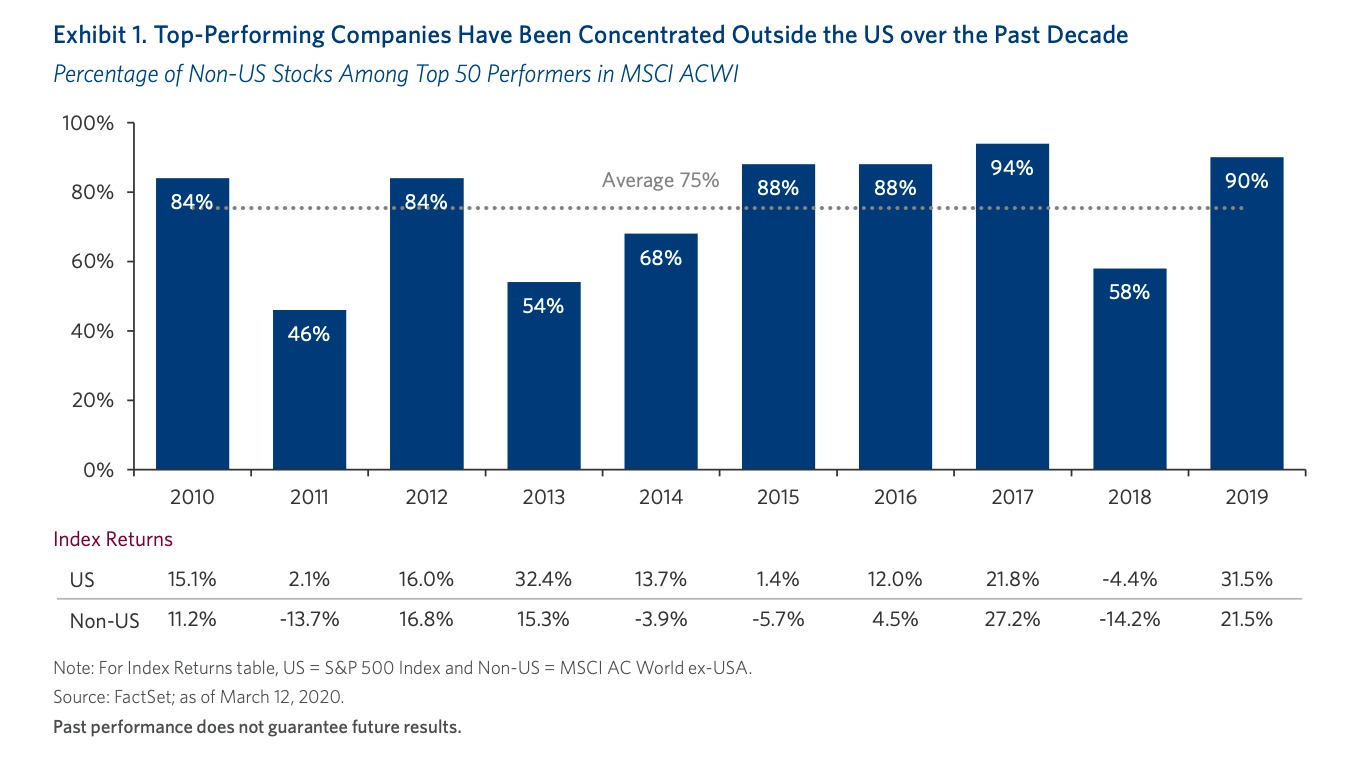
Non-US Stocks
- The outperformance of the US stock market has been well documented.
- This table, however, suggests something different below the surface.
- Looking at the top 50 stocks in the MSCI ACWI Index over the last decade – on average 75% of these have been outside the US.
Wirecard
Most Popular Robinhood Stocks Time-lapse
- 30 most popular stocks on Robinhood data sourced from Robintrack.
Understanding Value Investing
- This series is one of the better when it comes to understanding what has gone wrong for value investors.
- The first looks into whether value is actually cheap.
- “The evidence brings us full circle to Arnott’s observation that the problem with the Value Factor has not been the absolute performance of Value stocks. The problem has been shorting the Glamour stocks“.
- The second, propose something very intriguing – “that looking through the lens of optionality reveals that the source of excess returns to factors are not a function of the securities themselves, but rather the rules of portfolio construction and the embedded optionality these rules create“
- The third article is yet to be published.
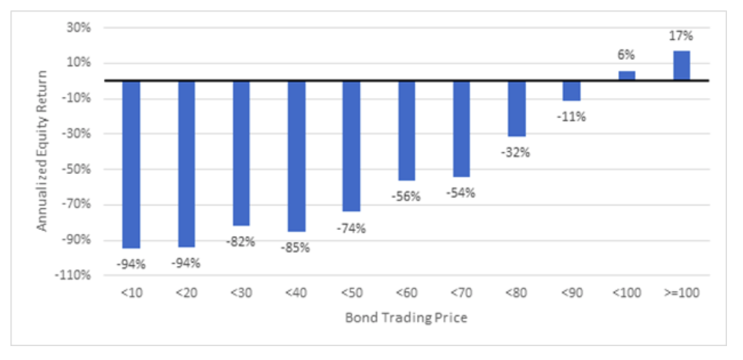
Bonds and Equities
- Surprisingly as bond prices fall below 90c on the dollar, the associated company equity returns deteriorate sharply.
- Effectively distressed risk is not compensated.
- This data sourced from Verdad bond database uses USD corporate high yield and investment grade bonds from 1996 until May 2020.
Popular Social Apps by Country
- It is really amazing that China has managed to home grow all its own most popular apps.

CIO Survey Part 2
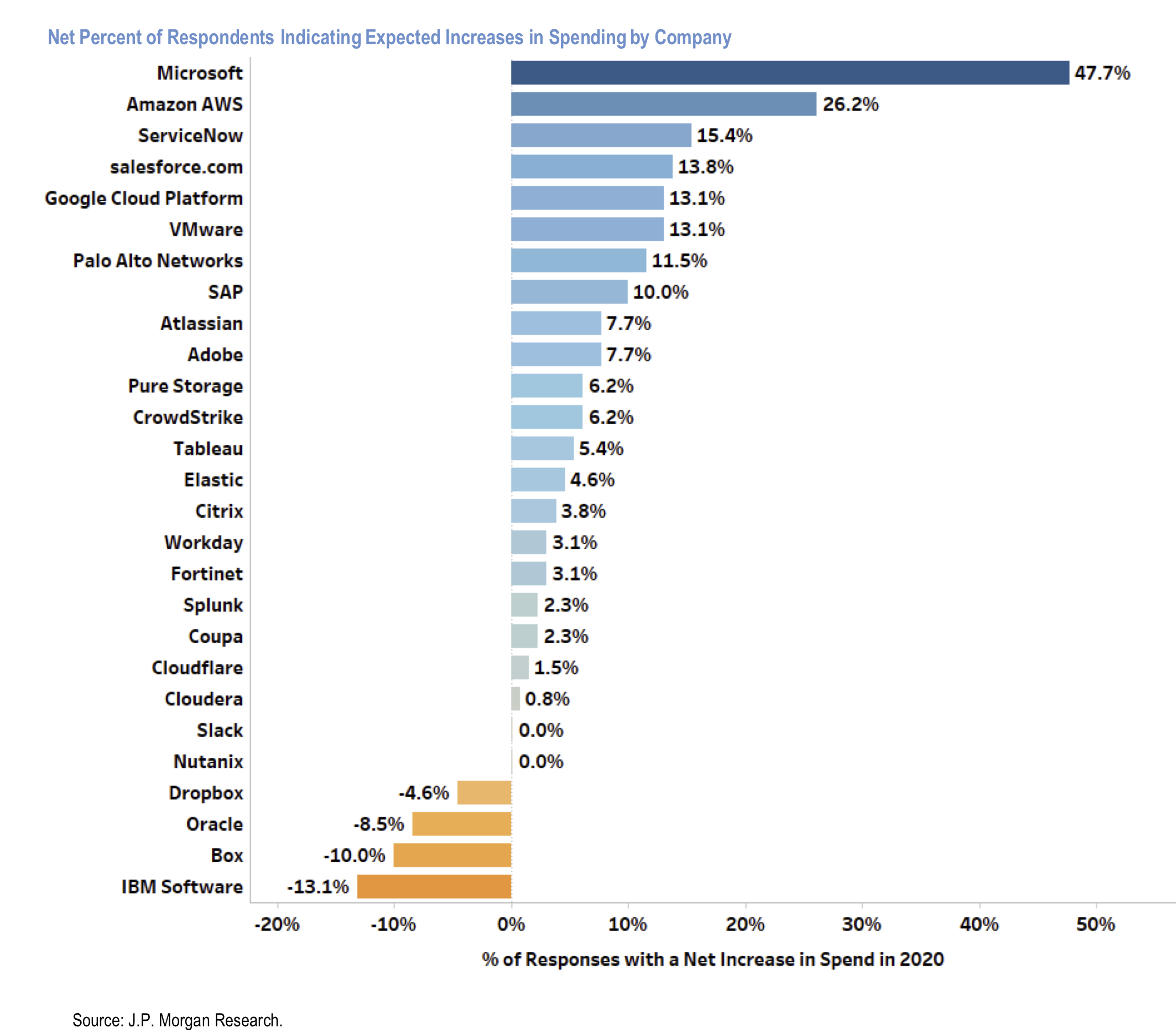
- JPM Survey of 130 Chief Investment Officers (CIOs) who command $88bn of annual IT spend.
- This chart shows spending plans by software provider – depicting net percentage who expect to increase spending.
- Clear winners are MSFT, AMZN (AWS) and ServiceNow.
- Clear losers are Dropbox, Oracle, Box and IBM.
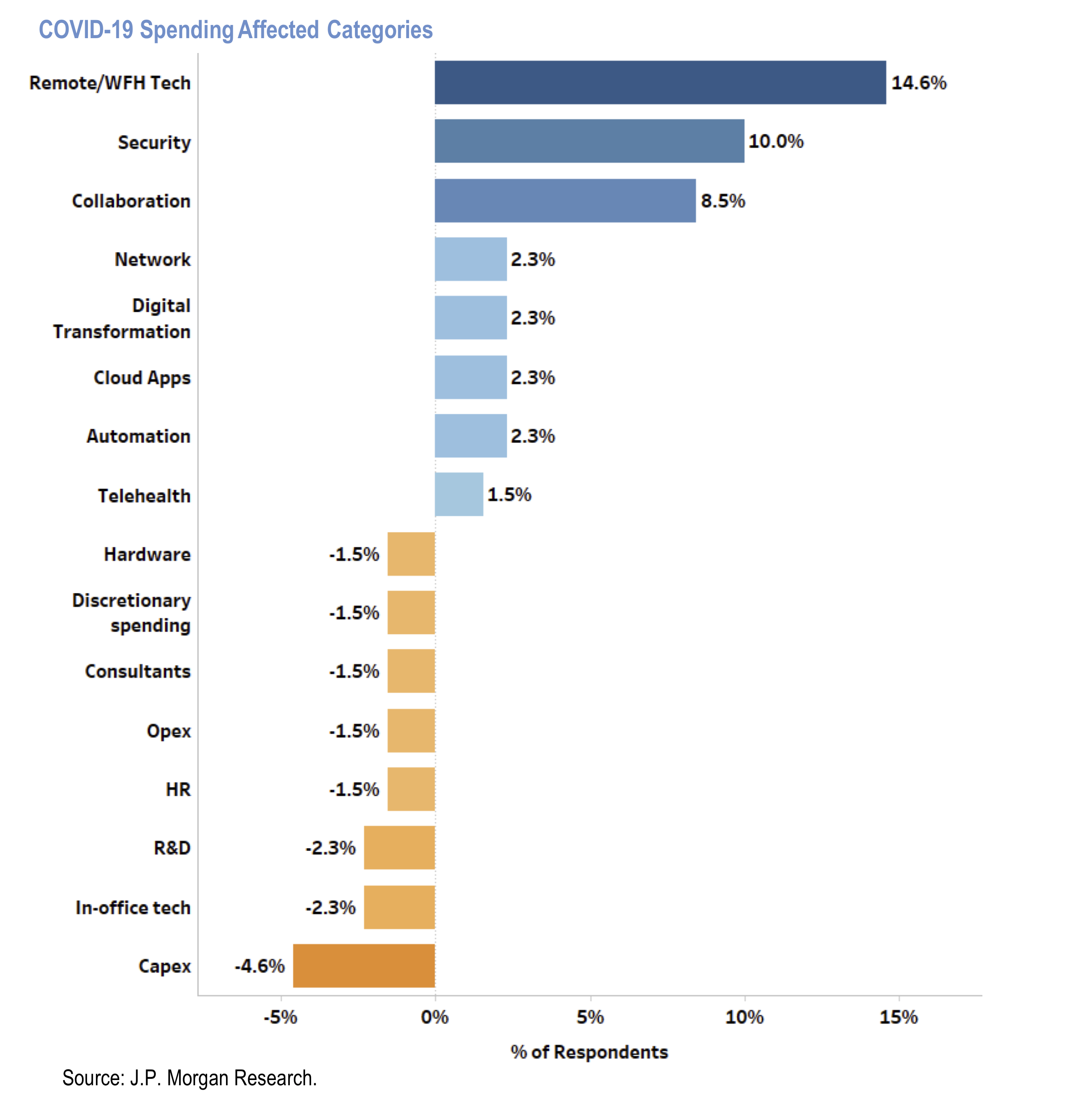
CIO Survey Part 1
- Results of a survey by JPM of 130 chief investment officers (CIOs) commanding $88bn of annual IT spend.
- This chart shows how CIOs’ foresee categories of IT spend will be affected due to Covid-19 pandemic.
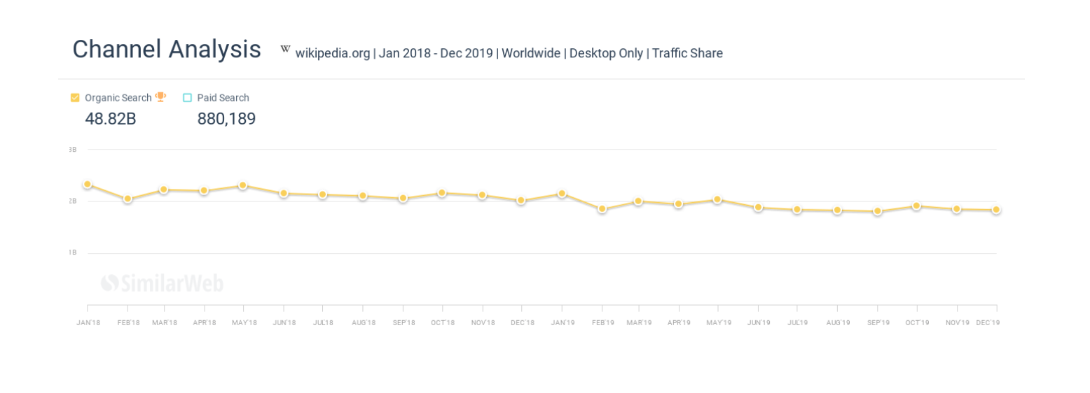
Wikipedia and Zero Clicks
- We previously discussed the rise of zero click searches at Google.
- This is an article about the direct impact of this on Wikipedia.
- “Over the past 24 months Wikipedia has lost billions of organic monthly visitors”
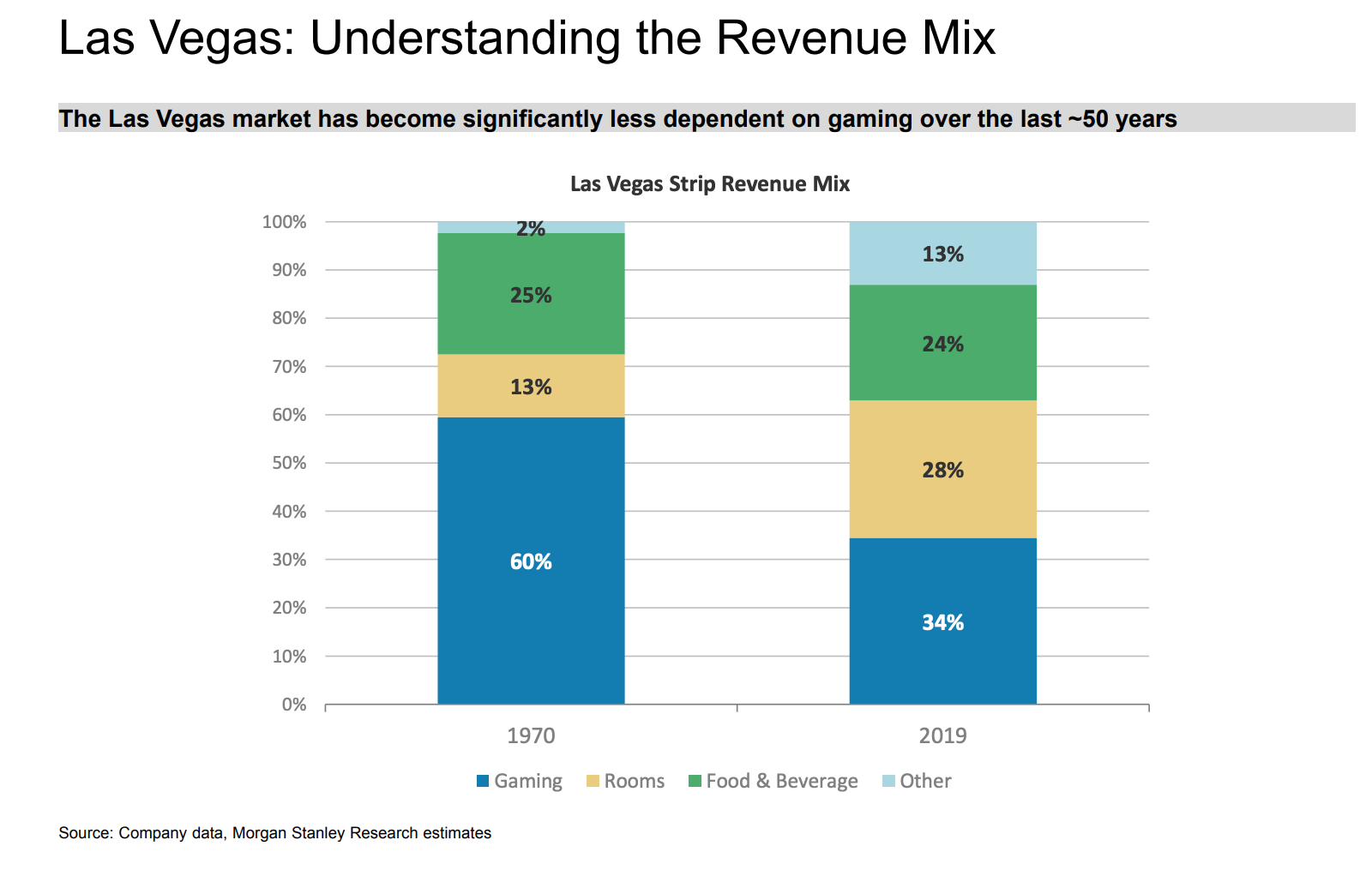
Las Vegas Revenue Mix
- Gambling is a much smaller part today than it was in the 1970s.
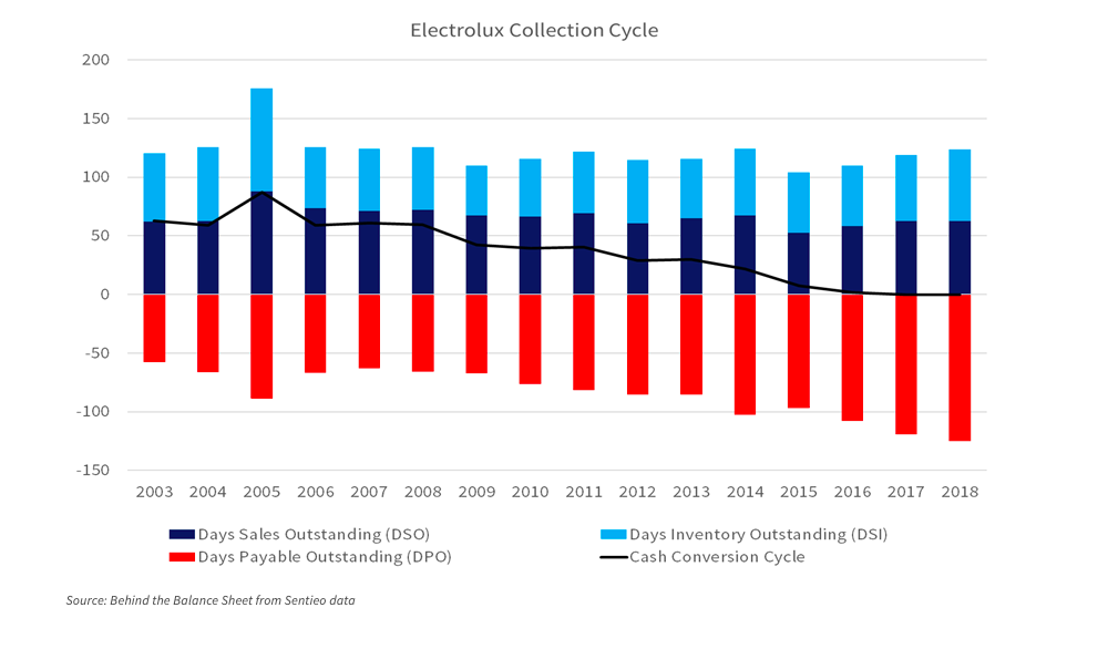
Working Capital & Covid
- This is a chart of the working capital of Electrolux since 2003.
- It shows that the total cash collection cycle has fallen from 63 days in 2003 (a peak of 87) to zero today.
- This was almost entirely achieved by payable days doubling from 60 to 120.
- In short the company is squeezing suppliers.
- What happens after Covid? This excellent blog post addresses this and other impacts.
Netflix Accounting
- A good article on accounting at Netflix.
- In short, it analyses content amortisation accounting and shows that this line item is being understated, boosting earnings.
- A staggering stat is that Netflix content spend went from $2bn in 2011 to nearly $14bn last year.
- This might not be relevant for the share price for now but is still worth knowing about.
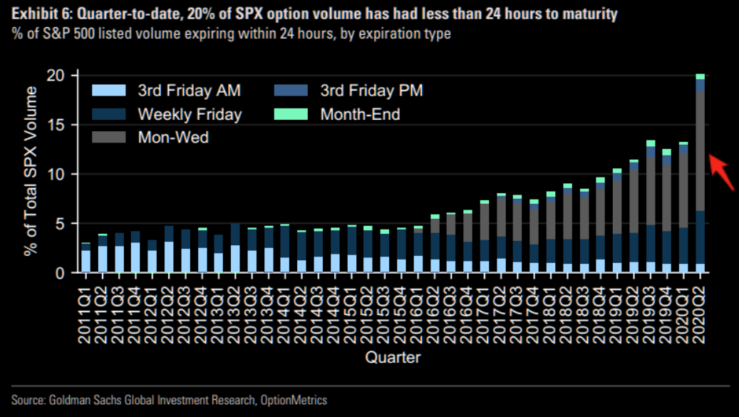
Option Volume by Expiry
- Fascinating chart showing that options volume is being concentrated – at nearly 20% – in options with 24 hour expiry.