- JPM Survey of 130 Chief Investment Officers (CIOs) who command $88bn of annual IT spend.
- This chart shows spending plans by software provider – depicting net percentage who expect to increase spending.
- Clear winners are MSFT, AMZN (AWS) and ServiceNow.
- Clear losers are Dropbox, Oracle, Box and IBM.
Stocks
Interesting, and often contrarian, Snippets on individual companies and the stock market.

CIO Survey Part 1
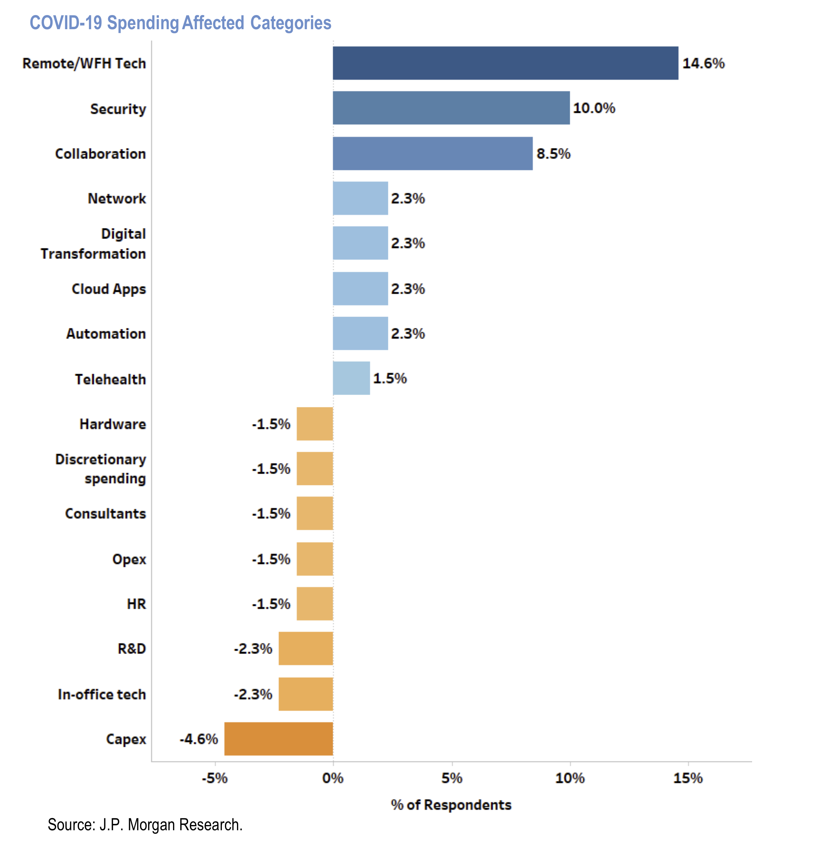
- Results of a survey by JPM of 130 chief investment officers (CIOs) commanding $88bn of annual IT spend.
- This chart shows how CIOs’ foresee categories of IT spend will be affected due to Covid-19 pandemic.
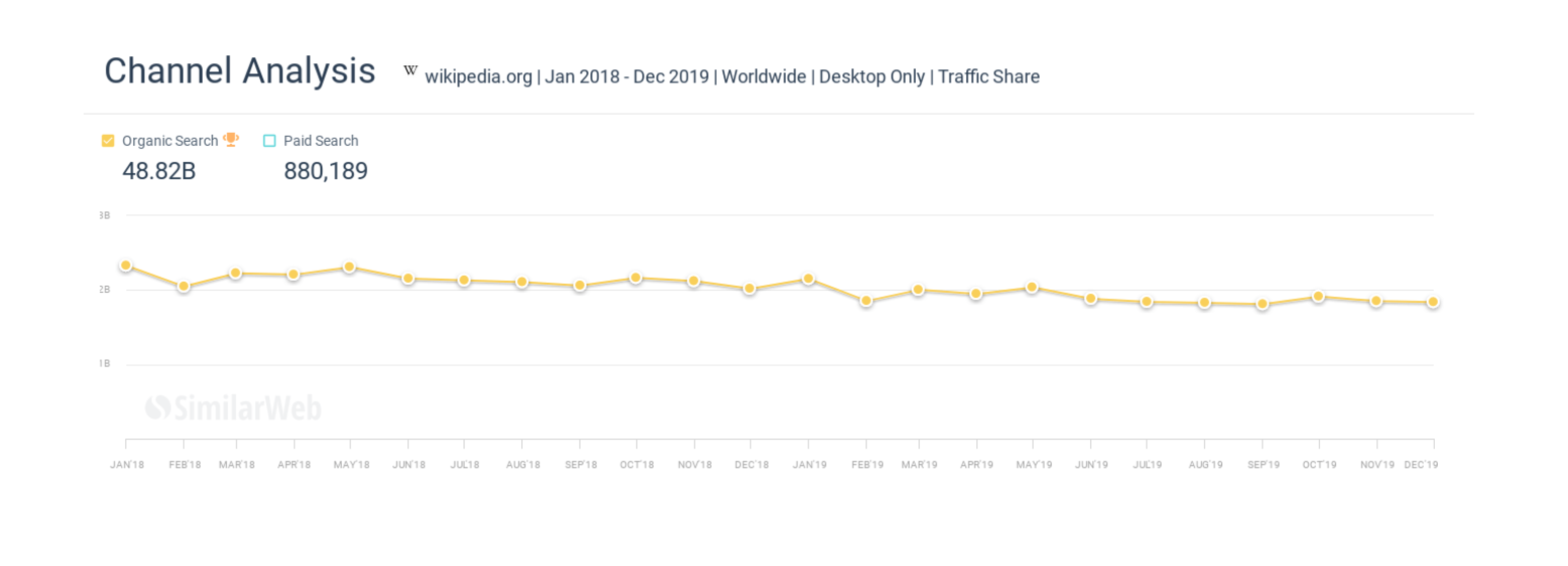
Wikipedia and Zero Clicks
- We previously discussed the rise of zero click searches at Google.
- This is an article about the direct impact of this on Wikipedia.
- “Over the past 24 months Wikipedia has lost billions of organic monthly visitors”
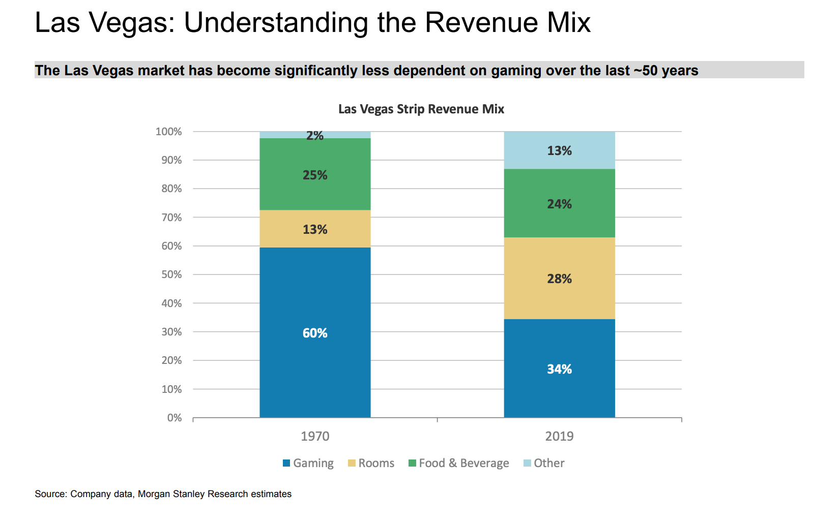
Las Vegas Revenue Mix
- Gambling is a much smaller part today than it was in the 1970s.
Working Capital & Covid
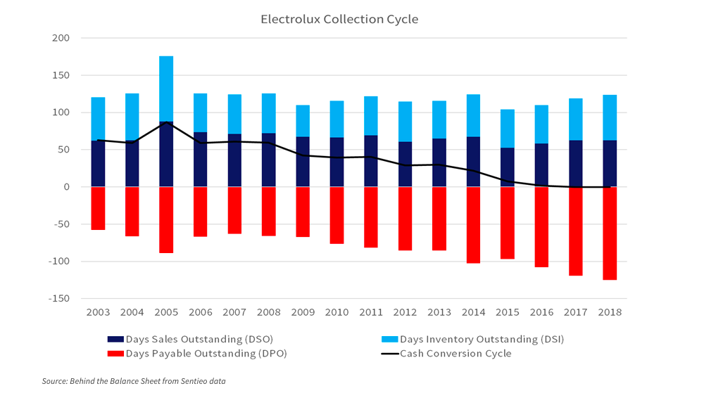
- This is a chart of the working capital of Electrolux since 2003.
- It shows that the total cash collection cycle has fallen from 63 days in 2003 (a peak of 87) to zero today.
- This was almost entirely achieved by payable days doubling from 60 to 120.
- In short the company is squeezing suppliers.
- What happens after Covid? This excellent blog post addresses this and other impacts.
Netflix Accounting
- A good article on accounting at Netflix.
- In short, it analyses content amortisation accounting and shows that this line item is being understated, boosting earnings.
- A staggering stat is that Netflix content spend went from $2bn in 2011 to nearly $14bn last year.
- This might not be relevant for the share price for now but is still worth knowing about.
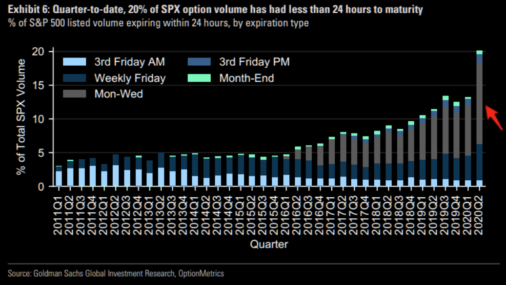
Option Volume by Expiry
- Fascinating chart showing that options volume is being concentrated – at nearly 20% – in options with 24 hour expiry.
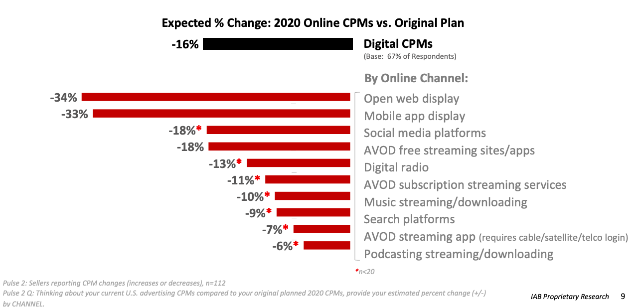
Ad pricing
- Always worth keeping an eye on digital ad prices.
- This chart from IAB shows the impact across various online channels.
- CPMs have been hit by -16%.
- Interesting to see the range – open web display being hit the hardest while video, podcast and search are more resilient.
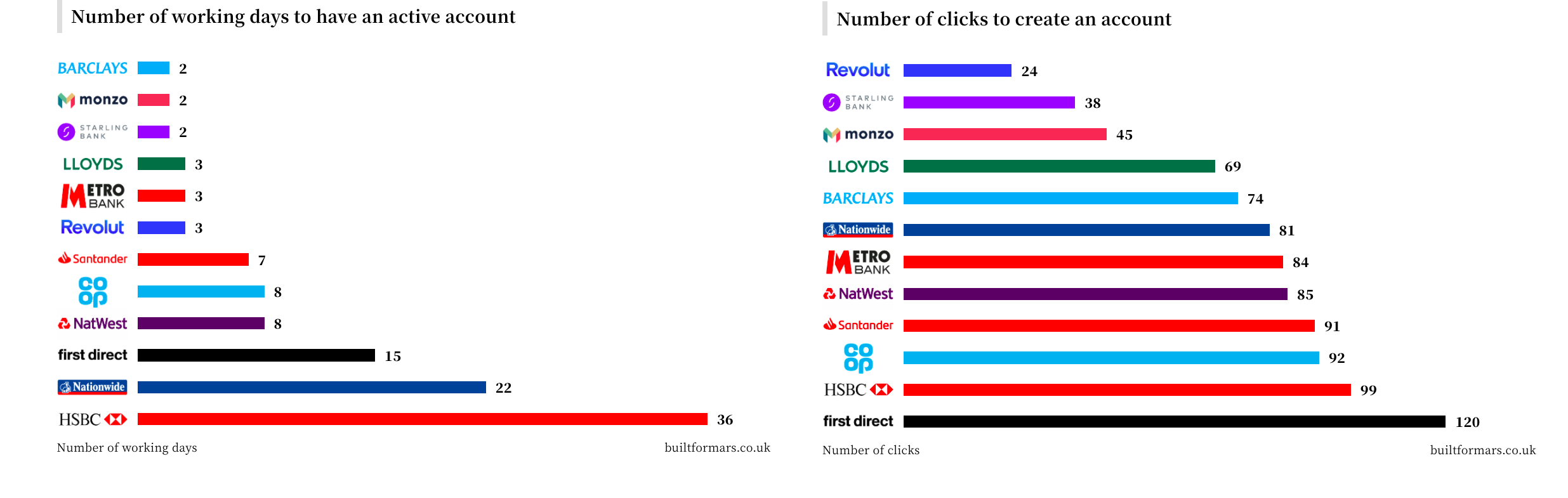
Banking 2.0
- On average a banking relationship in the UK lasts 17 years, longer than most actual relationships.
- This is a great chart comparing how long it takes in days and clicks to open a new account – challenger banks like Revolut win hands down.
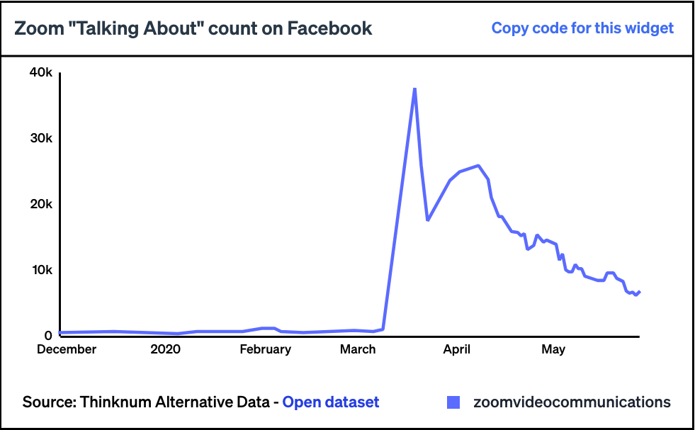
Zoom
- Thinknum alternative data suggesting that Zoom Video app popularity has probably peaked.
- Pictured is the ‘talking about’ score on Facebook but there are other indicators (e.g. app ratings) that suggest the same.
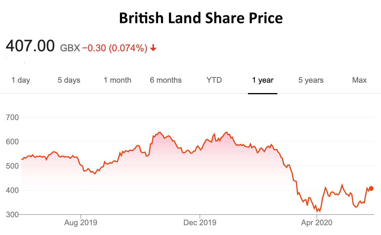
British Land
- Brookfield have declared a 7.3% stake in British Land (BLND) – the UK property company.
- This is interesting as Brookfield in the early 2000s bought a stake in Canary Wharf Group eventually, in 2014, taking it over (together with QIA via Songbird).
- BLND shares have been weak in the last year.
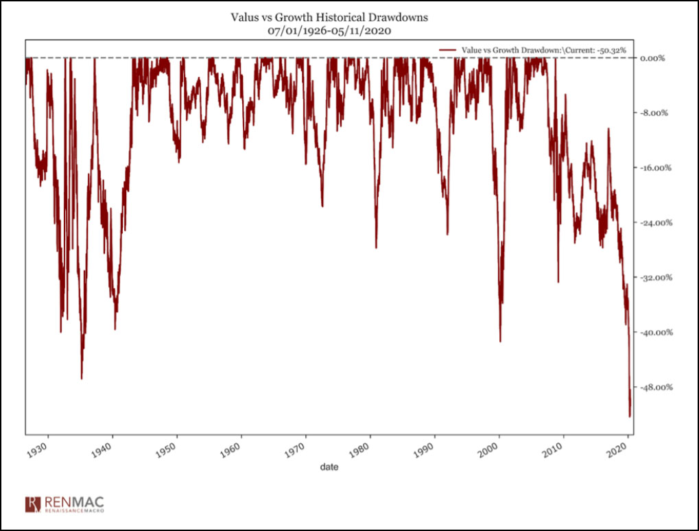
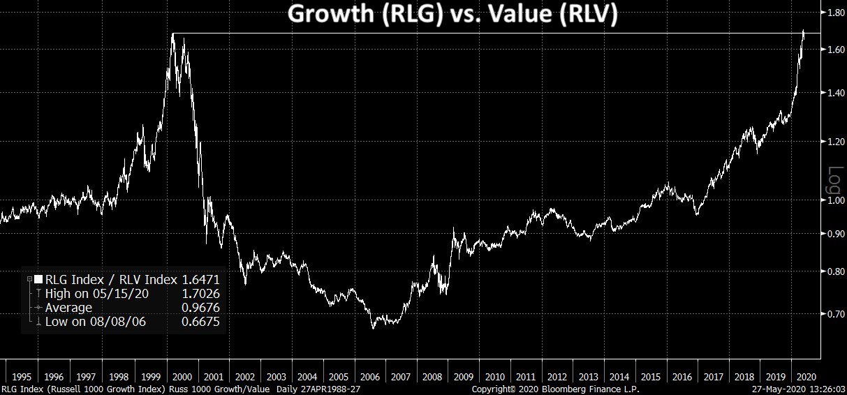
Value
- Value has had a very tough time.
- This chart shows drawdowns of value vs. growth since 1926.
- This drawdown is currently at a record -52%. (h/t 361 Capital)
- In fact the ratio of growth to value has just hit the same level as in 2000 Tech bubble peak (h/t Redburn).
- Investors are coming out defending the style even after adjusting for the valuation metric issues discussed before.
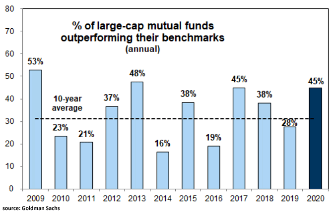
Fund Performance 2020
- Good to see that 45% of large-cap active managers are managing to use the dislocation of 2020 so far to outperform the market.
Covid & Hospital Procedures
- Data showing the impact of Covid on various hospital procedures.
- Unique patient visits are -54.5%.
- Interesting to see big drops in eye, spine and joint replacement surgeries.
- Knee (-99%) and hip replacement (-79%) are the hardest hit – not great for orthopaedic stocks.

Housing V-shape
- Housing in the US is having a V-shaped recovery already.

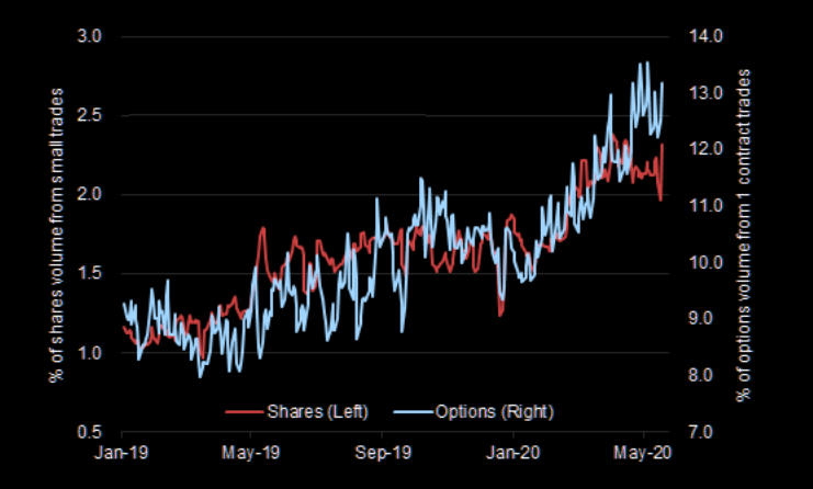
Retail Trading (pt 2)
- We previously wrote about the explosion of retail trading here.
- This is an interesting chart that shows that small traders are growing as a share of trading (stocks and options).
- h/t www.themarketear.com
Facebook Shop
Long-Term Stock Exchange
- Really interesting new stock exchange concept just approved by regulators (SEC).
- It is called the Long Term Stock Exchange (LTSE).
- Although the details aren’t clear the idea is to move away from short-term behaviour among investors and management.
- Will be interesting to watch if it takes off.
Travel Green Shoots?
- “I am pleased to say, but I would not get overly excited about it, that we have seen nice growth coming into May. And essentially, what we have seen is both growing out green shoots in the areas you would expect, places where movement has become possible, where people can now start to think about their summer holidays, et cetera. We see that very quickly when that happens and cancellations have settled down. They are still at elevated levels, but they have stabilized.” Expedia Q1 2020.
- “what we are seeing clearly is what you have been hearing that local, regional, domestic is certainly coming back stronger sooner.” Expedia Q1 2020.
- “we are seeing a significant number of hits in searches over the weekend, particularly I think from families looking at going on the two weeks summer holiday from Northern Europe to places in Italy, Spain, Portugal, et cetera.” Ryanair Q4 2020 Results.
Sony
- Really great article on Sony and their current CEO – Kenichiro Yoshida.
- This was a nice quote about the CEO – Yoshida’s humility is expressed through curiosity. “He came to me and said, ‘Let’s talk about medical things,’ and we met for dinner,” said Toru Katsumoto, who heads Sony’s medical business and research and development, of their first meeting. “I spoke about medical imaging and tried to explain the technology as simply as possible, but he had read a lot before we met. I was surprised and impressed. Once or twice a month, we have a face-to-face meeting and we exchange ideas freely.”
- The big thing about Sony today is the analogy with Microsoft – “A lot of what Nadella did was capitulate and say, ‘This is where we are now and this is what we are going to do,’ rather than chasing the glories of the past.”