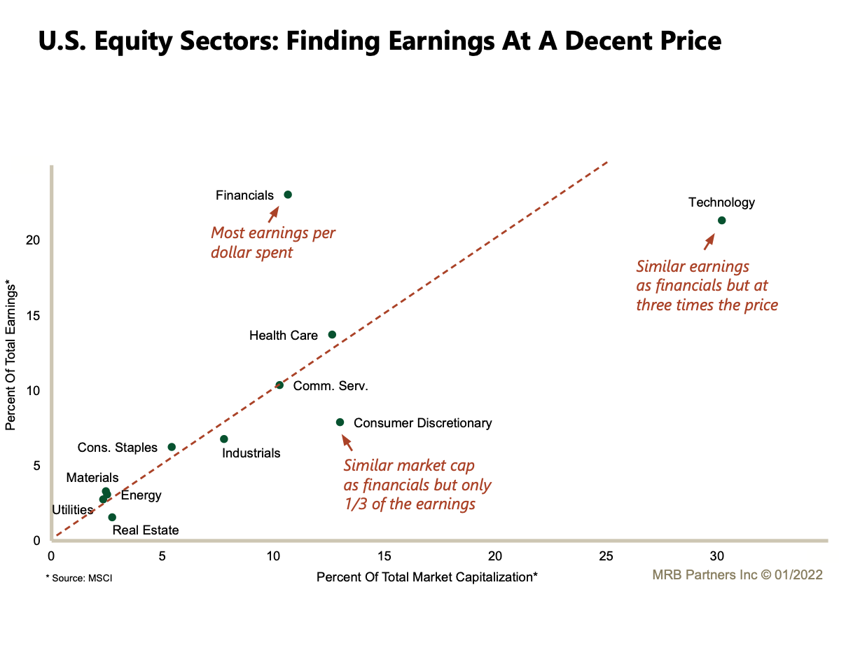
- Useful chart from MRB plotting a sector’s percent share of total US market capitalisation on the x-axis and percent share of total market earnings on the y-axis.
- It of course misses a lot of elements (e.g. growth of earnings, returns etc) but is still worth thinking about.
Earnings and Market Cap Share