Skip to content
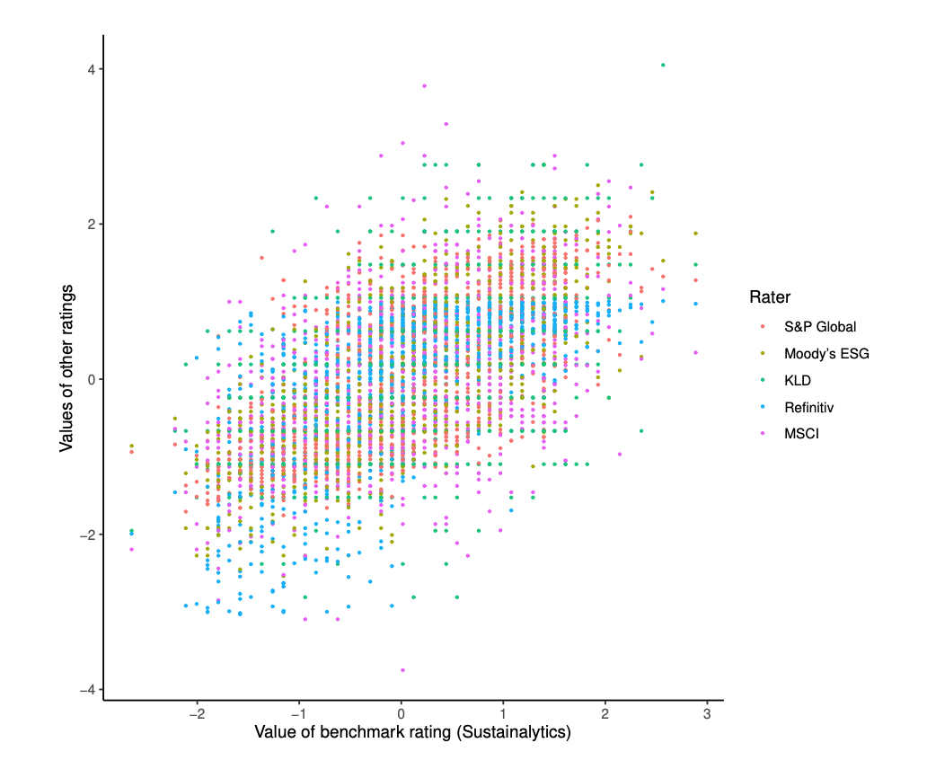
- ESG ratings from various providers just don’t agree and this is a nice chart to demonstrate this point.
- The horizontal axis takes Sustainalytics ratings for 924 firms as a benchmark.
- Ratings by other providers are then plotted on the vertical axis using different colours (see key).
- For each rater the ratings are normalised to a Z score (zero mean, unit variance).
- The results = for any level of benchmark rating there is a big range of values given by other ratings.
- The divergence is so bad between firms “it is difficult to tell a [ESG] leader from an average performer”.
- The paper then goes on to try to understand why this is.
WordPress Cookie Notice by Real Cookie Banner