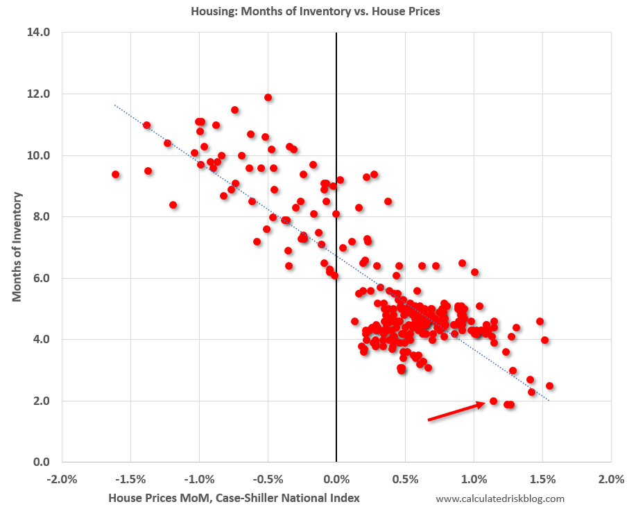
- Useful chart from the excellent Calculated Risk blog.
- “This graph shows existing home months-of-supply (from the NAR) vs. the seasonally adjusted month-to-month price change in the Case-Shiller National Index (both since January 1999 through February 2021).“
- Simply put if inventory is high prices decline, if months of supply is low they rise.
- Months of supply in March is 2.1. Prices are rising strongly.
House Prices and Inventory