- Nice page from IFS on how income inequality, living standards and poverty are evolving.
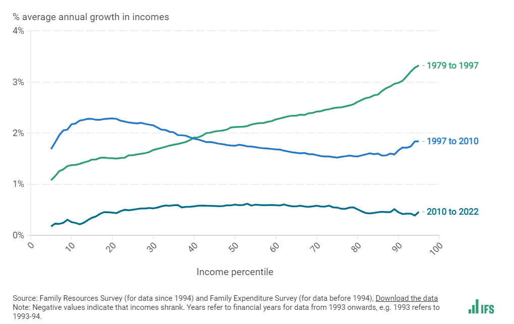
- This one, in particular, is interesting – “Another way to see how income inequality has changed over time is the following chart – known as a ‘growth incidence curve’. This shows the average annual percentage growth in incomes at each percentile of the income distribution, for selected time periods.“
Inequality in the UK