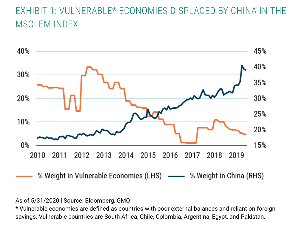
China has over time displaced the weight of vulnerable economies in the Emerging Markets (EM) Index, the latter itself falling due to improving macroeconomic fundamentals.
* Vulnerable economies are defined as countries with poor external balances and reliant on foreign savings. Vulnerable countries are South Africa, Chile, Colombia, Argentina, Egypt, and Pakistan.
Sourced from GMO, read on for more reasons to own EM.
The Department of Labor (DOL) has proposed a rule that might ban the ability of corporate sponsored retirement accounts (e.g. 401(k)s) from holding ESG Funds.
“Private employer-sponsored retirement plans are not vehicles for furthering social goals or policy objectives that are not in the financial interest of the plan,” said Secretary of Labor Eugene Scalia. “Rather, ERISA plans should be managed with unwavering focus on a single, very important social goal: providing for the retirement security of American workers.”
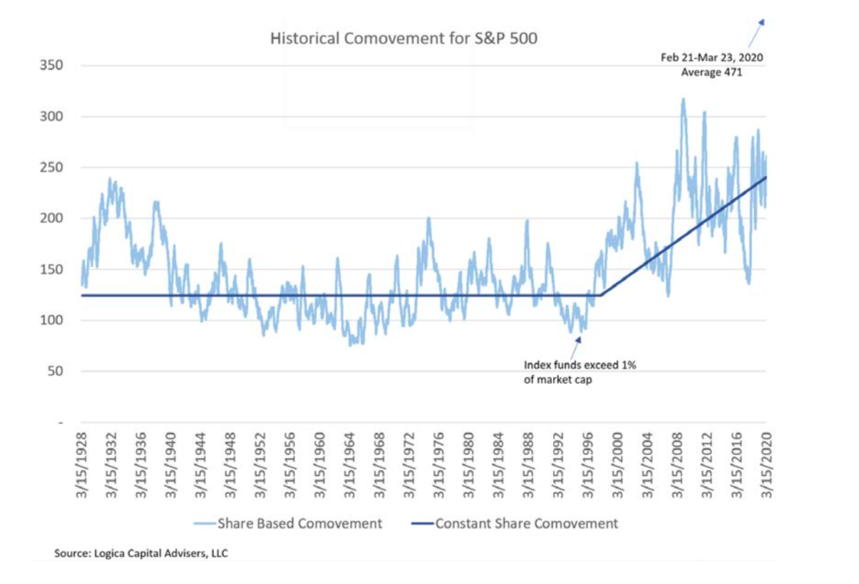
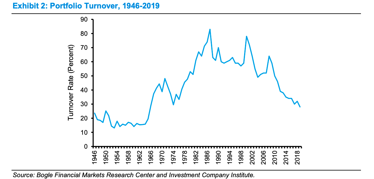
Comovement represents the absolute number of stocks in the S&P 500 which move on the same direction on any day (either up or down).
If half the stocks move up and half move down, comovement would equal zero. If 100% of the stocks move up, comovement would slightly exceed 500 (there are currently 505 stocks in the S&P 500).
Holding volatility relatively constant the rise of index funds has led to a marked increase in the comovement of stocks since the 1990s.
This along with volatility selling and illiquidity creates a market structure that has serious implications for investing.
This series is one of the better when it comes to understanding what has gone wrong for value investors.
The first looks into whether value is actually cheap.
“The evidence brings us full circle to Arnott’s observation that the problem with the Value Factor has not been the absolute performance of Value stocks. The problem has been shorting the Glamour stocks“.
The second, propose something very intriguing – “that looking through the lens of optionality reveals that the source of excess returns to factors are not a function of the securities themselves, but rather the rules of portfolio construction and the embedded optionality these rules create“