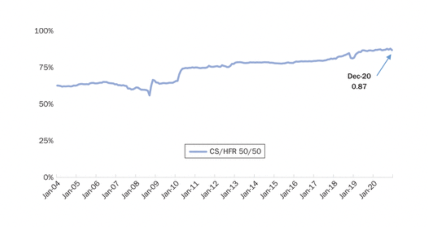
Hedge fund returns have become gradually more correlated to the S&P 500*.
This is bad for diversification and when combined with falling alpha, as described in this post, is worrying.
*This chart shows the 10-year trailing correlation of hedge fund returns (measured by a 50/50 weighted after fee return of Barclay Hedge Fund and HFRI Fund Weighted Composite Indices) vs. S&P 500.
Since its inception financial research has been on the hunt for factors that can consistently generate positive returns. Most famously Fama and French’s value factor.
This search has led to a what one author has termed the “factor zoo” – a proliferation of factors – a direct consequence of data mining.
There is also a replication crisis – that factors are not internally (i.e. the results can’t be replicated within the original sample) and externally (i.e. results can’t be replicated out of sample) valid.
This paper (summary here) is a rebuttal of these issue – it uses Bayesian updating from a prior that a factor’s usefulness is zero. Their work finds that no crisis exists.
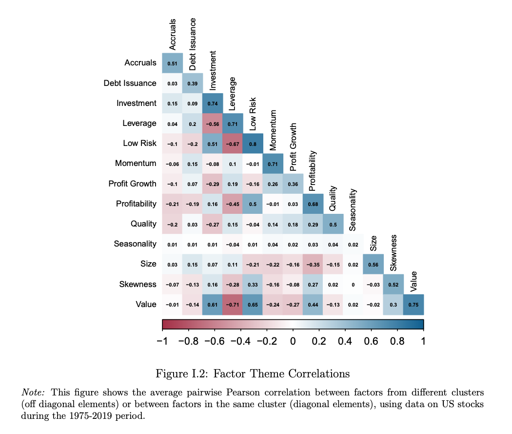
One idea worth thinking about is that according to the authors the 153 factors explored actually cluster into 13 themes – “possessing a high degree of within-theme return correlation and economic concept similarity, and low across-theme correlation” (as seen in the chart).
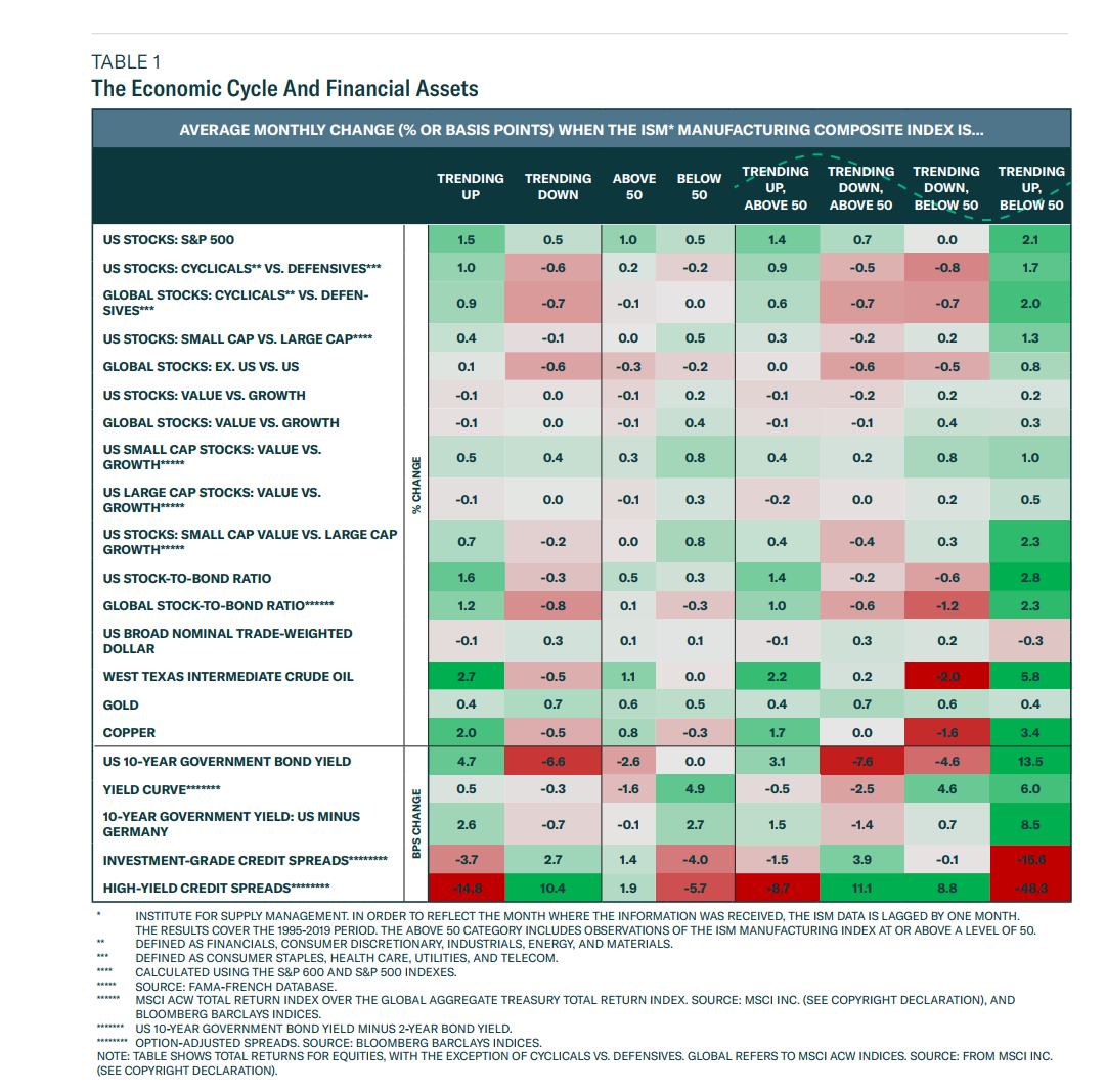
It shows how various financial assets (down the rows) react to the changing economic cycle (columns) as measured by the ISM Manufacturing Composite Index.
It covers the period 1995 – 2019.
Right now we are above 50 on the ISM index (59.9) but trending down.
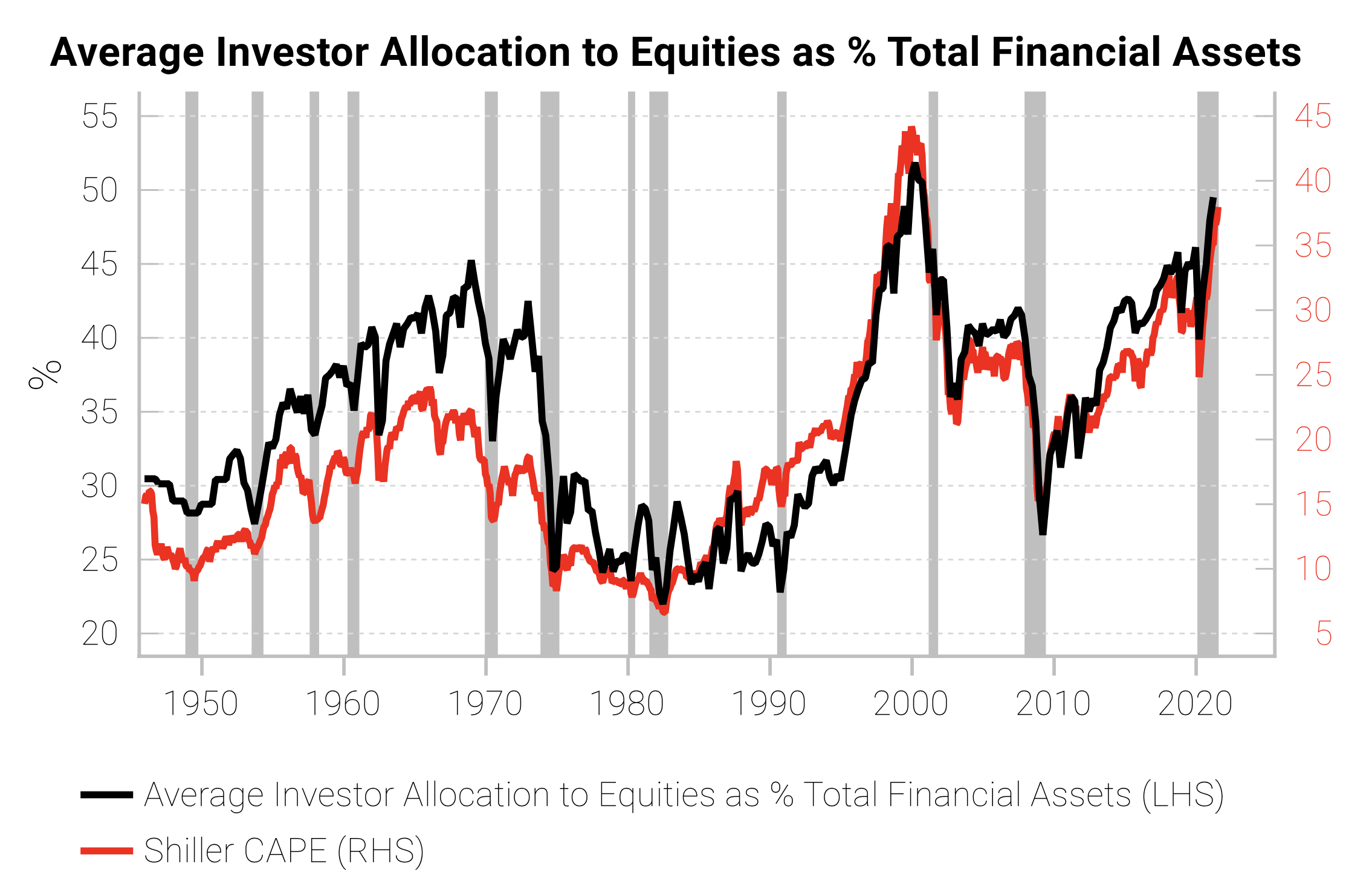
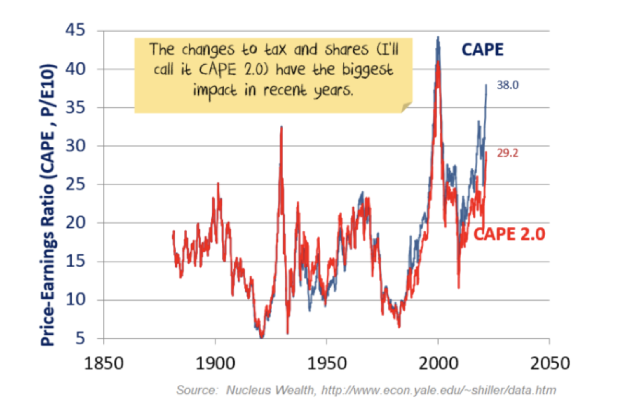
Interesting take on Shiller’s cyclically adjusted price earnings ratio (CAPE).
The analysis argues that one should be using today’s tax rate and adjusting for buybacks.
This leads to a CAPE 2.0 of 28x – far below the current CAPE of 38x and nowhere near the Dotcom peak.
This is the “basic” version and for those interested there is a more advanced (and more controversial) version that results in “the last 20 years go from being an expensive aberration to a typical investment period“.