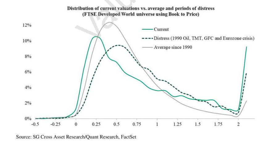
- An interesting chart from SG via Einhorn’s Q1 letter.
- It shows the distribution of valuations (using a book to price ratio).
- It compares today (solid green line), distressed periods (dark green and dotted) and average (since 1990).
- The conclusion is that today’s valuations are more extreme – especially the cheapest and most expensive stocks.
Valuation Distribution