- The Euro area export powerhouse depends heavily on the Chinese economy.
- So Chinese TSF (Total Social Financing), which is now stabilising/turning up, is a pretty good indicator of Euro strength.
Macroeconomics
Snippets on the big picture.

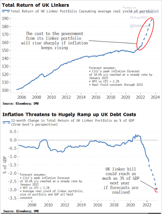
UK Linkers Backfiring
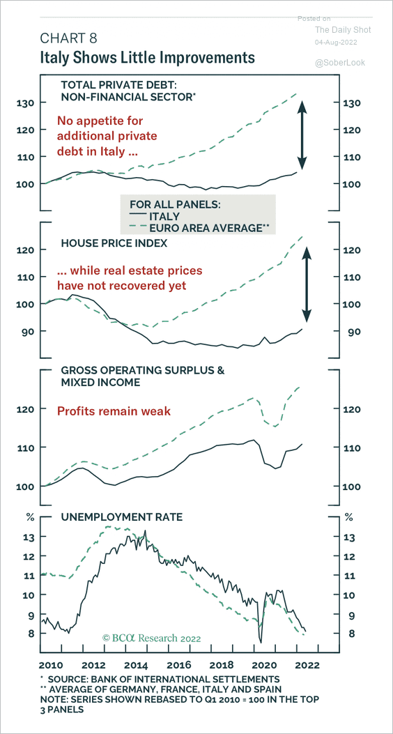
Italy
- Italy shows very little improvement sine 2011, across multiple economic measures.
- h/t Daily Shot.
Cost of Sanctions in Russia
- The first comprehensive economic analysis measuring the impact of sanctions on economic activity in Russia.
- The team relies on “using private Russian language and unconventional data sources including high frequency consumer data, cross-channel checks, releases from Russia’s international trade partners, and data mining of complex shipping data”.
- Results are grim – “From our analysis, it becomes clear: business retreats and sanctions are catastrophically crippling the Russian economy.”
UK Consumer
- Asda income tracker is painting a dire picture for the UK consumer.
- Inflation is squeezing and it could get worse later this year.
- Other worrying signs include spike in demand for pawnbrokers.
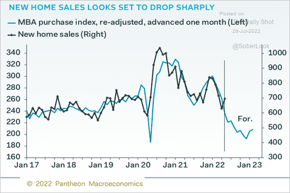
New Home Sales
- This important variable is now rolling over.
- And, according to this chart, it likely has more to go.
- h/t Daily Shot.
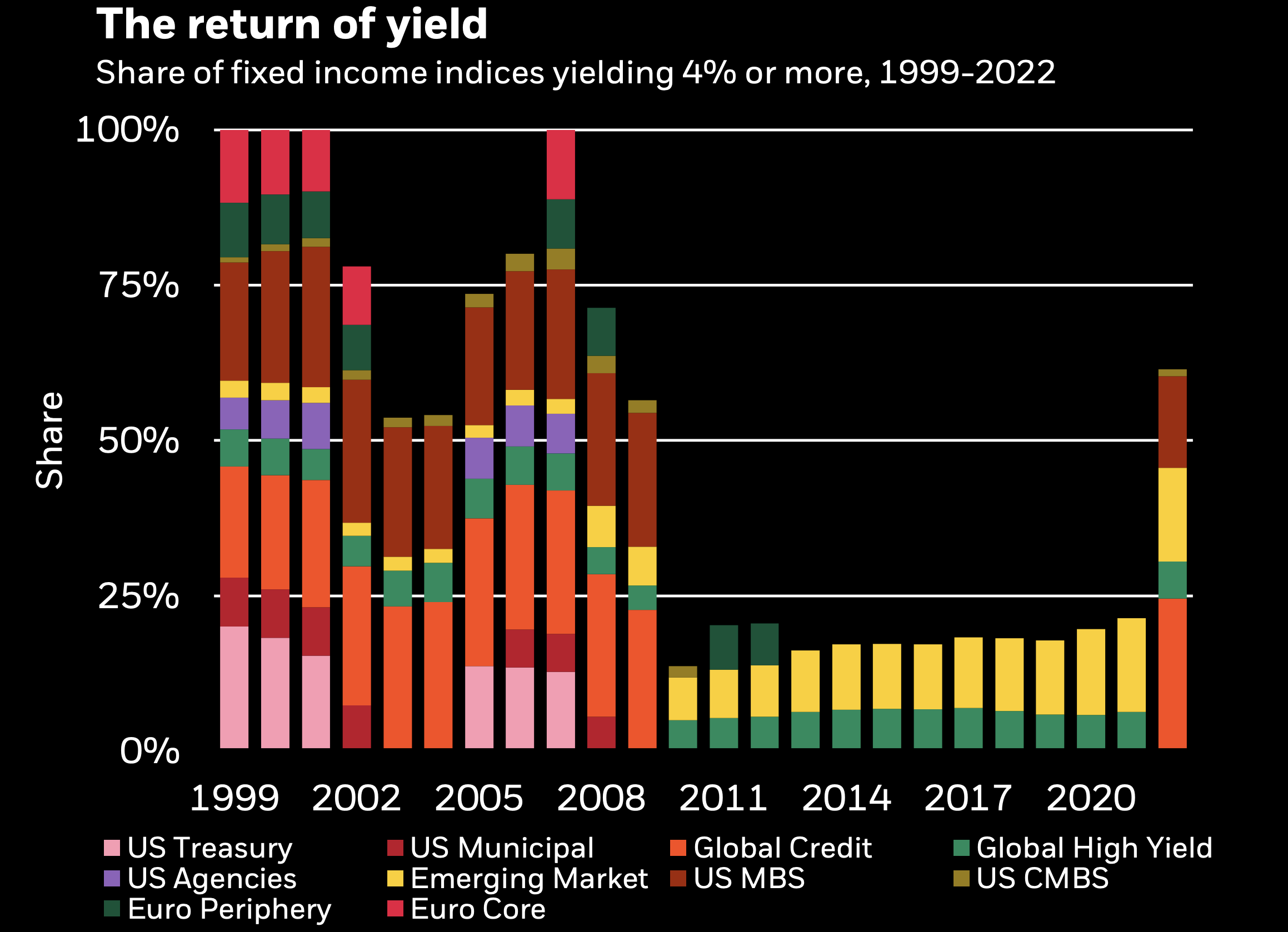
Return of Yield
- For the first time in a decade, the majority of fixed income assets yield 4% or above.
- NB “The bars show market capitalization weights of assets with an average annual yield over 4% in a select universe that represents about 70% of the Bloomberg Mulitiverse Bond Index.”
- Source: Blackrock
Inflation Expectations
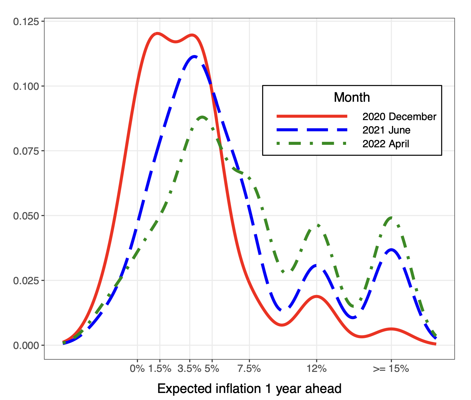
- Fascinating chart from BIS on how survey inflation expectations shift over time.
- As they say – first you get skewness, then variance, then both decline and the mean shifts.
- Temporary shocks become persistent in expectations.
- This happened in 1960s into 1970s in the US and 2010s in Brazil (see page 11 of deck).
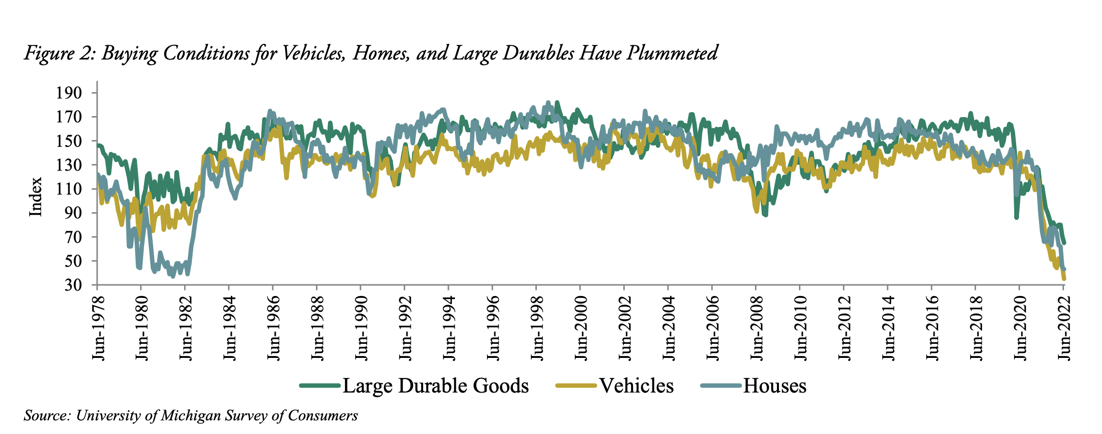
Consumer Confidence
- Pretty staggering chart.
- “Buying conditions for cars, houses, and large durable goods fell to multi-decade lows in June, according to the University of Michigan survey, meaning the vast majority of respondents believe it’s a bad time to buy the above“.
- Consumer sentiment about the economy is also at a 40-year low. Interestingly, Oaktree make the point that the magnitude of decline could be skewed by political bias.
- “For context, in June 1980, the difference between sentiment figures for self-identified Democrats and Republicans was 4.1 points. The gap is currently 31.5 points. This is another reminder of how people can interpret the same fundamentals very differently.“
- Source.
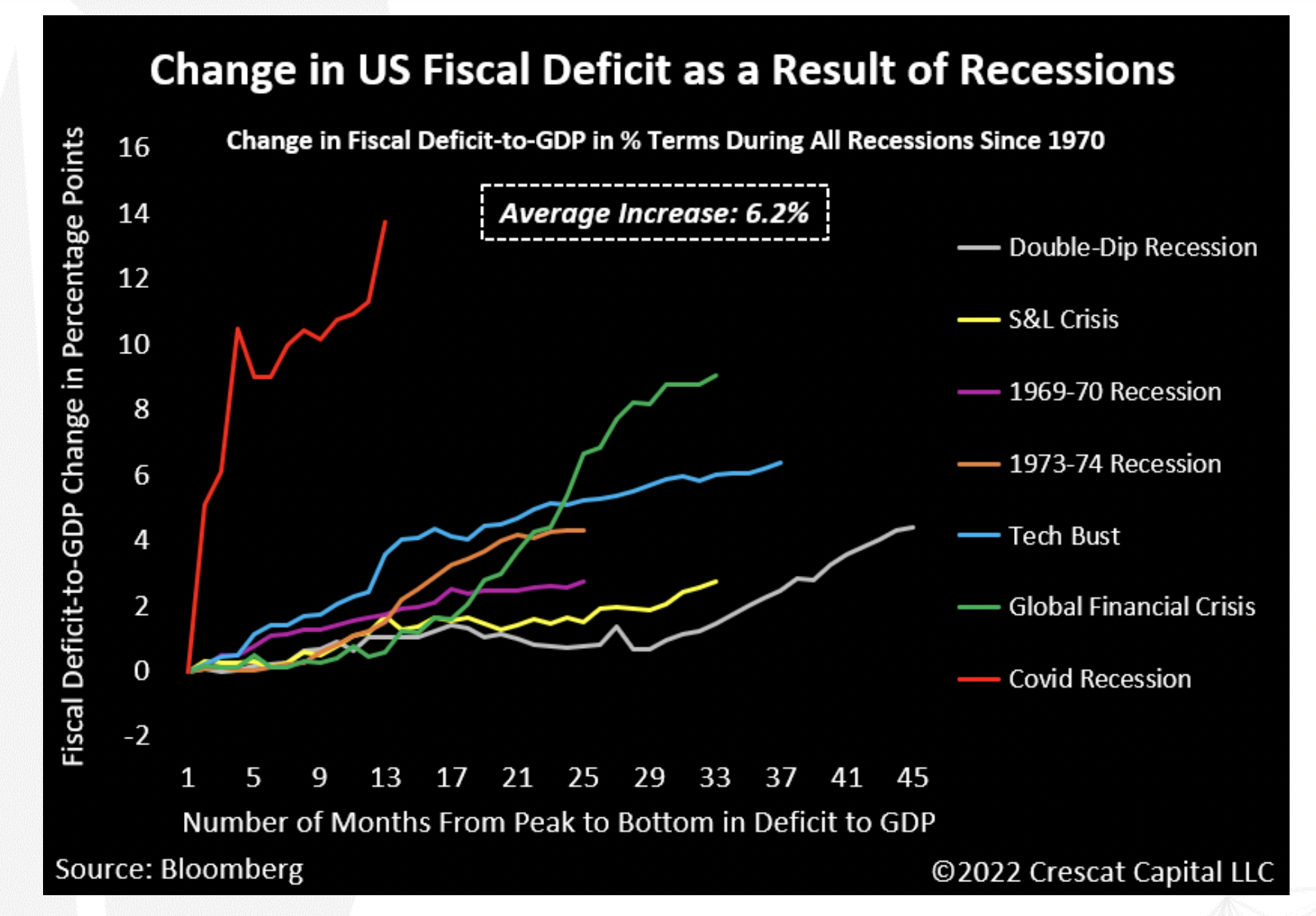
Fiscal Spending
- The last two recessions have stood out in the speed (Covid) and magnitude (Covid, GFC) of counter-cyclical fiscal spending by the US government.
- Source.
Hoisington Reading
- Hoisington AM, as long duration bond fund managers, practice sound economic thinking.
- Hence, especially in the current situation, it is always worth reading their quarterly letters.
- Q1 letter covers why they think US monetary policy has been a disaster, causing a cost of living crisis. In terms of outlook, they rattle off a huge list of recessionary indicators flashing red but place the outturn firmly at the command of the Fed.
- Q2 letter discusses the damaging effects of rapid monetary policy acceleration and deceleration. It also prints another list of already present recession indicators.
- The key balance point remains – recession is in the works which pushes inflation/growth/yields down. However, if the Fed falters, returning to a pandemic type response next year – then we have another cost of living crisis to contend with.
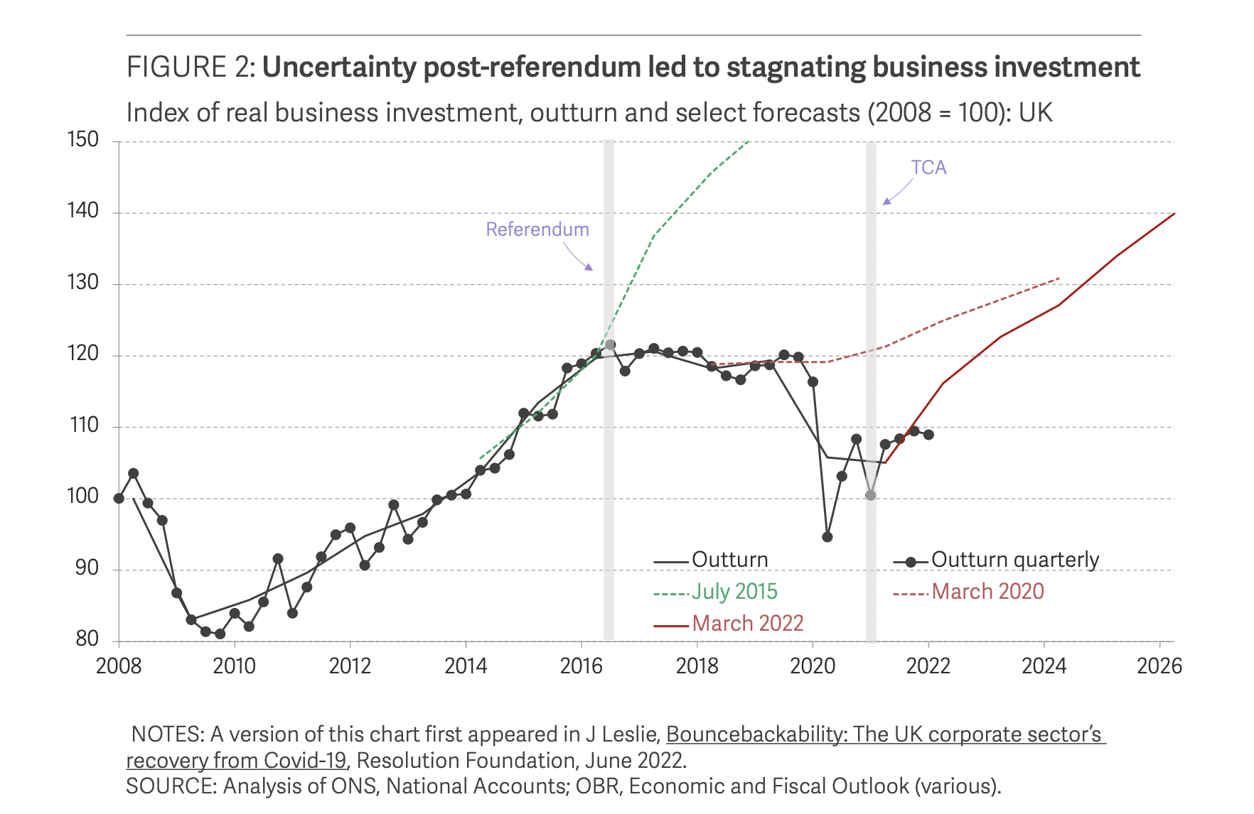
What was the effect of Brexit
- On the 23rd of June 2016 the UK decided to, by a slim majority (51.9%), to leave the EU.
- Some six years later this comprehensive report looks back to analyse the impact.
- The hit to business investment, as seen in this chart, is clear – “UK business investment fell by 0.1 per cent a quarter on average in the three years post-referendum, compared to growth of 1.7 per cent a quarter on average growth in the previous three years, and ongoing growth in other G7 countries.“
- However, the universally held belief that trade with the EU would suffer, didn’t materialise. “The UK has now been trading under the terms of the TCA [Trade and Cooperation Agreement] for 18 months, and, although UK imports to the EU have fallen relative to the rest of the world, the share of goods exports to the EU remains at its pre-Brexit levels.“
- Lots more analysis and data inside.
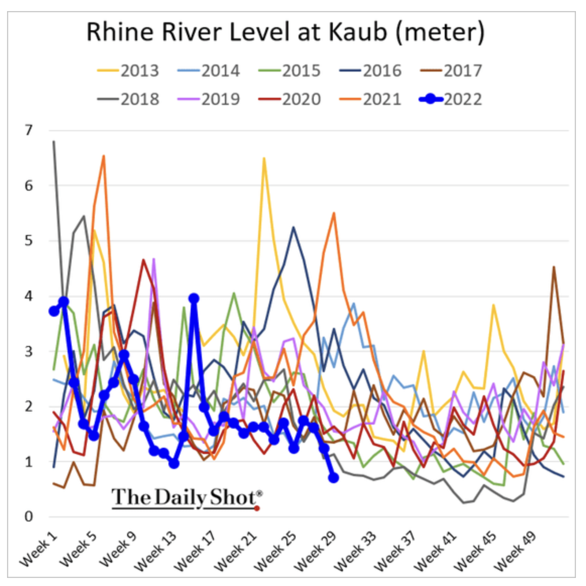
Rhine River Water Level
- Worrying development as the water level in the River Rhine drops to critical levels.
- The river is vital, in that 80% of German inland water way goods transport relies on it.
- This is especially important for bulk commodities and disruption could cause a 1% hit to German industrial production (at the worst point).
- h/t Daily Shot.
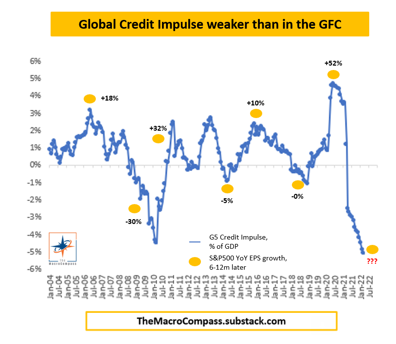
Global Credit Impulse
- Weakest in 20 years.
- Source.
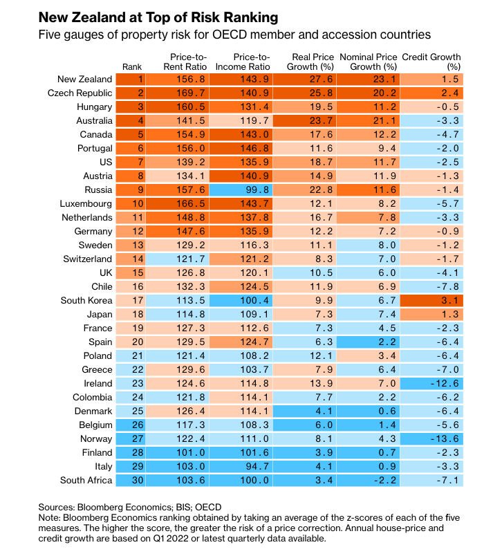
Property Market Indicators
- OECD countries by five gauges of property market risk.
- Source.
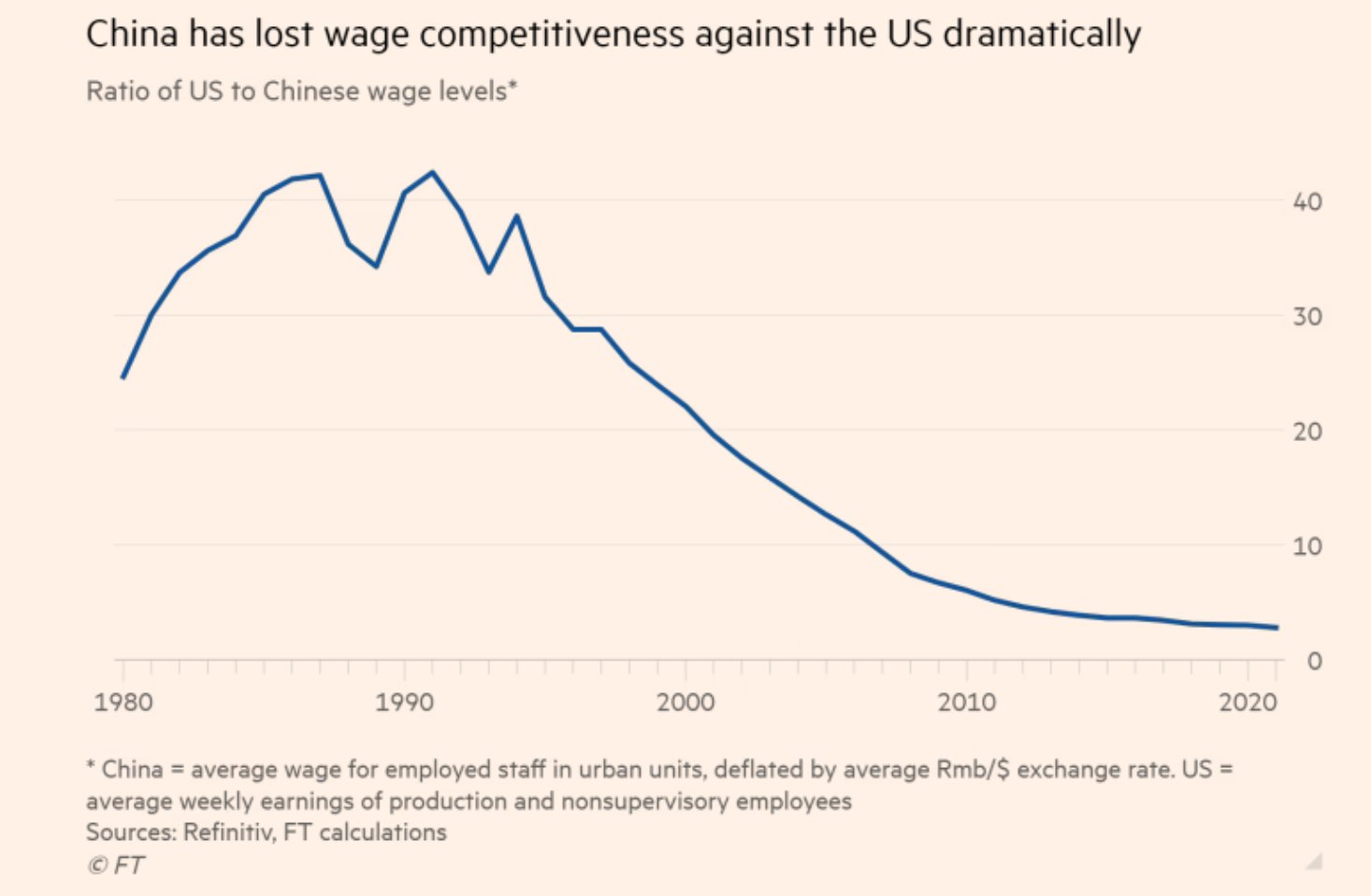
China Wages
- China has lost almost all of its wage advantage vs. the US.
- Source.
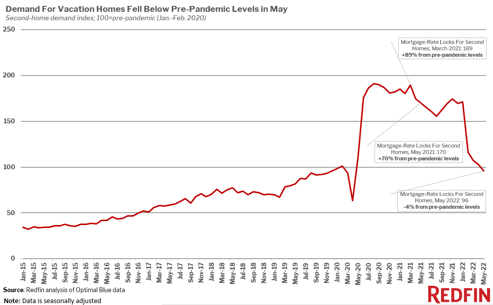
Demand for Second Homes
- Another in a series of charts showing a reversal of pandemic trends.
- This one shows that the demand for vacation homes in the US is back below pre-pandemic levels.
- NB the chart uses mortgage-rate lock data (which requires disclosure of purposes of home purchase).
- Source.
Infrastructure Building
- Interesting article arguing that state capacity is the real constraint for delivering infrastructure projects, not interest rates.
- “The new tunnels for New York’s East Side Access project cost about $4 billion per kilometer, while Paris built a similar project (infill development, went under the Seine, had problems with catacombs) for $230 million per kilometer. Copenhagen, Barcelona, Naples, and Milan were all cheaper still, while South Korea was generally the cheapest, with a tunneling cost around $100 million per kilometer, or perhaps less. That’s quite a difference in state capacity.“
- It’s not just tunnelling – NYC spent $39m per station to add elevators, Boston $25m while in Berlin it cost just $2.6m.
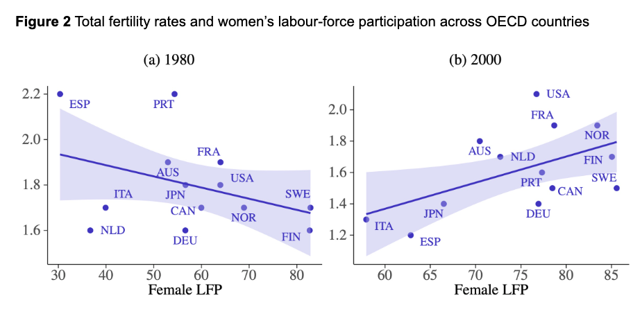
New Era of Fertility Economics
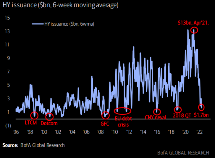
High Yield Issuance
- HY issuance has collapsed to levels seen in historic crises.
- Source: themarketear.com