- Purchasing manager surveys of producer prices in Europe are surging (Source).
Macroeconomics
Snippets on the big picture.

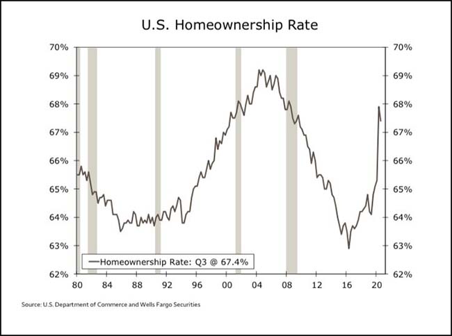
Homeownership Rate
- The US Homeownership rate spike has been remarkable.
- h/t 361 Capital.
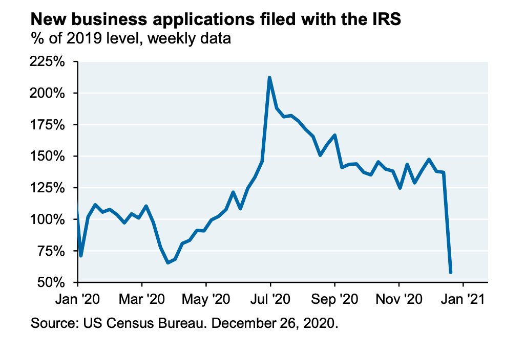
New Business Applications
- New business applications vs. 2019 level has fallen right back.
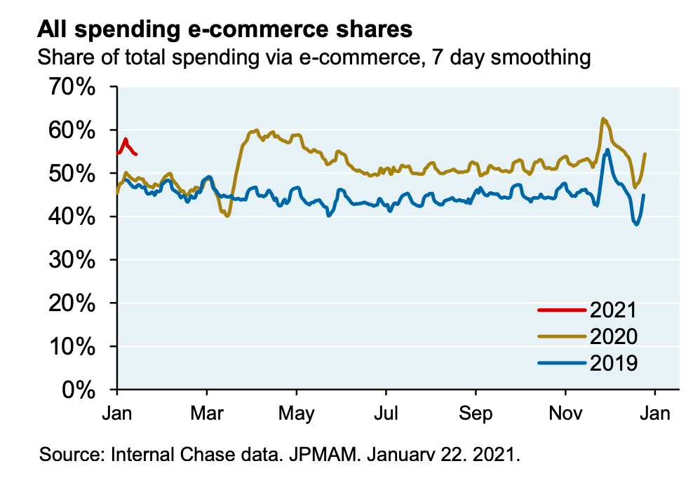
JPM Recovery Tracking
- Worth checking in with the latest recovery stats from JPM.
- This chart suggests that e-commerce continues to run at 2020 levels – will be interesting to see if this is a permanent change as the year goes on.
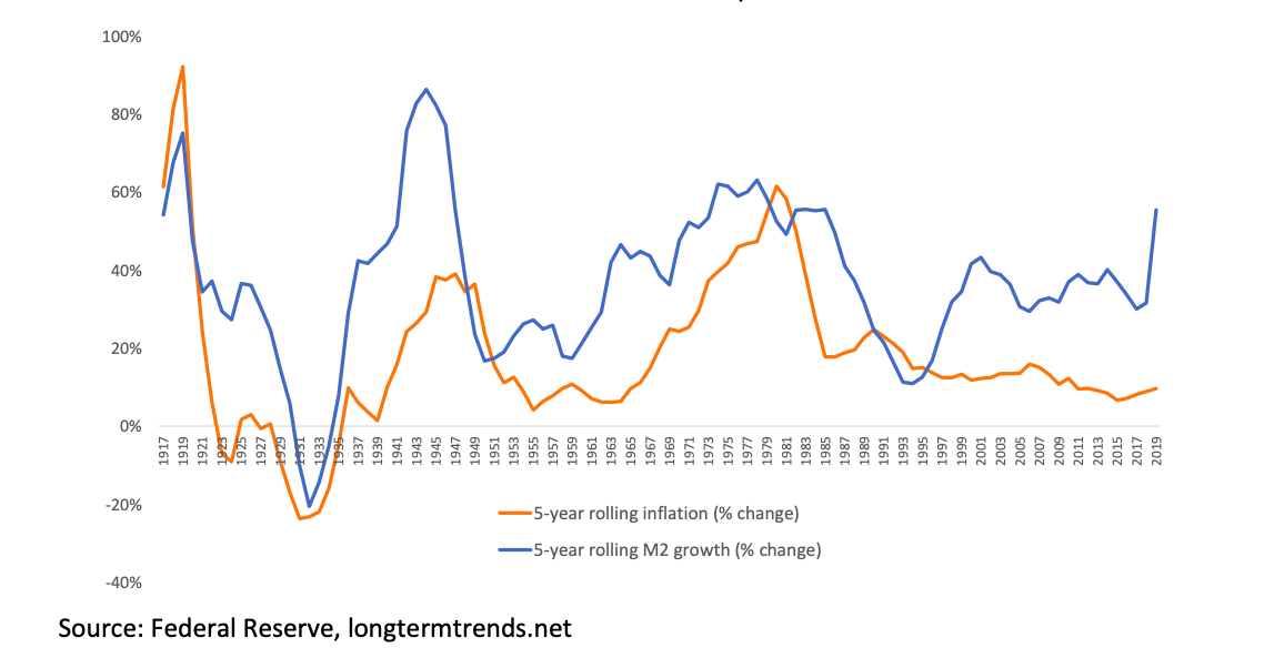
Inflation
- Could the accelerating M2 cause inflation?
Taiwan
- An investigation by Reuters suggests China is using “gray-zone” warfare to subdue Taiwan via military exhaustion.
- “The risk of conflict is now at its highest level in decades. PLA aircraft are flying menacingly towards airspace around Taiwan almost daily, sometimes launching multiple sorties on the same day. Since mid-September, Chinese warplanes have flown more than 100 of these missions, according to a Reuters compilation of flight data drawn from official statements by Taiwan’s Ministry of National Defense.”
- Something to watch carefully.
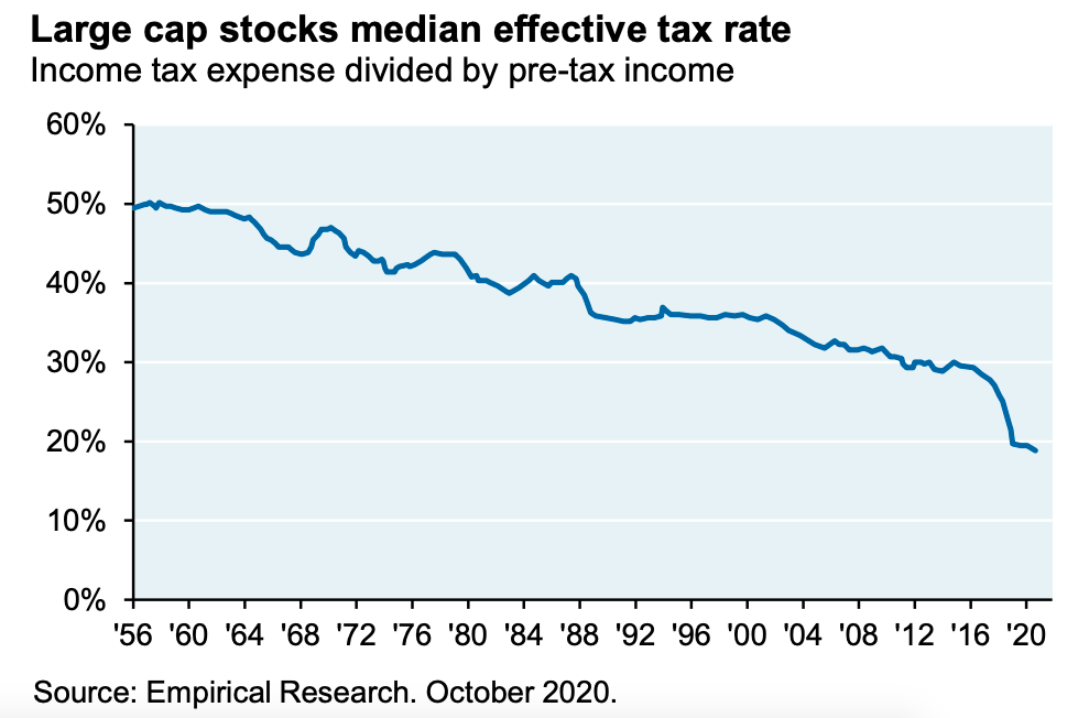
JPM Outlook 2021
- Good outlook piece by JPM Asset Management.
- Some amazing stats on the state of US federal finance – debt levels are about to hit World War II peaks (as % of GDP), and the projected 2020 deficit (at 16% of GDP) is the largest since 1945.
- This interesting chart shows the fall in the corporate effective tax rate for large cap stocks over the years.
- Under Biden’s plan – which will raise $2.2trn by raising and broadening corporate taxes (vs. $700bn Trump corporate tax cuts) – this trend could reverse (costing 10% of S&P EPS).
- Lots of other interesting observations inside.
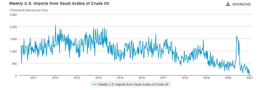
US Saudi Oil Imports
- For the first time in 35 years, no oil flowed from Saudi Arabia to the United States last week, according to EIA data.
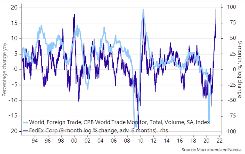
World Trade
- Fedex share price suggesting (with a six month lead) that world trade should start to improve.
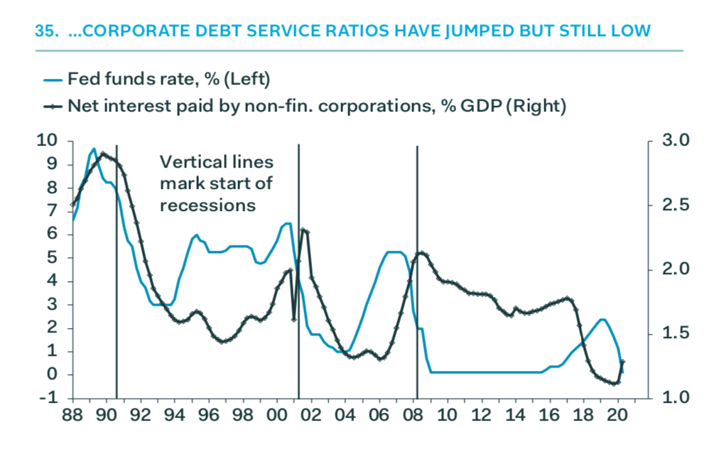
Corporate Debt Service
- Corporate debt service ratios, despite an uptick, are near very low levels.
- Source: Pantheon Macro.
Gundlach Slides Dec 2020
- Latest webcast slides from Jeffery Gundlach always worth a flick.
- This interesting chart perhaps explains why the US economy has been so resilient this time around.
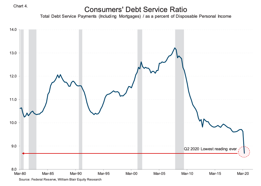
Consumer Debt Service Ratio
- Lowest reading ever of the debt service ratio, positive for consumers.
China Stimulus
- This time around the stimulus out of China has been one of the lowest.

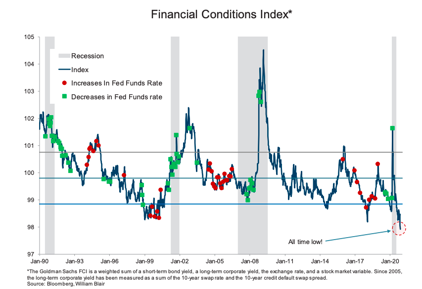
Financial Conditions Index
- The Goldman Sachs Financial Conditions Index hit an all time low.
- NB it does incorporate equity values, as part of a broad measure of financial conditions.
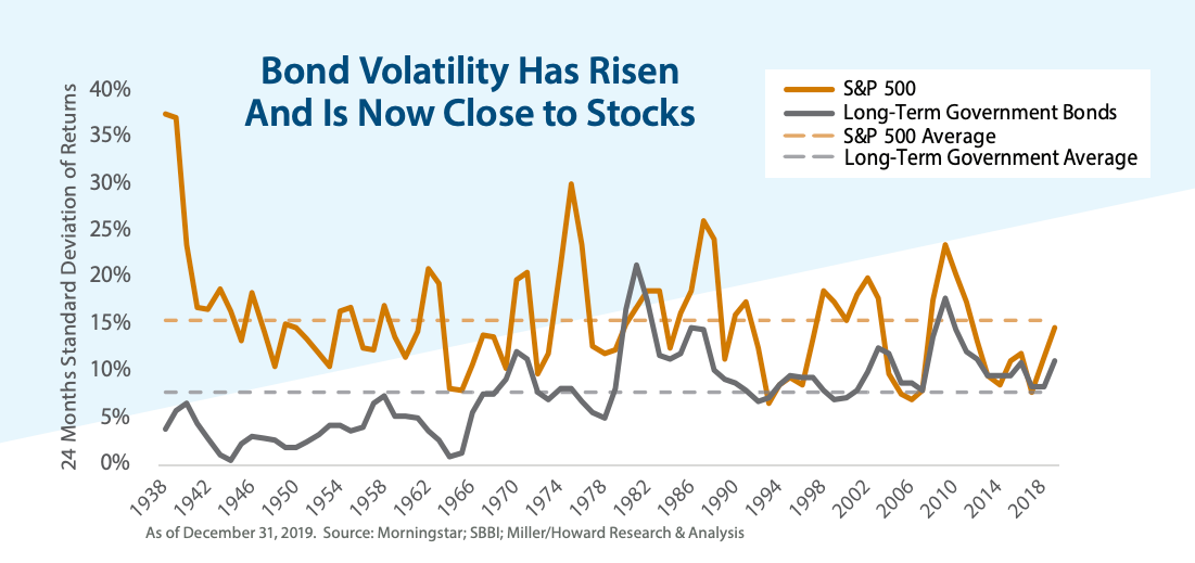
Bond Volatility
- The volatility of government bond returns has risen over time so that it now matches that of stocks.
- Part of a series discussing the future of the 60/40 portfolio.
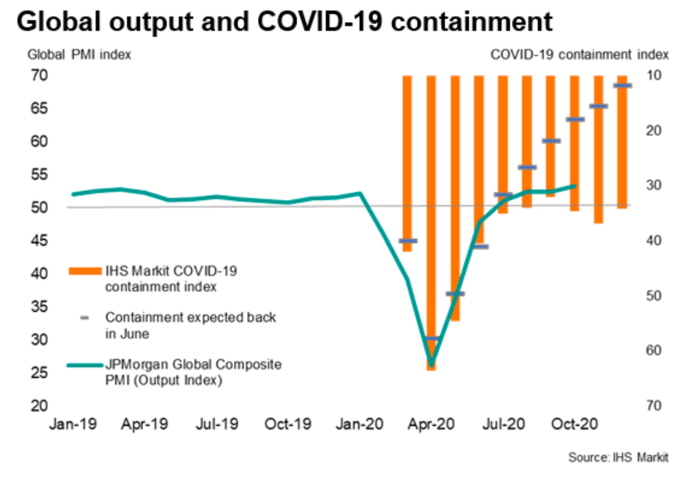
PMIs and Containment
- Interesting chart plotting global PMI (green line) against an index of containment (orange line, degree to which economies are locked up).
- This index eased from a peak of 64 in April to 32 in September, helping PMIs rise.
- In October it has started to rise to 35, and throughout has remained higher than what was expected a few months ago (dashes) – it should have been 18 by now.
- Suggests PMIs could start to weaken again?
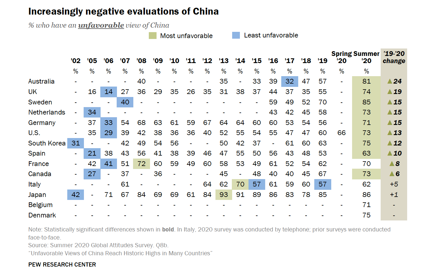
China
- Pew research suggests negative views on China have grown across many advanced economies.
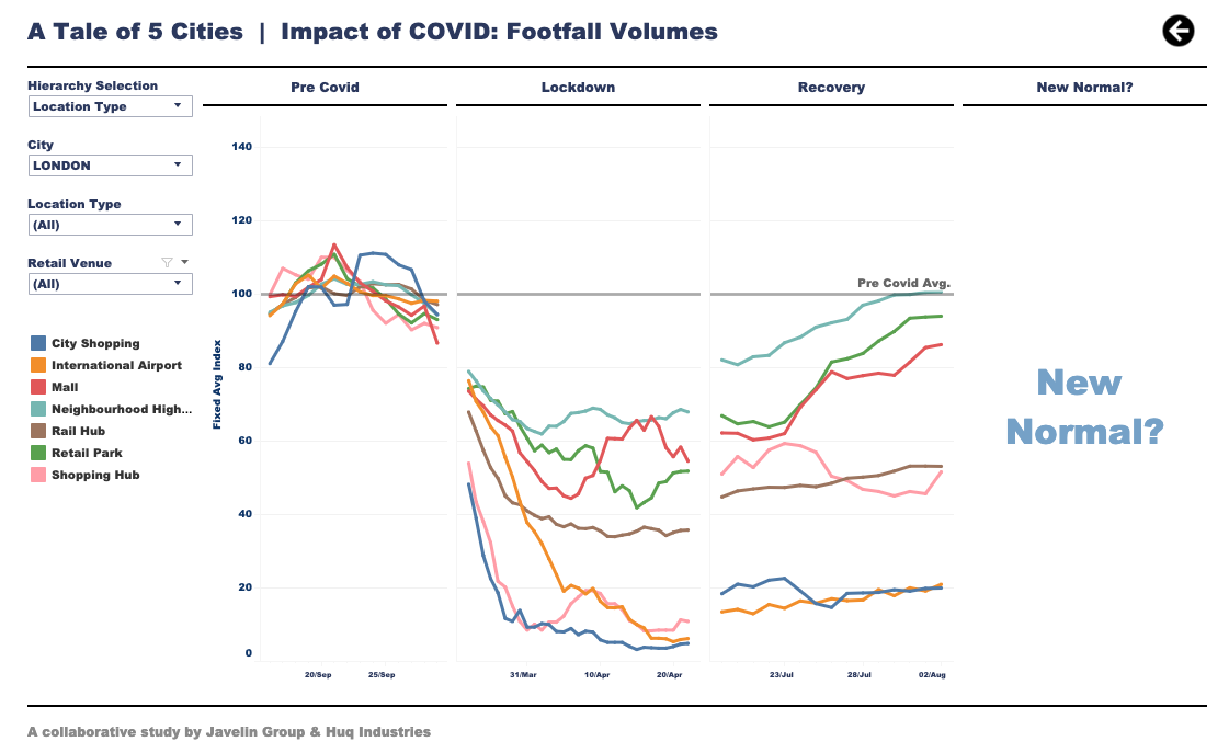
Covid and Retail Footfall
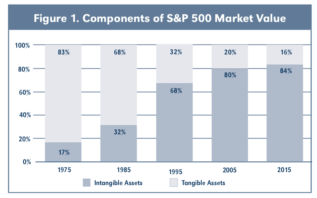
Misleading Chart – Intangible Asset Edition
- First Snippet Blog article points the finger at the pictured chart.
- The chart depicts the rise of intangible assets in firm value described as a “second industrial revolution”, burying with it traditional analysis, accounting, value investing and lending support to ESG.
- By digging into the definition and associated formula, the article argues this chart is in fact just showing the rise in valuation across firms as measured by Price to Tangible Book.
- By framing the problem in the first way one assumes a single explanation for the rise – intangible assets, itself an ambiguous word, when the intellectually honest way should be to frame it in the second way, which leaves the question open.
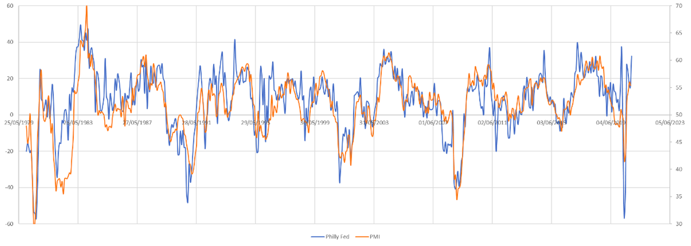
PMIs
- Chart plotting Philly Fed against US Purchasing Manager Index.
- Latest entry suggests path for PMIs is upwards.