Macroeconomics
Snippets on the big picture.

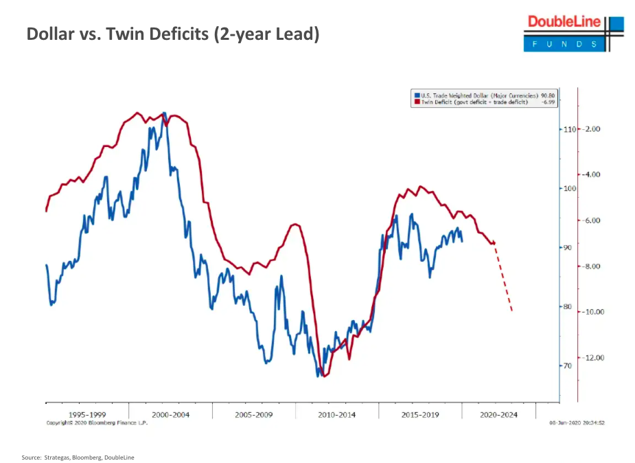
Gundlach Latest Slides
- Always worth a flick through the latest presentation – titled Superman – from Jeffery Gundlach.
- This is an interesting slide showing that twin deficits (current account and budget) lead the US Dollar exchange rate by 2 years – suggesting downward pressure on the latter.
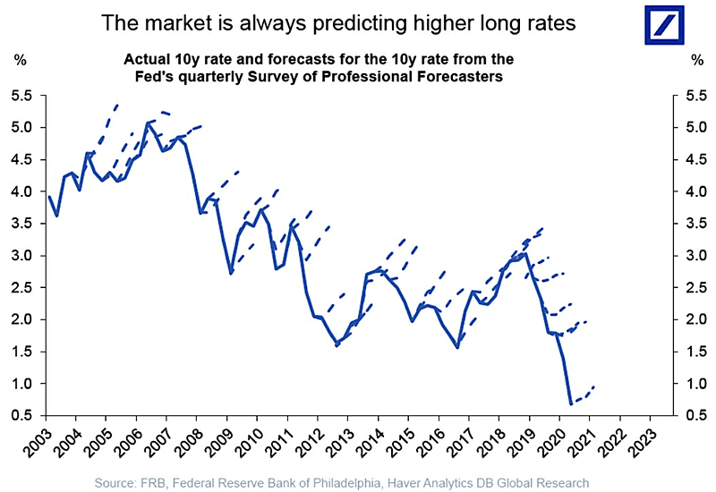
Predicting Interest Rates
- The solid line depicts the actual path of 10-year rates.
- Dotted lines are predictions by market participants in a Fed survey.
- For 20 years there has been a consistent forecast of higher rates that has not materialised.
- Source.
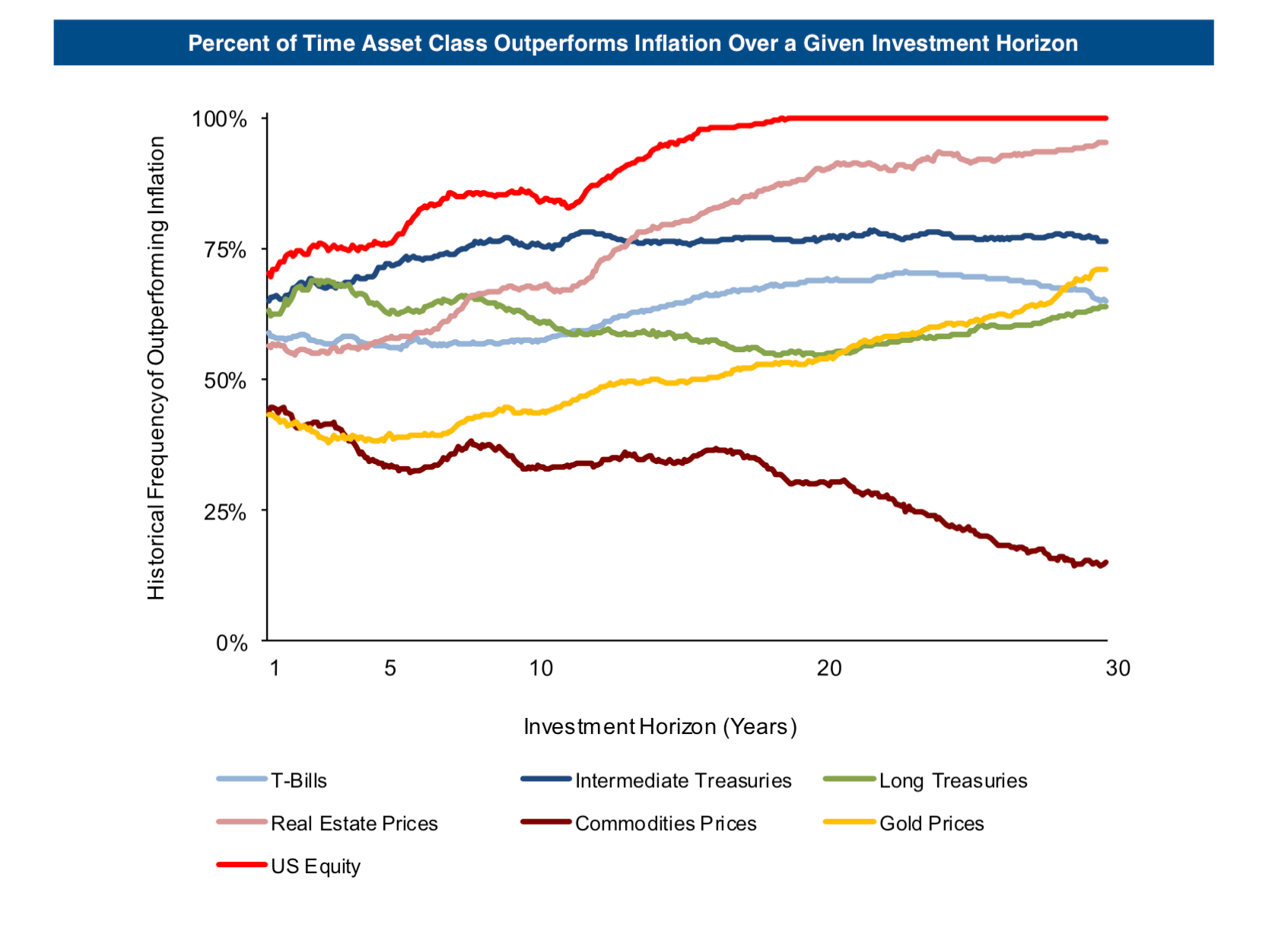
Assets and Inflation
- Interesting chart showing the percent of time (y-axis) various asset classes outperform inflation over a given time horizon (x-axis).
- Equities come out on top.
- Gold and Commodities, the usual hedges, actually don’t perform that well.
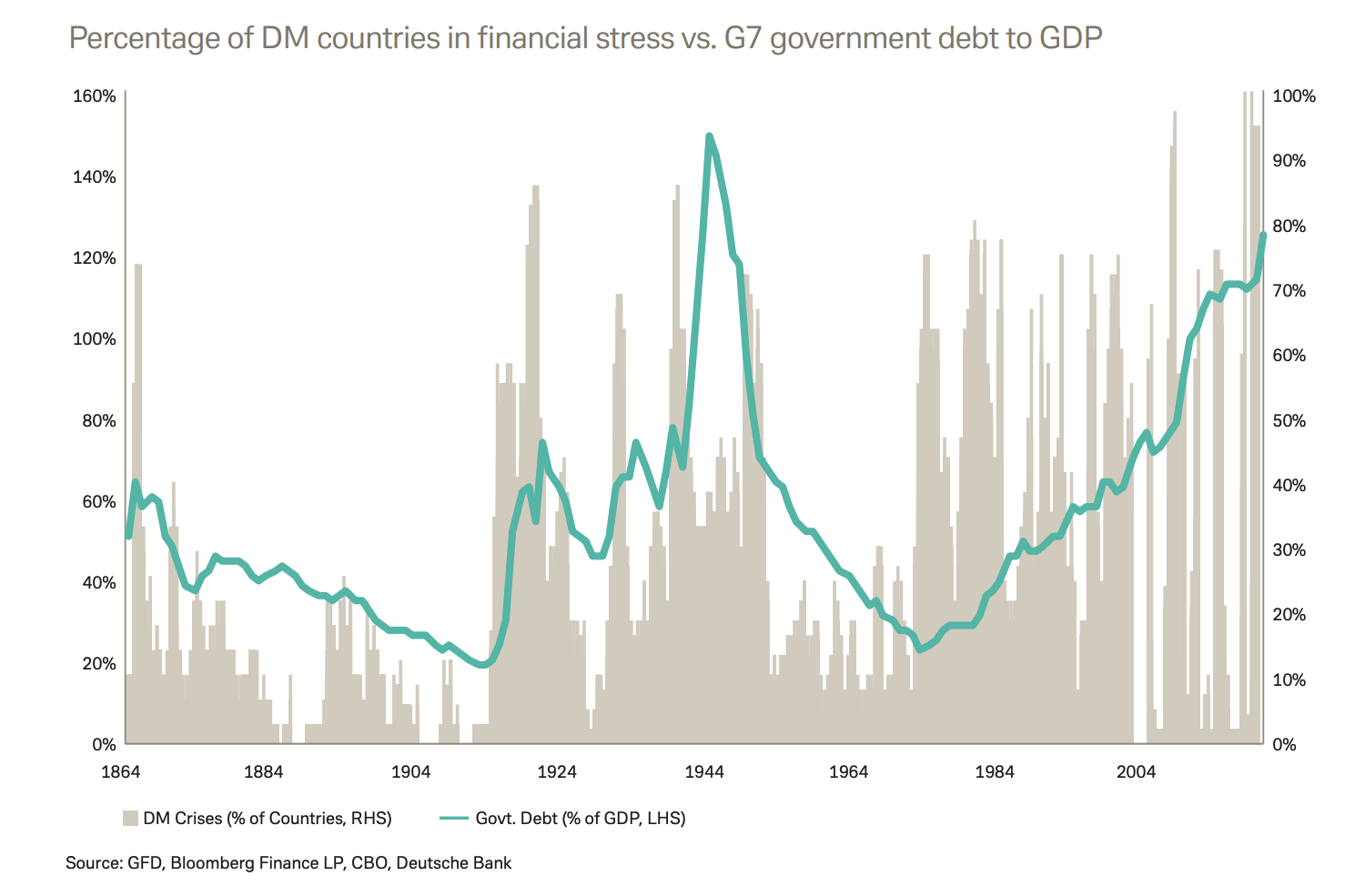
Debt and Crises
- This chart shows government debt to GDP of the G7 countries.
- It has been rising steadily and could close in on a record.
- Charted against this is the percentage of countries that have seen a financial shock over any 12 month period.
- Interesting to see that financial crises are more frequent in the post-Bretton Woods era, which coincided with rising debt.
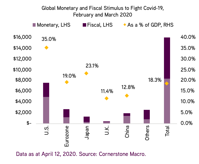
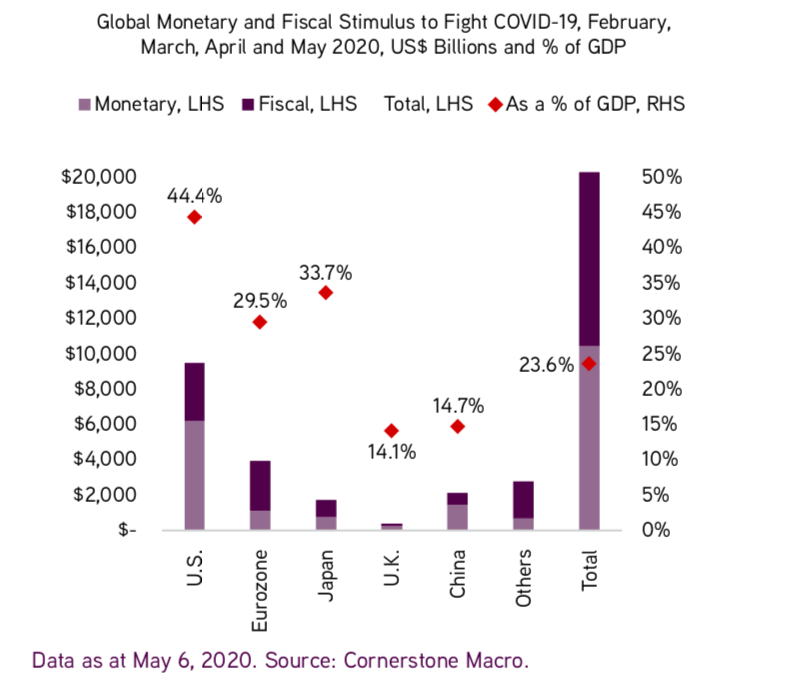
Fiscal and Monetary Stimulus
UK Housing Market
- April Zoopla report is worth a read.
- This chart shows the bounce back in demand, with sales agreed likely to follow given pent up demand.
- Interestingly two coastal cities saw the biggest increase, while London is still down as demand shifts elsewhere.

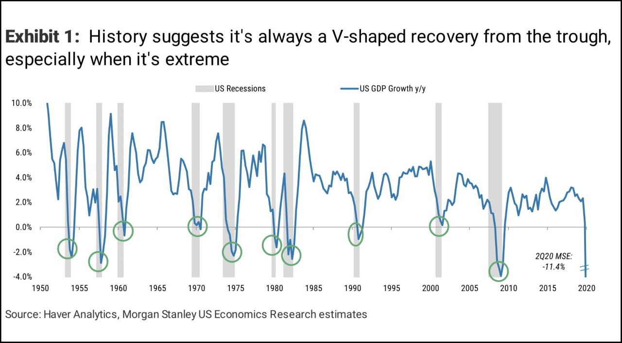
It is always V-shaped?
- Interesting chart from MS that suggests that in the post-war period recoveries have tended to be V-shaped.
- The latest fund manager survey from Bank of America shows just 10% of respondents expect this.
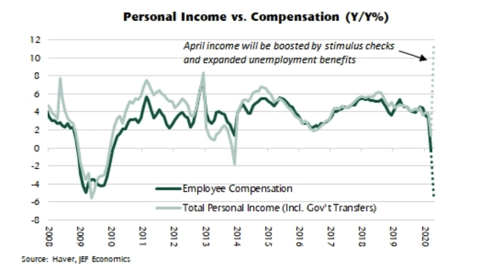
Stimulus vs. Covid
- Interesting chart from Jefferies on the US Economy.
- They crunched the numbers and found that, because of various bits of stimulus more than offsetting falls in compensation, personal income has actually surged in April.
- Stimulus is of course front-end loaded and, unless extended, this picture likely fades with time.
- Nevertheless, it is very interesting to see how strong its impact has been.
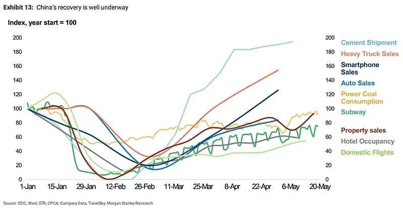
China Recovery
- China’s recovery, across a set of metrics, is well under way.
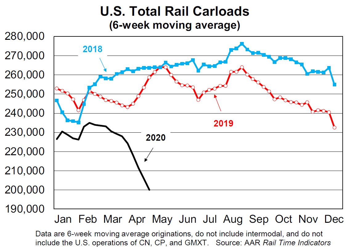
Rail Car Traffic US
- A staggering decline in rail traffic. April saw -25%, a record.
- “Any industry that’s been around for 190 years has experienced a lot, but railroads have never faced something quite like what they’re facing now“.
Paul Tudor Jones on Gold and Bitcoin
- An interesting piece from Paul Tudor Jones on inflation, gold and bitcoin (explaining his latest investment in the latter).
- This is an interesting chart from the piece showing Gold above ground against M1 money supply.

Mastercard Spend Data
- Mastercard have updated spending data for the week ending May 7th.
- Pictured are cross-border volumes.
- Card not-present (i.e. physically) non-travel continues to grow strongly.
- Card present growth has bottomed and seeing a bit of improvement due to intra-Europe travel.
- Looking within borders. US Switched volumes are now -6% YoY from mid -20%s in April.
- Rest of world also seeing a bit of improvement from -33% at worst point to -19% now.

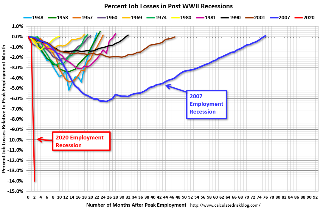
Employment in Recessions
- This is a great chart from Calculated Risk blog.
- It shows job losses as a percent from the start of an employment recession.
- Goes without saying what we are seeing now stands out.
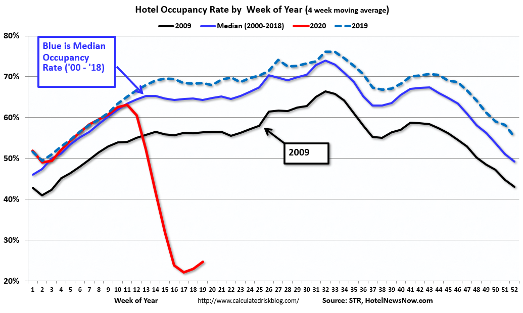
US Hotel Occupancy
- Some tiny green-shoots.
- STR data for 26 April through 2 May 2020 showed slightly higher U.S. hotel occupancy compared with previous weeks.
- The black line in the chart is 2009 – the worst year for hotels since the Great Depression.
- “Week-to-week comparisons showed a third consecutive increase in room demand, which provides further hope that early-April was the performance bottom,”
- TSA (Transport Security Administration) numbers have indeed ticked up and are at the highest level since March 30th.
- “At the same time, this past week was the first to show solid evidence of leisure demand as weekend occupancy grew in states that have significantly eased mitigation efforts.”
- h/t Calculated Risk.
UK High Frequency Data
- Always worth keeping an eye on Bank of England publications.
- This is a great set of charts from the latest Monetary Policy Report.
- They show high-frequency data on what is going on in the UK economy in March.
- Will be interesting to see how these evolve going forward.

Covid Impact Update – Location & Other Data
- We previously highlighted Foursquare location data.
- Here is the latest update a month on.
- A lot of traffic is starting to return to normal – fast food, gasoline stations and auto shops have all come back.
- Indeed fuel demand has started to tick up as well.
- Spending is also picking up (likely helped by government support).
- Peaks have normalised in grocery stores and big box retail.
- One interesting point here is that some food companies have pointed out that buying big multi-packs for stocking vs. single serve has hurt margins (page 6 here).
- Home improvement stores and outdoor trails are still seeing traffic much higher than February.
- Bars, restaurants, offices, clothing stores, furniture stores, movie theatres and gyms are still at lows.

Hoisington Q1 2020 Letter
- Another interesting instalment from Hoisington.
- Whereas Einhorn thinks that inflation is coming, Hoisington think this couldn’t be further from the truth (and hence think the yield curve will be anchored at zero).
- “Recent articles have suggested that the Federal Reserve and the Department of the Treasury are engaged in Modern Monetary Theory (MMT) or some form of “helicopter money”, the famous Milton Friedman phrase also referred to by Ben Bernanke. The inference is that once the virus is contained, these new efforts will yield different and more powerful economic and inflation results than did the Quantitative Easing periods following the 2008-09 Global Financial Crisis (GFC). Further, the suggestion is that the fiscal policy actions taken this year totaling $2.7 trillion will be far more effective than the $2 trillion stimulus package of 2009. Are these assertions that MMT is in place and monetary and fiscal actions will spur economic and inflation rates higher true? The short answer is no.”
- What follows is a rather technical economic theoretic description of what is going on.
- It is worth getting one’s head around this. Especially understanding how quantitative easing leads to increased excess deposits by banks at the Fed and not borrowing (a decision that is independent) and hence economic impact.
- Overall they are predicting deflation – grim reading indeed.
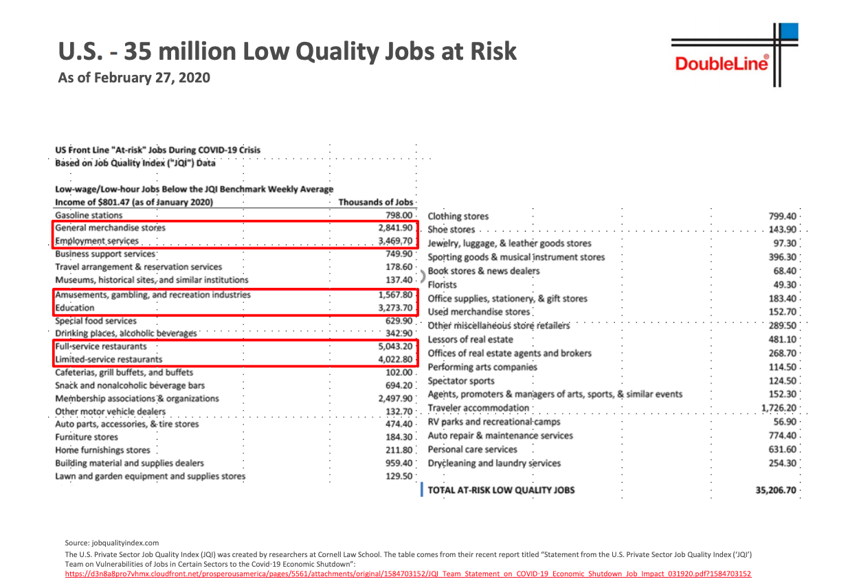
US Employment Picture
- This slide from Gundlach’s presentation (which if you haven’t seen is worth a flick, a transcript can be found here).
- It suggests that 35 million low quality jobs are at risk in the US.
Fiscal and Monetary Stimulus
- Staggering chart showing the level of fiscal and monetary policy stimulus in $billions and as a % of GDP.
- Source: KKR.