- The recent increase in central bank holdings of gold …
- is the first time since the end of the Second World War!
Macroeconomics
Snippets on the big picture.
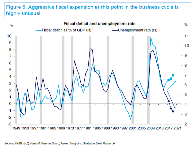
US Deficit
- US Deficit is back to $1trn levels.
- This type of fiscal expansion is very unusual at this point in the cycle.
- h/t Deutsche Bank Research
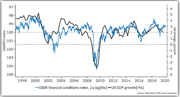
Financial Conditions & GDP
- Financial Conditions also suggest growth will improve.
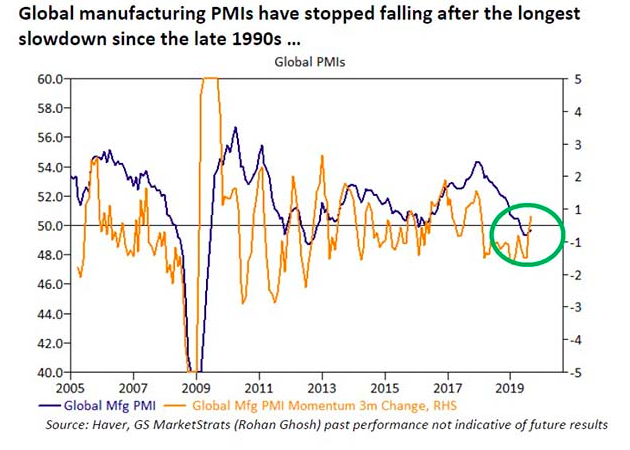
Global PMIs
- Interesting to see the second derivative of Global PMIs has turned positive – bullish?
Fed and Climate Change
- An interesting and novel conference organised by the Fed on Climate Change Economics. Live stream available.
- “It’s important for us from a monetary policy perspective to know what the potential growth rate of the economy is and if climate events or climate risk is going to shave that off, even if it’s over the long term,” San Fran Fed chief Mary Daly said earlier this week.
- h/t SeekingAlpha
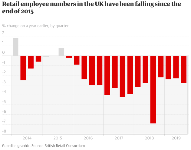
UK Retail
- Sober reading about the UK’s biggest private employment sector.
- Interestingly this hits women harder than men.
- Article suggests 20% of retail space will close in the near future.
- We wonder with AMZN opening retail stores though, could this be an example of pressure point theory.
Global Fertility Crash
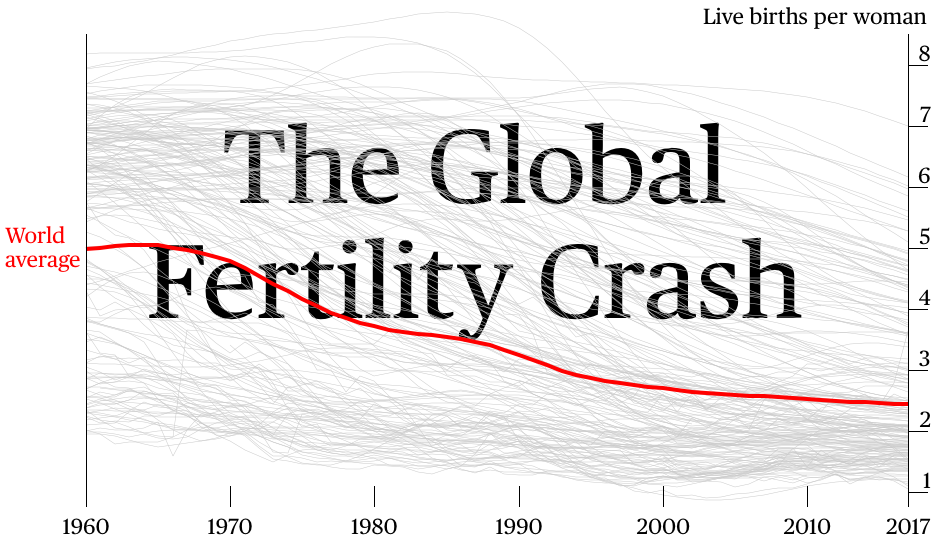
- An interesting look from Bloomberg at global fertility rates.
- In 1960 the global fertility rate was five live births per woman.
- This is now 2.43, close to the level required to keep the world population stable.
- Half of all countries are already below this level.
- This has all sorts of implications for investments in the long run.
- Each grey line is a country – try to guess which the worst is?
- h/t FT Alphaville
Sharpe Ratio
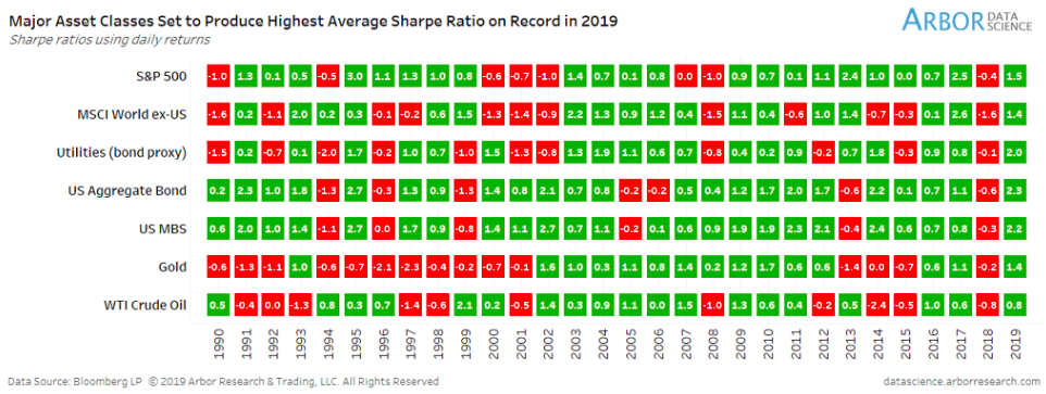
- Major asset classes this year are set to produce the highest Sharpe ratio since 1990.
- Sharpe Ratio is the return on an asset divided by the risk (measured as standard deviation) i.e. return per unit of risk taken.
- h/t isabelnet.com.
Dr. Copper vs. Gold
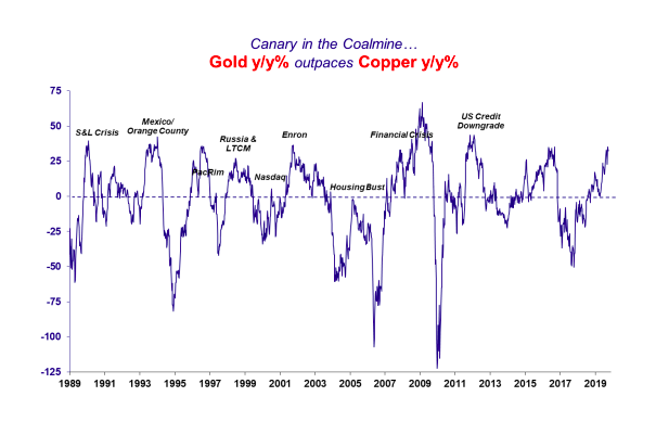
- Gold is outpacing Copper year on year.
- This is generally seen as a negative sign.
- Source: MacroMavens.
National Happiness
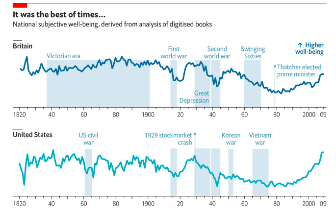
- Two academics have used digitised books and newspapers since 1820 to measure happiness based on word usage.
- They control for the change of meaning in some words (e.g. awful – used to mean ‘to inspire awe’).
- You can see clearly in the chart that war is bad for happiness.
- They also find that wealth does lead to an increase in happiness but it is dwarfed by the impact of increases in health.
- In fact, 1 year of longevity has the same effect as 4.3% of GDP Growth.
- Source: The Economist.
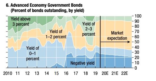
Yield
- Chart of Global Government Bond yields.
- 25% have a negative yield … almost none yield more than 3%.
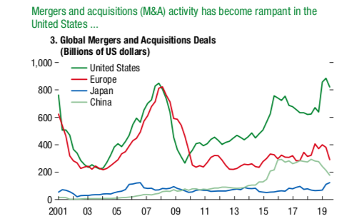
M&A
- Interesting to see M&A in the US is back to peaks.
- Not so much in Europe, Japan or China.
- Source: IMF Global Financial Stability Report.
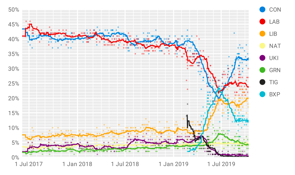
UK Election Polls
- Updated opinion polls in light of events this evening.
- Source: Wikipedia.
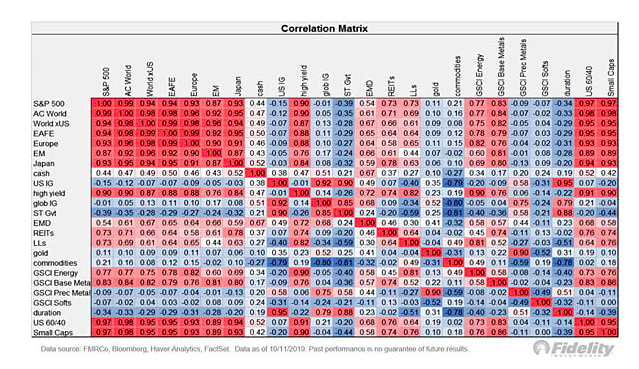
Cross-Correlations
- Chart showing the cross-correlation of asset classes from Fidelity.
- h/t: 361 Capital.
Dividend Yield
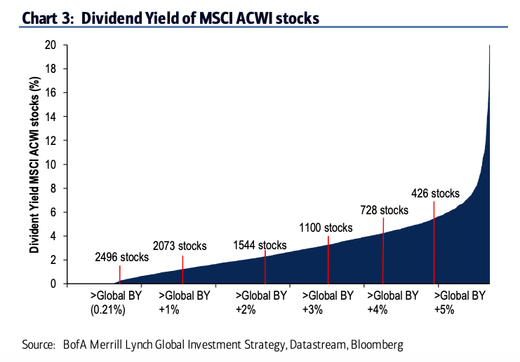
- 1,100 companies in the MSCI World Index yield more than +300bps above global government bonds (source BofA Merrill Lynch).
PMI Heat Map
- Interesting to see how related the cyclicality of the world is.
Central Bank Balance Sheets
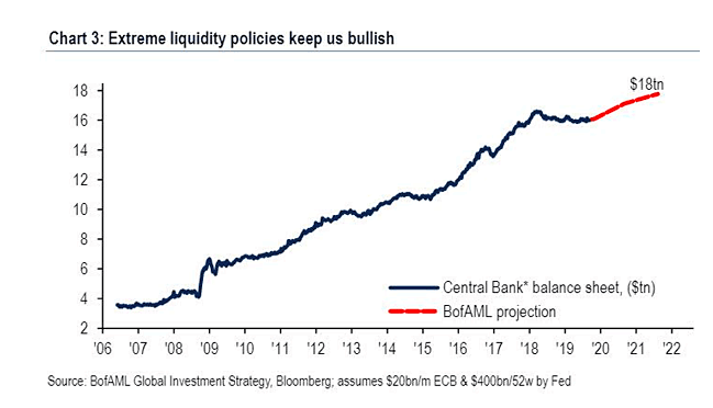
- Central bank Balance sheets are back to growth according to Merrill Lynch.
- This is after 2 years of being flat.
- This is seen as a bullish sign.
- h/t Isabelnet
Yield Curves
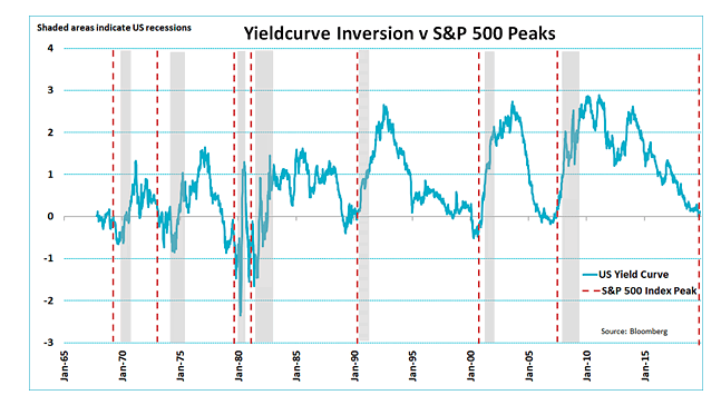
- Typically the S&P 500 peaks 10 months after the yield curve inverts.
- h/t Isabelnet
Oaktree Latest
- Latest memo from Howard Marks of Oaktree who we mentioned here.
- It explores the implications of negative interest rates and is an informative and very intuitive read, as always.
Central Bank as Debt Holders
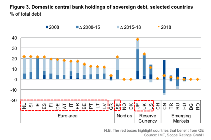
- Great chart showing the current level of sovereign debt held by central banks across different countries (as % of GDP).
- From 2008 (dark blue) until 2018 (orange diamond) and …
- … how we got there (lighter blue lines show changes).
- h/t ScopeRatings


