- Despite the fall in equities this year, the ERP has hardly budged.
- The current level suggests equities aren’t particularly attractive, especially in the US.
- Chart sourced from the excellent Topdown Charts.
Stocks
Interesting, and often contrarian, Snippets on individual companies and the stock market.
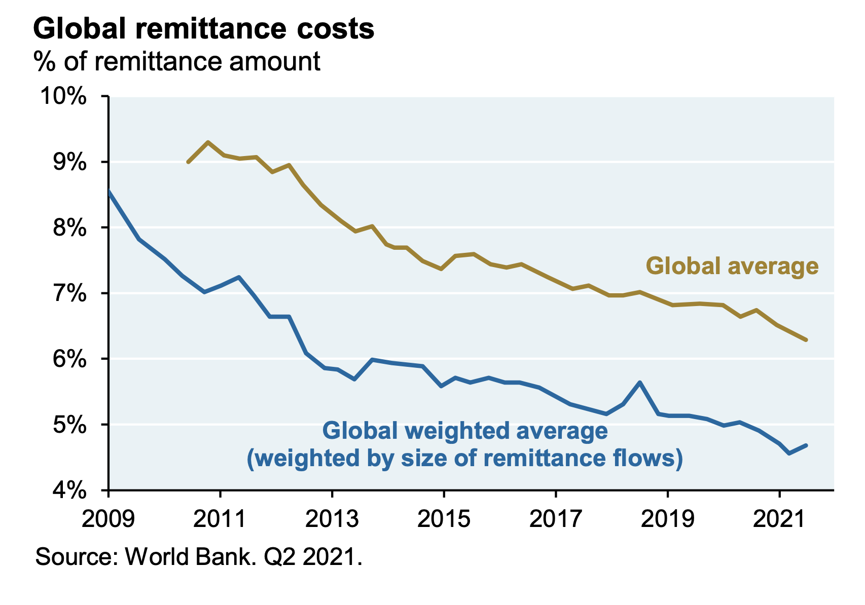
Global Remittance Costs
- One big positive of the Fintech boom and financials competition has been this chart.
- The cost of sending money cross-border has fallen to 5% (still far too high).
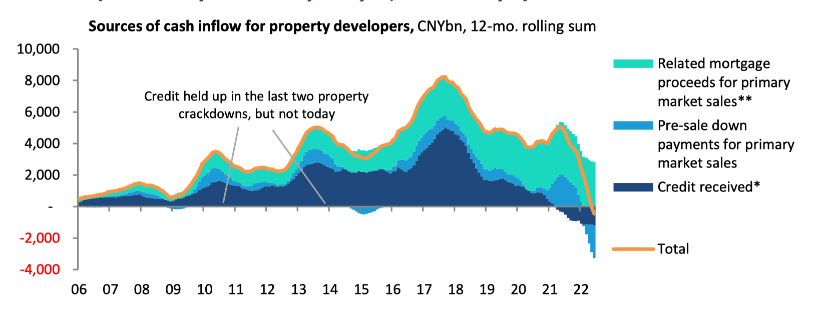
China Property Developers
- The Chinese property market is the biggest asset market on earth (worth $60 trillion).
- Its potential crash has been one of the key narratives in financial market for the past two decades.
- There are now signs of things cracking, as written up so brilliantly in this Net Interest piece.
- This chart, for example, looks at property developer cash flow – where the picture has turned decidedly negative.
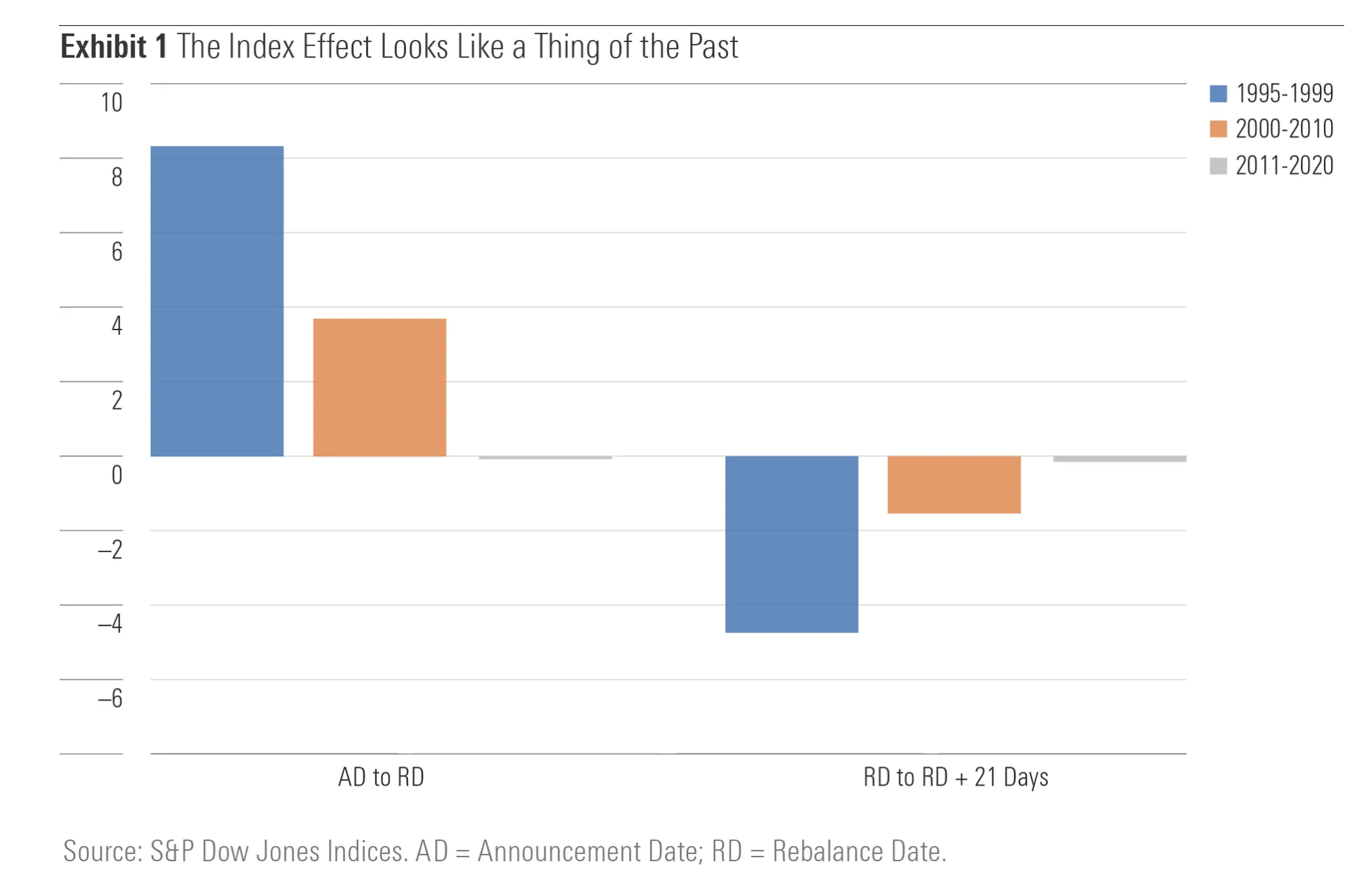
Index Inclusion
- According to Morningstar data, inclusion into an index no longer attracts the usual rise (on announcement) and then fall in stock price.
- “Indeed, the up-and-down trajectory that was once the fingerprint of the index inclusion effect now resembles a flat line that runs from announcement date through the weeks following inclusion in the S&P 500.“
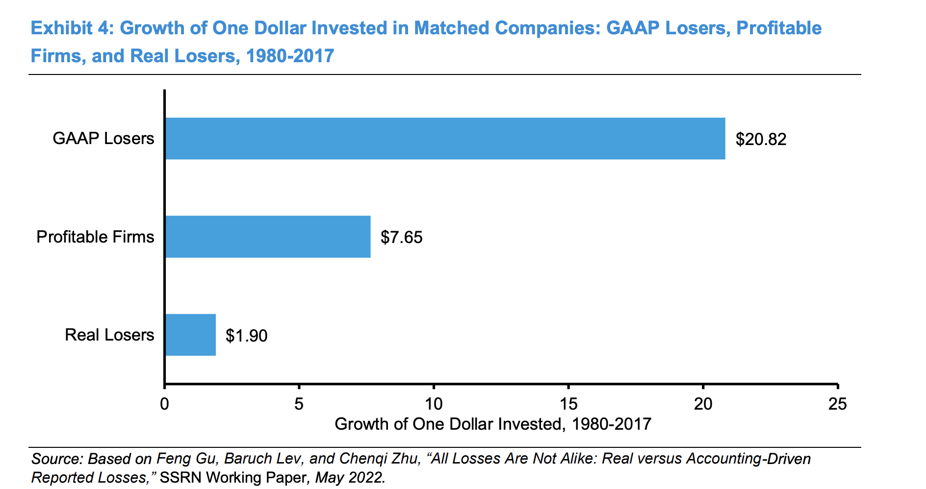
GAAP vs. Real Losers
- This chart shows the performance of three groups of firms.
- GAAP losers – firms where expenses exceed sales, but once an intangible investment adjustment is made they turn profitable. In other words they are investing.
- Real losers – these are firms that even after the adjustment is made are still loss making.
- Profitable firms – at the outset these firms are profitable i.e. sales exceed all expenses.
- From 1980 – 2017, GAAP losers substantially outperformed
- NB the outperformance vs. profitable firms really shows up post 1996. “The message is that the market ultimately recognizes and pays for intangible investments that create value, even if they create losses in the short term.“
- This chart comes via Investment Talk, a brilliant curation of all manner of investment resources.
- Source, Original.
Value Stocks Valuation
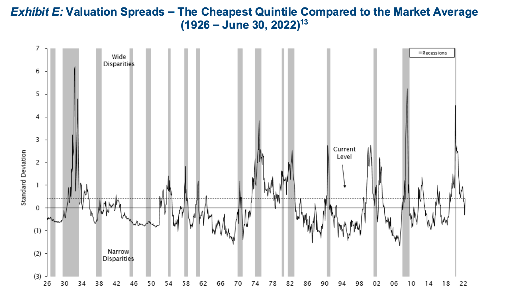
- The cheapest stocks are no longer that cheap.
- Source.
- Footnote: Empirical Research Analysis, National Bureau of Economic Research. As of June 30, 2022. Cheapest quintile refers to the most undervalued 20% of stocks in an analysis of large-capitalization US stocks. Standard Deviation is a measure of dispersion of a data set from its mean. Prior to 1952, the spread is measured using the price-to-book data of the largest 1,500 stocks. Current Level refers to the valuation spread as of June 30, 2022 which is 0.4 standard deviations above the mean.
ARK Performance and Flows
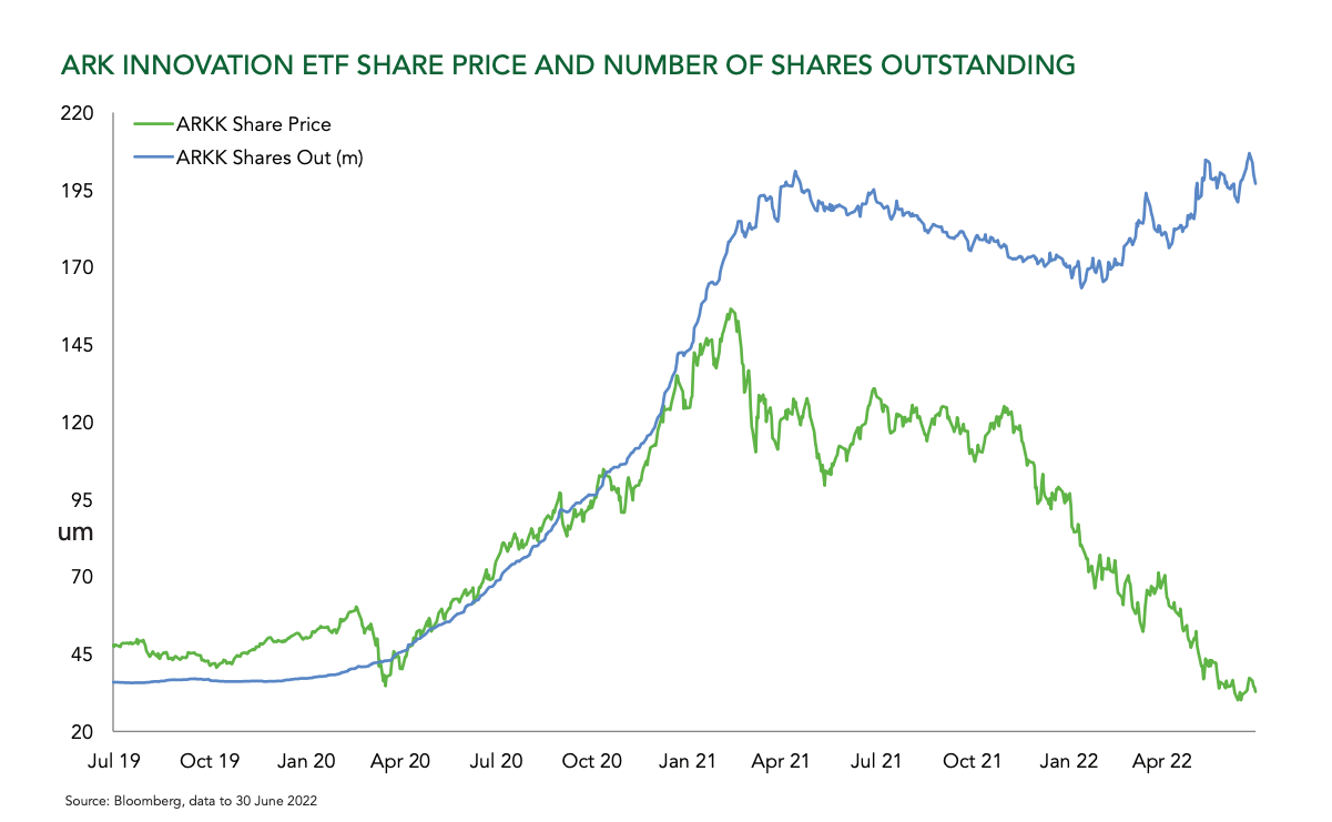
- “In fact, flows have remained strongly positive into equities throughout the sell-off. As the chart shows, ARK Innovation ETF has suffered no net redemptions despite declining 71% in price since the peak. The ‘buy the dip’ mentality is alive and well.“
- Source: Ruffer.
Biotech correlation to Growth
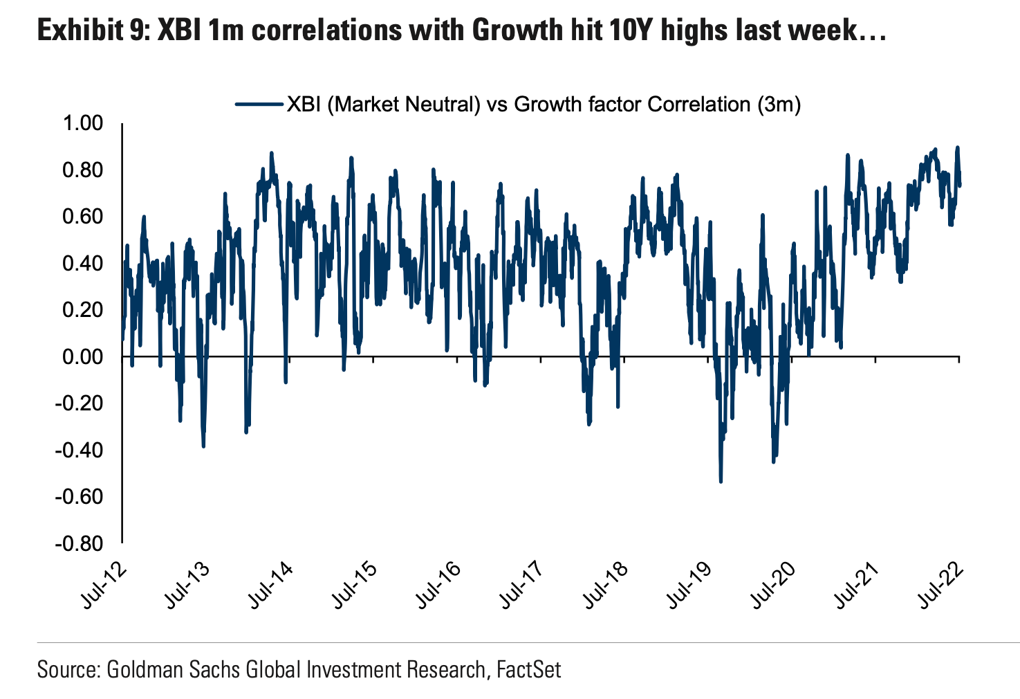
- XBI index correlation to the growth factor hit a new high.
- Source: Goldman Sachs.
EM vs. DM Performance
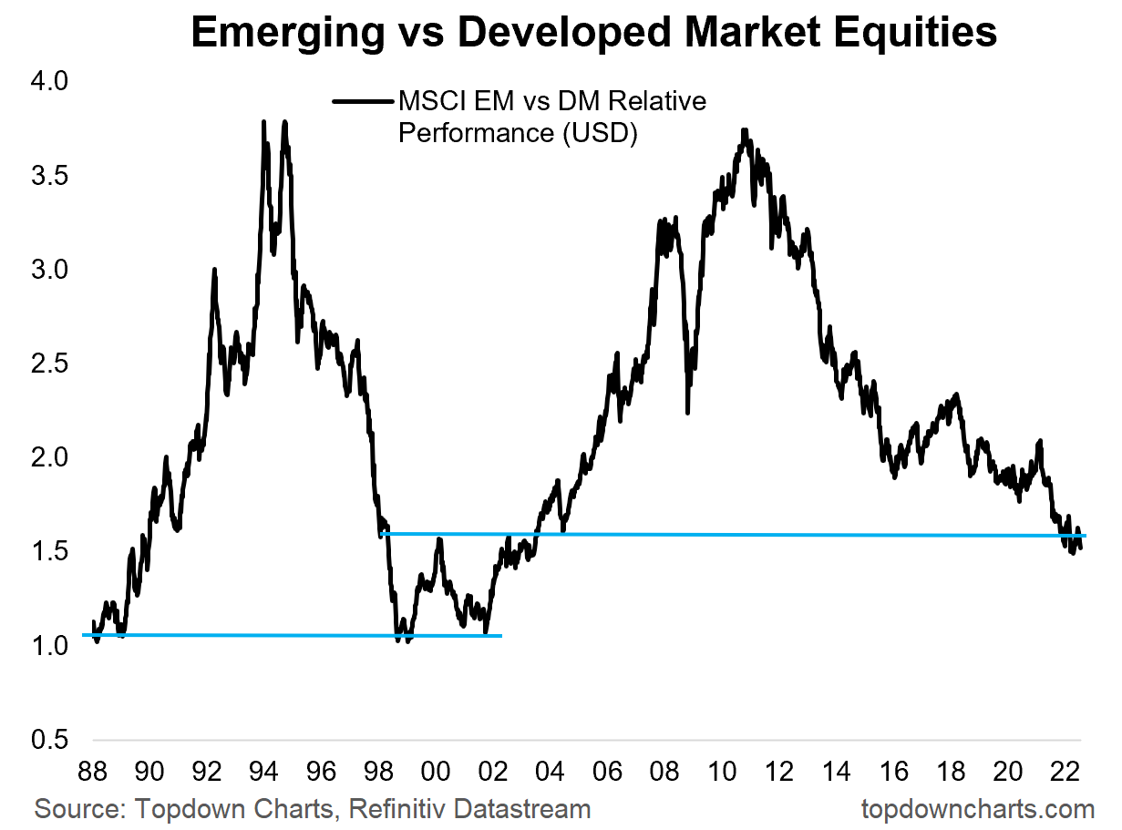
- Emerging market relative to developed market ratio could revisit historic lows.
- From the excellent Weekly Chart Storm.
Clean Energy and Financial Engineering
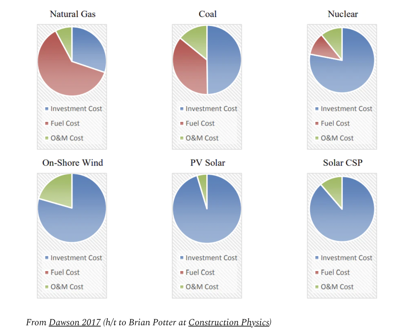
- “Oversimplifying monstrously, clean energy technology requires big CapEx outlays today for low or next-to-no OpEx for decades.“
- “This is why finance is so important to clean energy—it’s the way we teleport those future OpEx savings through time and space to cover those higher upfront costs.“
- So argues this interesting article, exploring clean energy.
- This chart summarises the idea nicely (excludes things like biomass which are an exception).
US College Enrolment
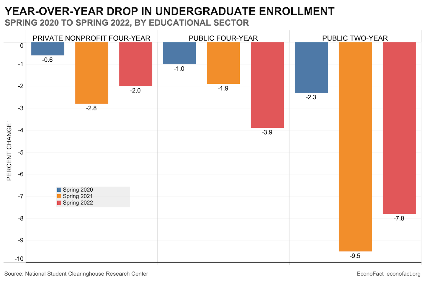
- We are seeing a third year of declining undergraduate enrolment into colleges in the US.
- Although the rate of decline is smaller, it is still a lot worse than many predicted by this point.
- There are, however, some green shoots in spring application data (here and here).
- Useful for followers of the Education sector.
Graphics Cards Back to Earth
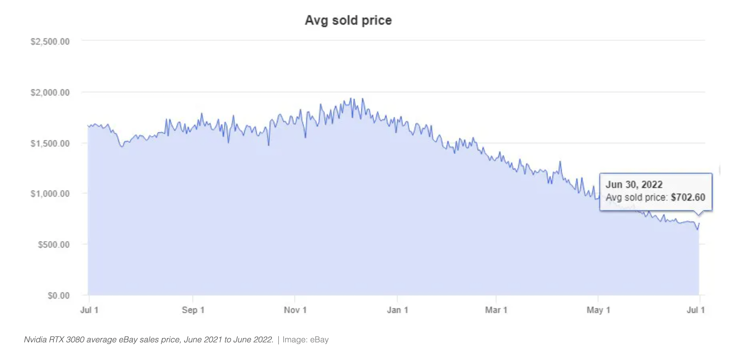
- GPU, or graphics cards, have been very hard to get in the past two years.
- Largely because of their use to mine crypto currencies.
- Yet the deflating market has found its way here as well, with prices now sliding.
Cyclicals vs. Defensive Stocks Ratio
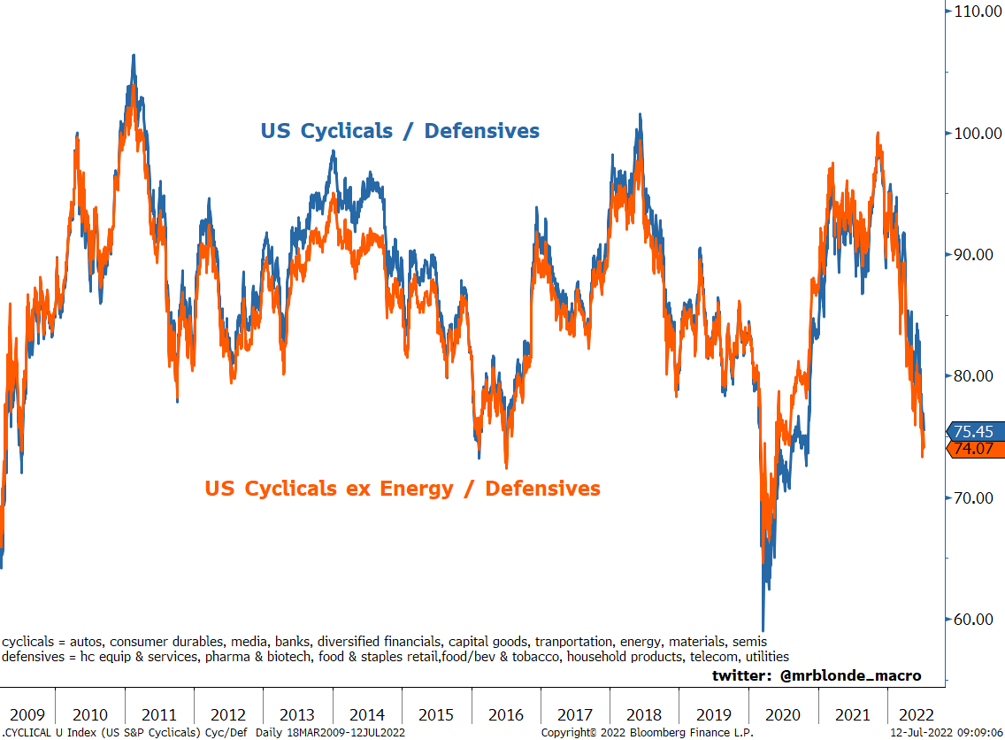
- Defensive stocks have strongly outperformed cyclicals this year.
- Partly this is driven by extreme flows.
- Chart is from the excellent Weekly Chart Storm by Callum Thomas, absolutely recommend subscribing.
Stock Correlation
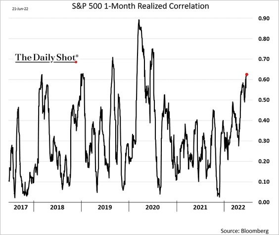
- The correlation among S&P 500 stocks has been rising in 2022, towards extreme levels.
P/E at Market Bottoms
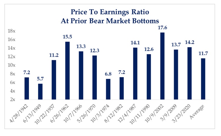
- Useful chart showing the P/E ratio at bear market bottoms for the S&P 500.
Energy vs. Tech
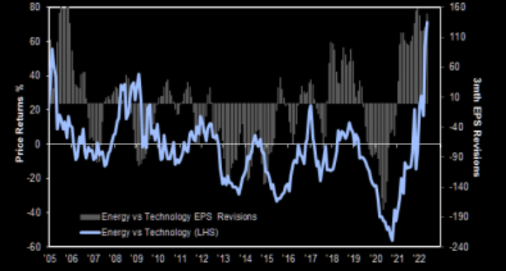
- Energy vs. Tech looks extended, both in terms of price performance and earnings revisions.
- Chart from JPM Quant team via themarketear.com.
CEOs Appearing on Podcasts
- A new paper examines the question of why CEO’s allocate precious time to appearing on podcasts.
- Between 2016 – 2020 over a quarter of all S&P 1500 CEOs appeared on at least one podcast.
- This has grown from 6% in 2016 to 22% in 2020.
- They find it tends to be CEO’s of firms more focussed on consumers and ESG.
- It also tends to be CEOs who have strong reputation incentives (looking for a new job, have own twitter account, founders).
ESG Ratings Divergence
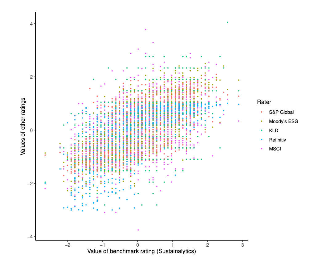
- ESG ratings from various providers just don’t agree and this is a nice chart to demonstrate this point.
- The horizontal axis takes Sustainalytics ratings for 924 firms as a benchmark.
- Ratings by other providers are then plotted on the vertical axis using different colours (see key).
- For each rater the ratings are normalised to a Z score (zero mean, unit variance).
- The results = for any level of benchmark rating there is a big range of values given by other ratings.
- The divergence is so bad between firms “it is difficult to tell a [ESG] leader from an average performer”.
- The paper then goes on to try to understand why this is.
Private Equity Valuations Paid
- Bain report on private equity industry is always worth a flick.
- This was an interesting chart on valuations – showing that multiples started to drift up from 2015 onwards reaching highs last year.
- Part of this was a mix shift towards growth and technology, where 2020/2021 saw ballooning multiples paid for software businesses (here, page 49).
Biotech IPO by Stage
- Amazing rise in the % of pre-clinical biotechs IPOing.
- Source.


