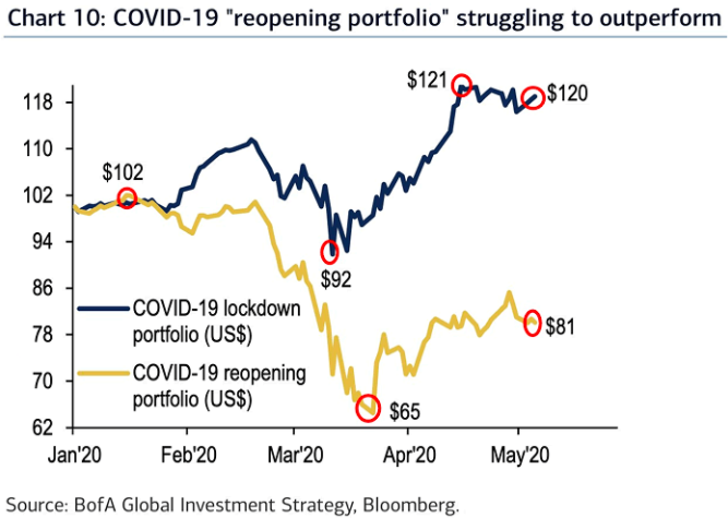
- Interesting chart from BofA.
- It shows the relative performance of the “reopening” portfolio vs. the lockdown portfolio.
- You can imagine what stocks make up each portfolio.
- Interesting to see “reopening” struggling despite some of the green-shoots here.
Lockdown vs. Reopening Portfolio