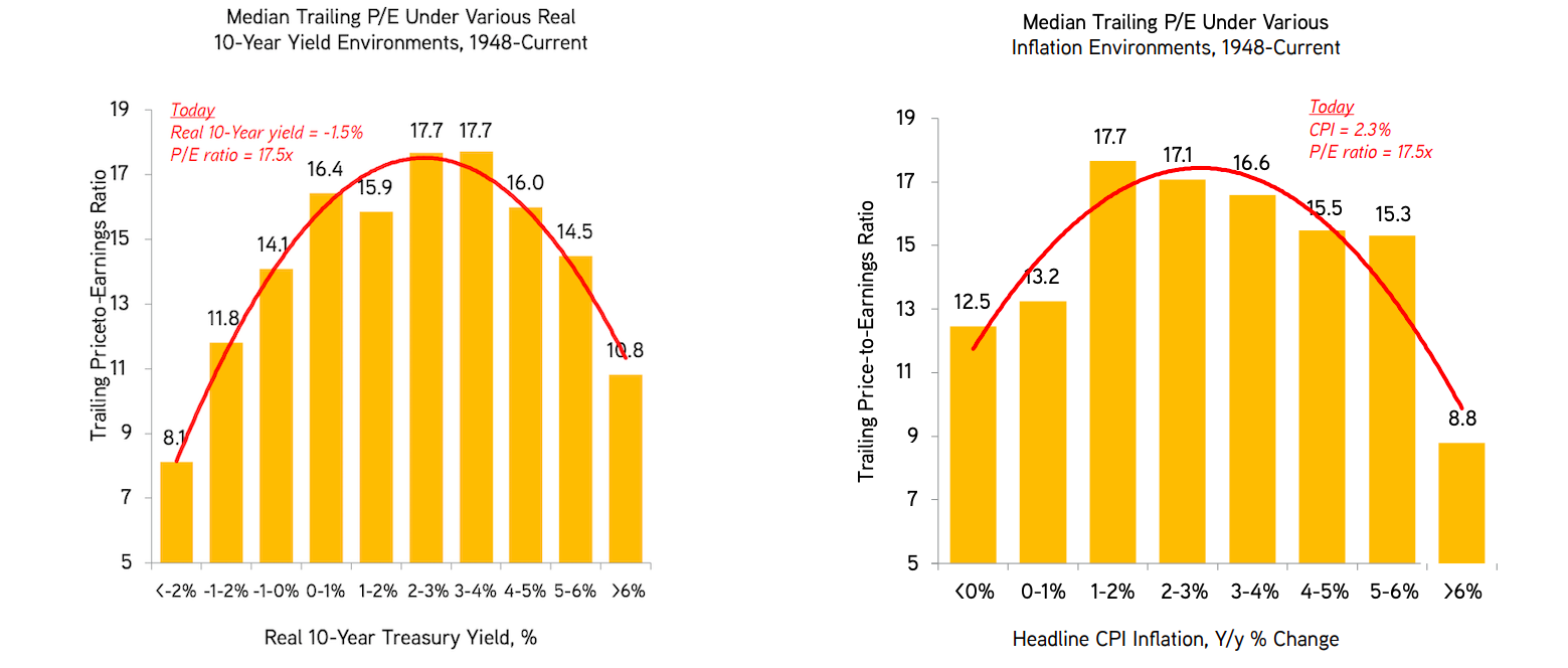
They plot the markets trailing P/E ratio against CPI inflation (right hand side) and the 10-year real treasury yield (left hand side).
The data is from 1948 to today and sourced from BofAML
As real-rates go negative or inflation falls multiples tend to be lower.
KKR analysis suggests there isn’t some funny data skewing results here.
What about today? at the current real 10-year yield of -1.5% and inflation rate of 2.3% (likely to fall) the 17.5x P/E ratio for the market (since increased) stands out as too high.
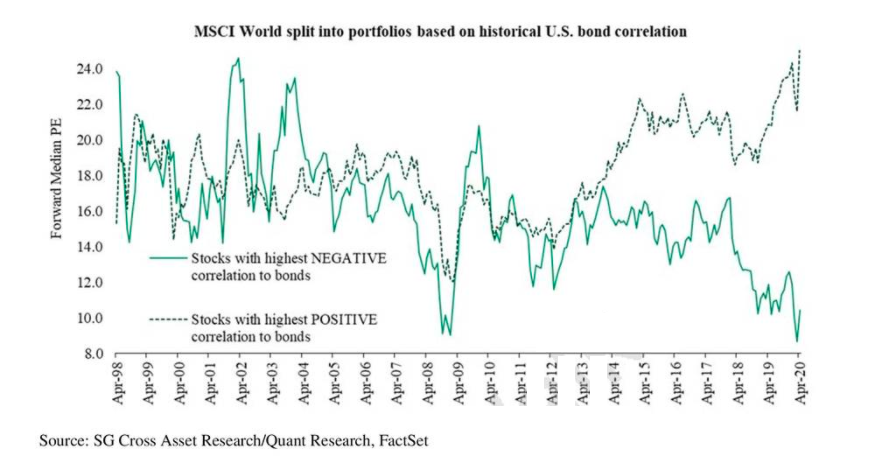
These types of equity strategy charts are good to hang on to.
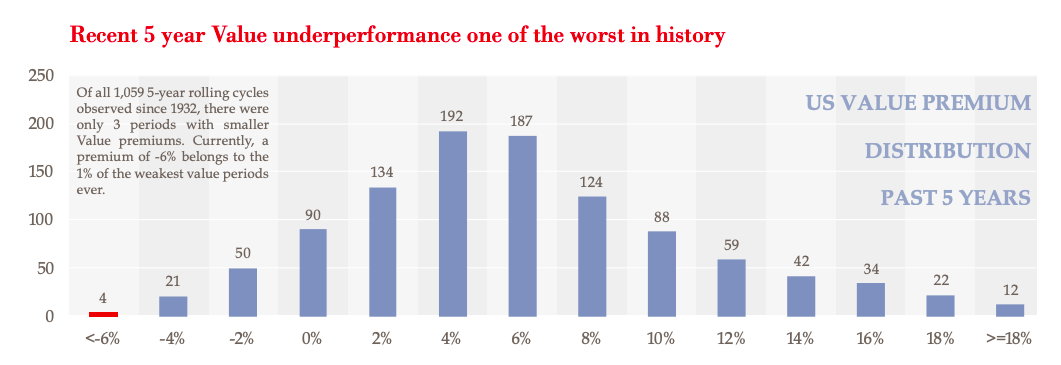
“Of all 1,059 5-year rolling cycles observed since 1932, there are only 3 periods with smaller value premiums. The current -6% belongs to the 1% of the weakest periods”
Typically this type of underperformance has led to 14-19% outperformance in the subsequent 5 years.
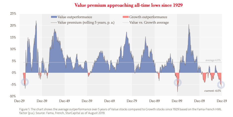
Interesting long term chart of value and growth outperformance.
“The development of share prices has long vindicated this theory: from 1926 to 2007, Value stocks recorded around 5% higher annual returns than Growth stocks. Over the last five years, Value stocks have underperformed Growth stocks by an average of nearly 6% per year.”