2022 saw a new record in off-exchange trading of US ETFs.
Part of a broader trend where trading off-exchange in US equities went from 35% in 2015 to 43% last year.
Yet, as the FT Alphaville article notes, “ETF shift from lit to off-exchange trading has actually been even starker than it has for equities as a whole“.
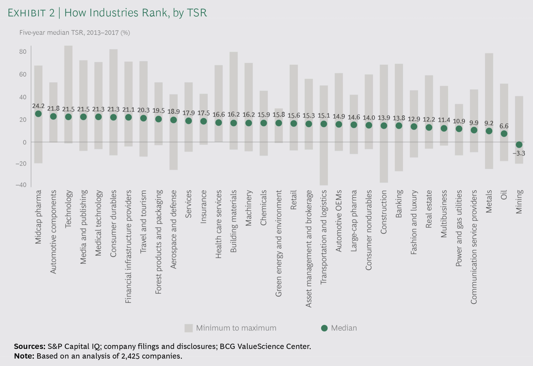
It looks at TSR (Total Shareholder Return) over a 5-year period (2013-2017) across industries.
“The median TSR of the top ten companies in each industry was higher than the industry’s median by 9 percentage points (in insurance) and 32 percentage points (in media and publishing as well as metals).“
“The lesson is this: being in a sector whose market performance is below average is no excuse. TSR is a relative—as well as an absolute—metric, so whether an industry is under pressure or accelerating, every company has the opportunity to outperform its peers.”
The big three are increasingly dominant, even more so in small cap stocks.
“Last year, the big once again became even bigger. At the end of 2021, Vanguard, BlackRock and State Street, the three biggest index fund providers, together control on average 18.7 per cent of S&P 500 companies, according to Lazard. Their ownership of smaller companies is even more concentrated. By the end of last year, they held 22.8 per cent of shares in the midsized S&P 400 index, and 28.2 per cent of the small-company S&P 600 benchmark.“
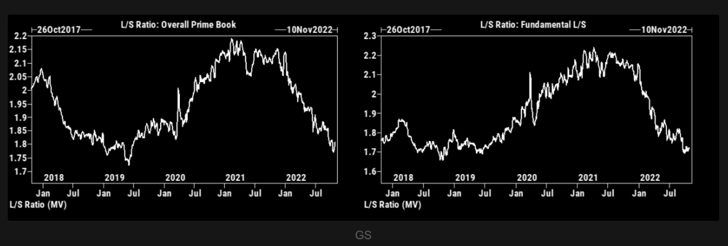
“GS PB long/short ratio stays at longer term relatively depressed levels. This is not to be used as an input for short term trading strategies, but worth having in the back of your head.“
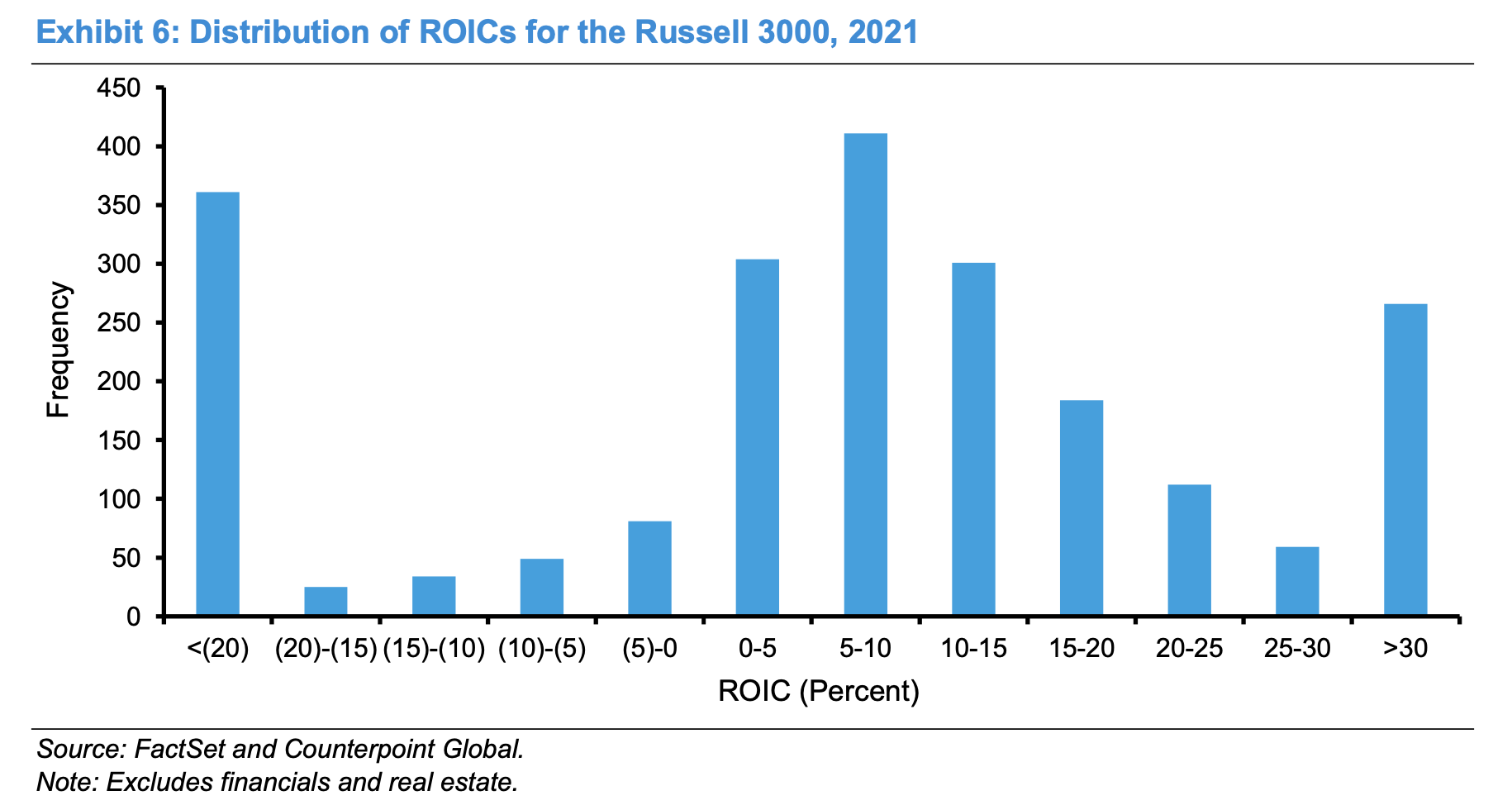
Interesting chart from Mauboussin showing the distribution of ROIC of the Russell 3000 index.
“The mode is an ROIC of 5 to 10 percent, and the distribution is shaped like a bell between the tails. But nearly 30 percent of the sample are at the extremes of an ROIC of -20 percent or less or 30 percent or more.“
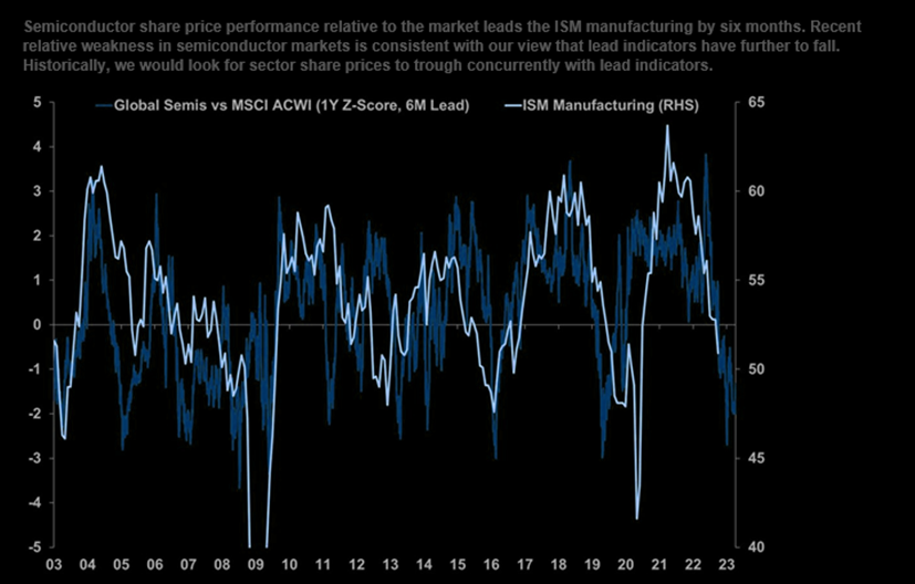
“Semiconductor share price performance relative to the market leads the ISM manufacturing by six months. Recent relative weakness in semiconductor markets is consistent with our view that lead indicators have further to fall. Historically, we would look for sector share prices to trough concurrently with lead indicators.“