- A good tool that shows how Trump is tracking vs. Biden when compared to the same time in the 2016 election against Clinton.
Macroeconomics
Snippets on the big picture.

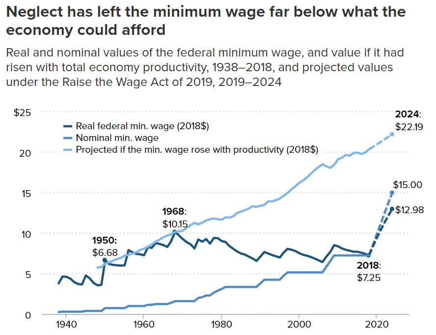
Minimum Wage
- Minimum wages in the US would be a lot higher had they followed productivity (light blue line).
- Instead they have stayed suppressed with some rise expected under new legislation.
- Source.
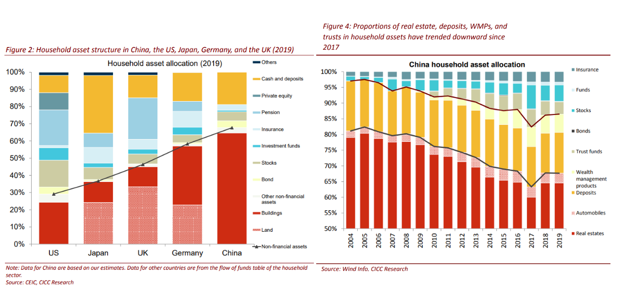
Asset Allocation by Households
- A useful chart showing on the left hand side asset allocation by households of various countries.
- China clearly stands out.
- Right hand side shows that China’s asset allocation has actually been changing over time – with an increase in funds/stocks/insurance.
Liquidity
- As machines takeover liquidity provision isn’t guaranteed
- “With fewer opportunities to profit from connecting buyers and sellers, and a much greater risk of losing money in the meantime, HFT-style market makers pulled back abruptly and in some cases likely shut down entirely. Thus the liquidity they provided dropped to a tiny fraction of its previous peak over the first couple weeks of March“

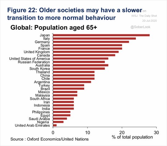
Recovery by Country
- The normalisation of behaviour, and with it the economy, is likely to depend on the age of a society.
- Older societies are likely to be slower.
- h/t Dailyshot.
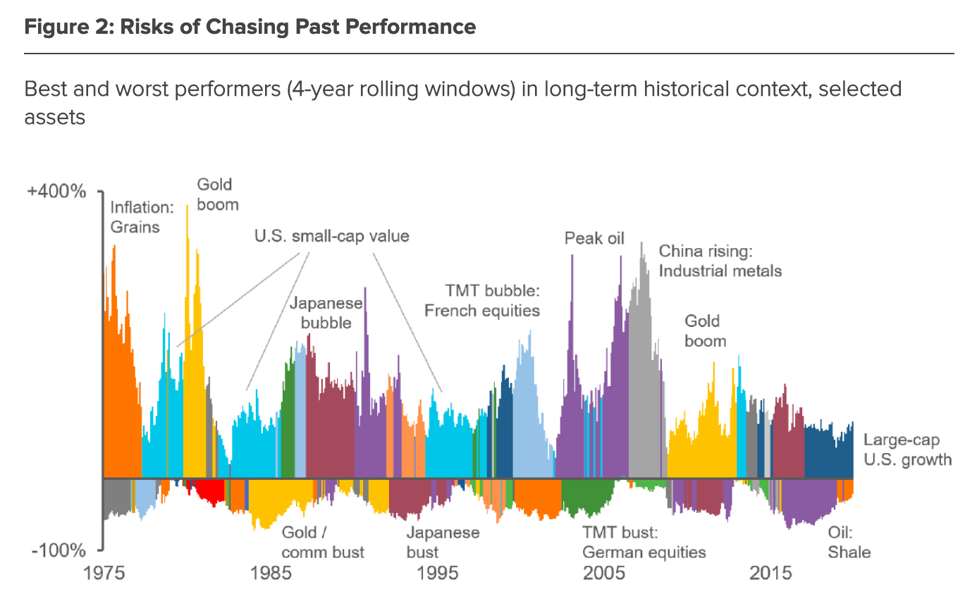
Asset Leadership
- “A colourful illustration, showing best- and worst-performing assets over rolling four-year periods since the mid-1970s.
- From this perspective, the recent outperformance of large-cap growth does not look especially unusual in either duration or magnitude. Diverse assets, including commodities and other types of equities, have enjoyed periods of comparable success.
- Moreover, the chart reminds us that recent standouts may swiftly become underperformers as conditions change.”
- Source.
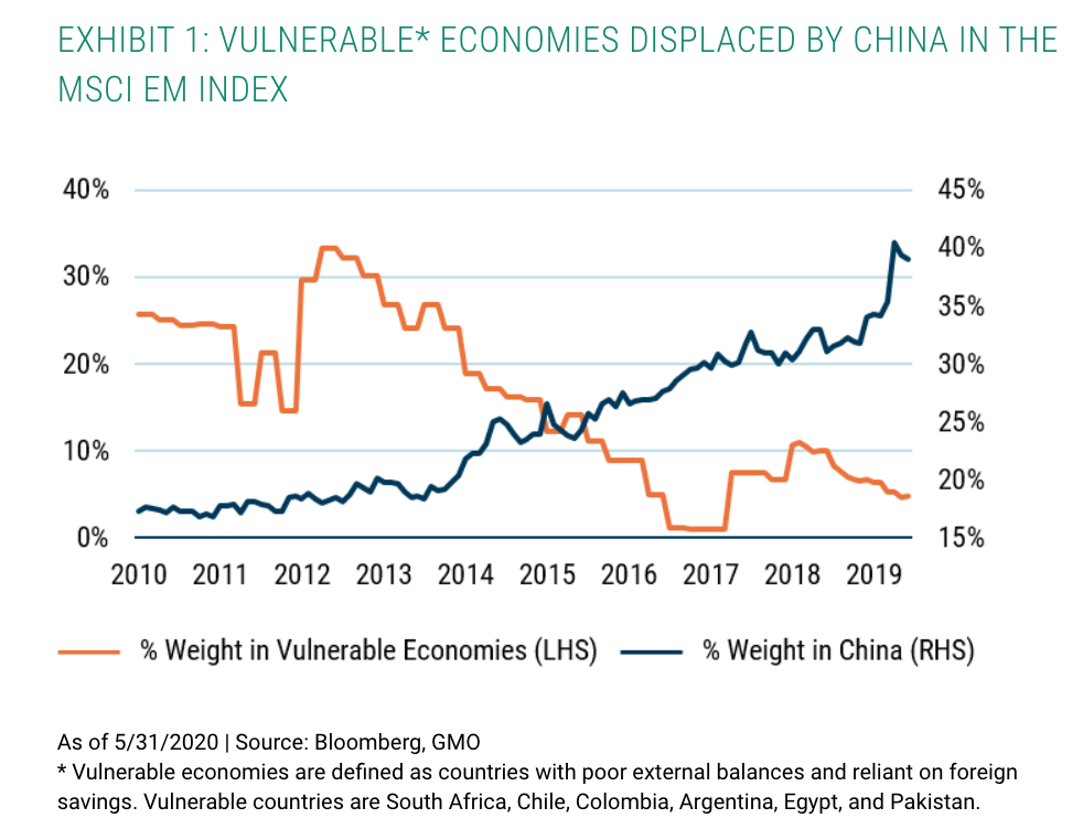
Emerging Markets
- China has over time displaced the weight of vulnerable economies in the Emerging Markets (EM) Index, the latter itself falling due to improving macroeconomic fundamentals.
- * Vulnerable economies are defined as countries with poor external balances and reliant on foreign savings. Vulnerable countries are South Africa, Chile, Colombia, Argentina, Egypt, and Pakistan.
- Sourced from GMO, read on for more reasons to own EM.
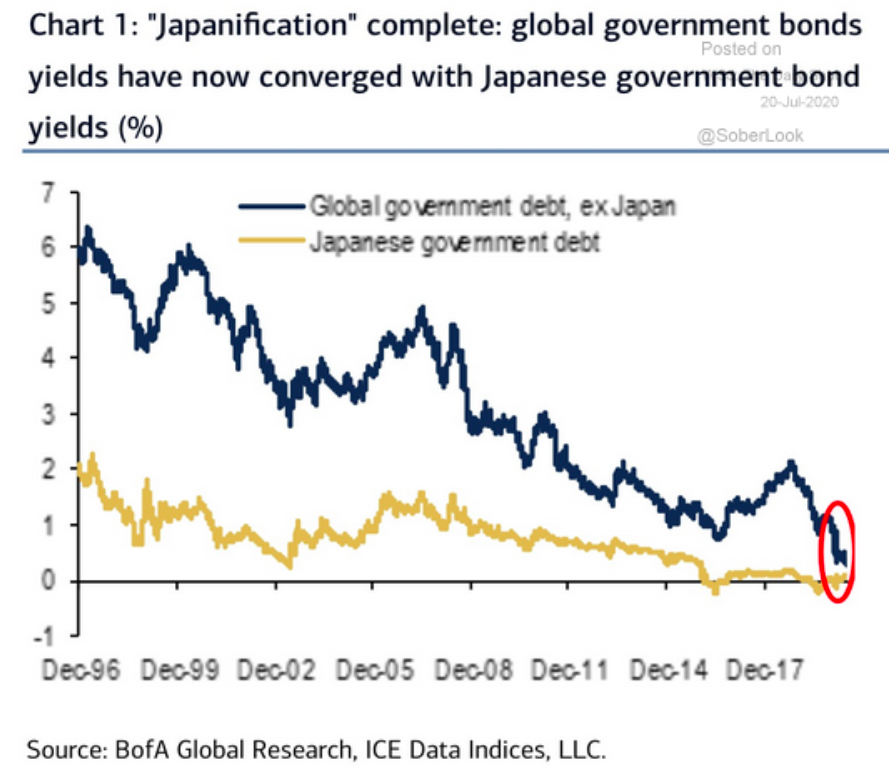
Japanification complete
- Interest rates around the world have now converged to those of Japan.
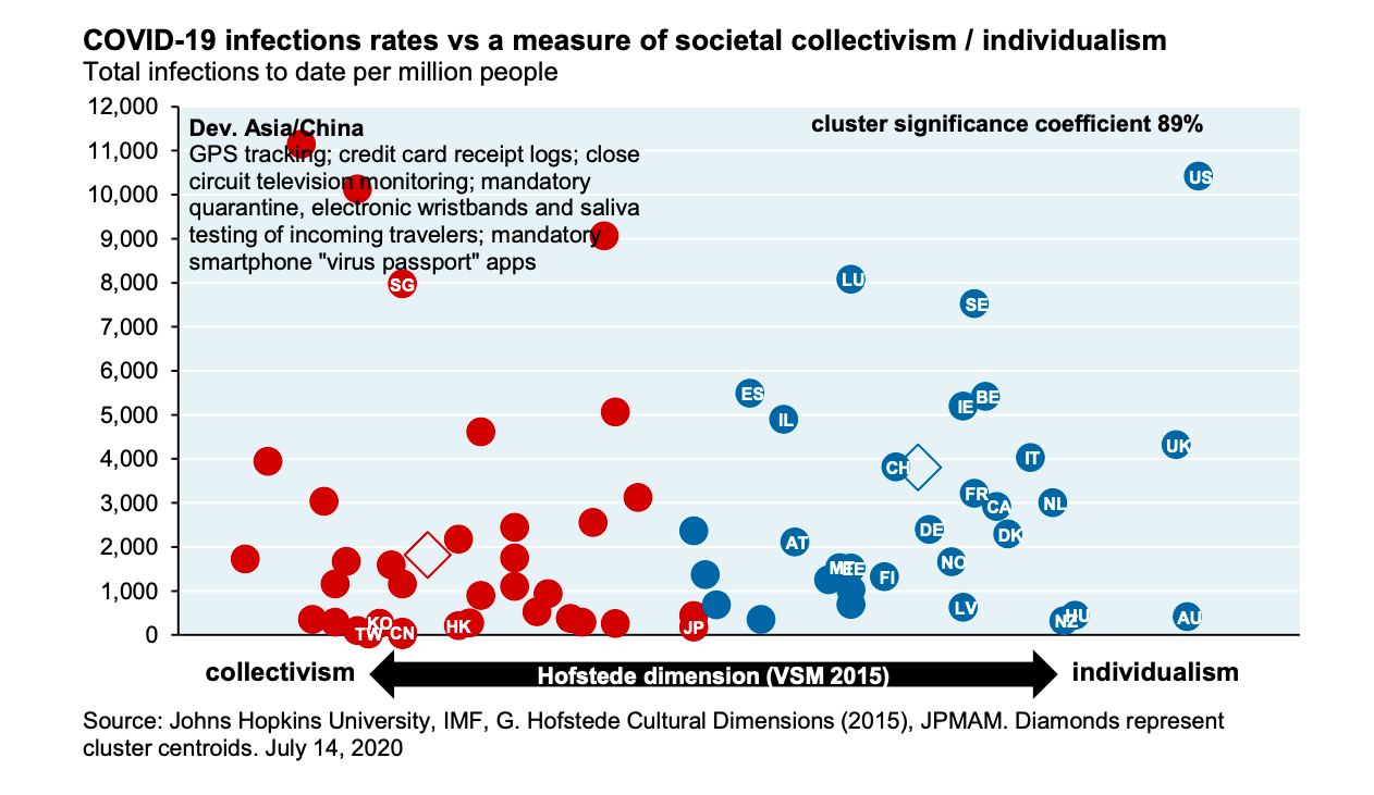
Collectivism and Covid Infection Rates
- A compelling chart sourced from JPM research on Covid.
- On the x-axis is a measure of “collectivism vs. individualism” – a concept developed by Geert Hofstede in 1970s.
- “The individualism vs. collectivism dimension considers the degree to which societies are integrated into groups and their perceived obligations and dependence on groups. Individualism indicates that there is a greater importance placed on attaining personal goals.“
- On the y-axis a measure of Covid infection rates per capita.
- “A standard cluster analysis shows a high degree of significance when thinking about COVID within a collectivism/individualism dimension.“
US Elections
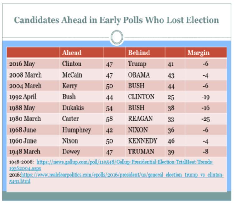
- Predicting the outcome of US elections is difficult.
- This is a model that is forecasting a 91% chance of a Trump victory.
- The model has a good hit rate – “Mr Norpoth told the outlet that his model, which he curated in 1996, would have correctly predicted the outcome for 25 of the 27 elections since 1912, when primaries were introduced.“
- It is also dismissive of early polls, which currently give Biden a 9 percentage point lead, as seen in this chart – “The terrain of presidential contests is littered with nominees who saw a poll lead in the spring turn to dust in the fall. The list is long and discouraging for early frontrunners.“
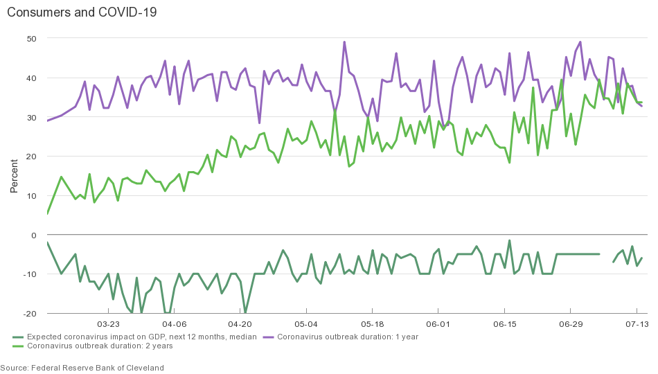
Consumers and Covid-19
- The Cleveland Fed has been maintaining a survey of consumers for their views on how they are responding to COVID-19.
- “Consumers continue to see a long road ahead, with nearly two-thirds expecting that the coronavirus outbreak will last either one or two years …
- However, we are starting to see some changes in behavior, as fewer consumers report storing more food supplies than had been the case earlier …
- And the impact of the coronavirus on GDP over the next twelve months looks to be decreasing in size, from -20% in late March to -10% in late April and -5% in late May.”
Covid-19 JPM Research
- Thorough and useful set of research notes from JPM Asset Management on Covid-19.
- It includes economic tracking using real time credit/debit data, latest US infection tracking, update on drugs and vaccines, testing, impact on the markets, analysis of mortality, and loads more.
- The chart shows how US high frequency economic variables are tracking.
ESG Funds and the Department of Labor
- The Department of Labor (DOL) has proposed a rule that might ban the ability of corporate sponsored retirement accounts (e.g. 401(k)s) from holding ESG Funds.
- “Private employer-sponsored retirement plans are not vehicles for furthering social goals or policy objectives that are not in the financial interest of the plan,” said Secretary of Labor Eugene Scalia. “Rather, ERISA plans should be managed with unwavering focus on a single, very important social goal: providing for the retirement security of American workers.”
- 401(k)s alone hold $5.6 trn AuM.
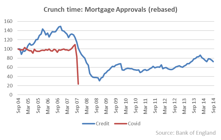
UK Housing
- A data rich post about UK housing with some gloomy predictions.
- Pictured is a chart of mortgage approvals – in blue since the three years leading up to the financial crisis and red since the three years before lockdown.
- Mortgage approvals are “the leading indicator” for housing transactions and it does not bode well.
UK Market Valuation
- The UK stock market is very cheap relative to the world no matter how you cut it.

Central Banks and Bond Markets
- Chart depicting how much of the outstanding domestic bond market of major economies is currently owned by the central bank itself.
- Japan is a clear stand out, while others are catching up.

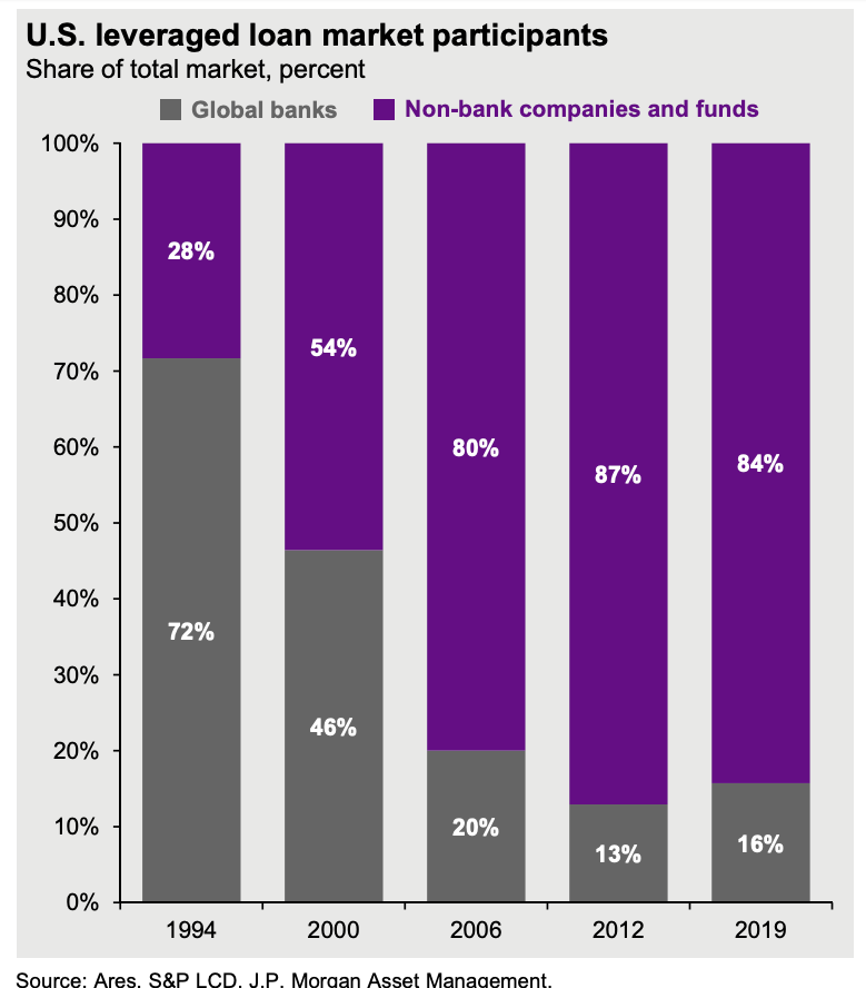
US Leveraged Loans Market
- Fascinating to see the change in market participants away from banks.
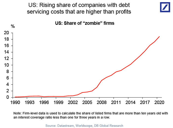
Zombie companies
- Low rates have spawned a growing army of zombie companies.
- This chart from DB shows companies where debt service payments exceed profits. These now make up nearly 20% of firms.
Foursquare Recovery Index
- Forsquare (covered here before) continues to be a great source of data to track the recovery.
- Recently this has been put together into a handy Recovery Index.
- The methodology and premise are described here.
EU Recovery Fund by Country
- Allocation of the EU €750bn recovery fund by country as a % of GDP.
- Source.
