How to get attention: If you want to get famous for making big non-consensus calls, without the danger of looking like a muppet, you should adopt ‘the 40% rule’. Basically you can forecast whatever you want with a probability of 40%. Greece to quit the euro? Maybe! Trump to fire Powell and hire his daughter as the new Fed chair? Never say never! 40% means the odds will be greater than anyone else is saying, which is why your clients need to listen to your warning, but also that they shouldn’t be too surprised if, you know, the extreme event doesn’t actually happen.
Recession watch: … So the best approach is to emphasise the dangers of recession but claim this is at least 18 months away. If it happens sooner, you can say you correctly warned about the dangers. If there is no recession you can simply postpone your forecast and hope nobody remembers.
Loeb’s Third Point Capital Q2 Letter – where he discusses adjusting his process/strategy towards more quality compounders – with rationale for recent purchases (BABA, JD, AMZN etc) supporting this.
Klarman’s Baupost Group Q2 Letter – where he discusses his eight impacts of the pandemic on the future.
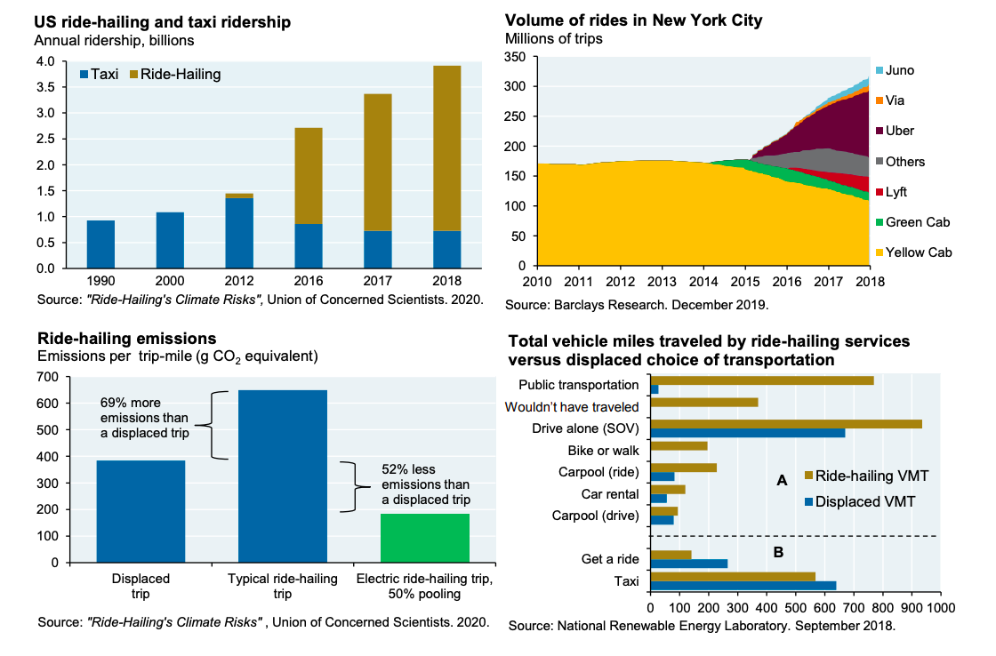
Is ride-hailing good for the green house gas emissions?
“The answer from several recent studies is straightforward: after accounting for people who would have taken public transport, biked or walked instead, and those who would not have traveled at all, there’s a substantial net increase in estimated vehicle miles traveled and emissions from ride-sharing, possibly as large as 60%-80% compared to a world with no ride-sharing at all”
Charts tell this story – (clockwise) a surge in ride-hailing in the US including NYC coupled with increased emissions per trip and miles travelled compared to the category they replace.
Sourced from this great note on Energy market outlook.
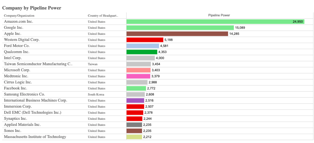
An interactive table of the tech world’s most valuable patent portfolios.
This chart shows the top 20 companies overall. Clicking through it’s possible to rank by industry.
Usual suspects at the top but interesting to see companies like Cirrus Logic and Sonos making it.
For an explanation of how the Pipeline Power score – which takes into account the value rather than the raw quantity of patents in a portfolio – is derived click here.
NB Sadly the data is slightly dated (from 2017) but likely still very relevant.
“With fewer opportunities to profit from connecting buyers and sellers, and a much greater risk of losing money in the meantime, HFT-style market makers pulled back abruptly and in some cases likely shut down entirely. Thus the liquidity they provided dropped to a tiny fraction of its previous peak over the first couple weeks of March“
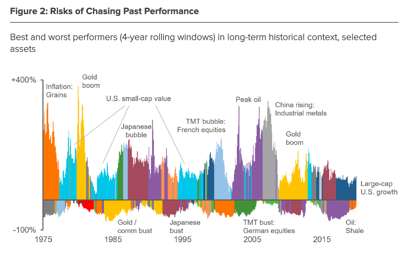
“A colourful illustration, showing best- and worst-performing assets over rolling four-year periods since the mid-1970s.
From this perspective, the recent outperformance of large-cap growth does not look especially unusual in either duration or magnitude. Diverse assets, including commodities and other types of equities, have enjoyed periods of comparable success.
Moreover, the chart reminds us that recent standouts may swiftly become underperformers as conditions change.”
A brilliant article on the business of scientific publishing from the early roots and the story of Robert Maxwell to the rise of the internet and the present day.
“Scientists are not as price-conscious as other professionals, mainly because they are not spending their own money,” he [Robert Maxwell] told his publication Global Business in a 1988 interview. And since there was no way to swap one journal for another, cheaper one, the result was, Maxwell continued, “a perpetual financing machine”. Librarians were locked into a series of thousands of tiny monopolies. There were now more than a million scientific articles being published a year, and they had to buy all of them at whatever price the publishers wanted.
In response to the internet Elsevier bundled – Elsevier created a switch that fused Maxwell’s thousands of tiny monopolies into one so large that, like a basic resource – say water, or power – it was impossible for universities to do without.“
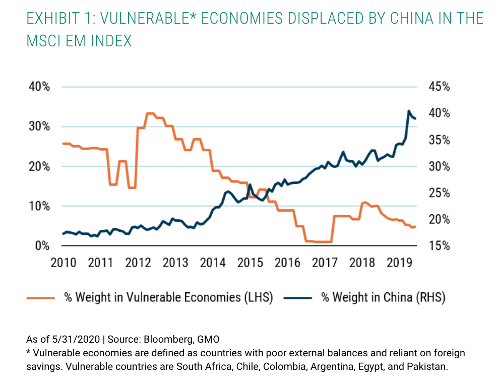
China has over time displaced the weight of vulnerable economies in the Emerging Markets (EM) Index, the latter itself falling due to improving macroeconomic fundamentals.
* Vulnerable economies are defined as countries with poor external balances and reliant on foreign savings. Vulnerable countries are South Africa, Chile, Colombia, Argentina, Egypt, and Pakistan.
Sourced from GMO, read on for more reasons to own EM.
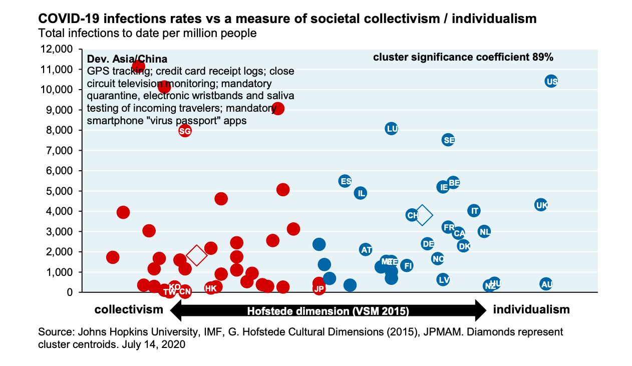
A compelling chart sourced from JPM research on Covid.
On the x-axis is a measure of “collectivism vs. individualism” – a concept developed by Geert Hofstede in 1970s.
“The individualism vs. collectivism dimension considers the degree to which societies are integrated into groups and their perceived obligations and dependence on groups. Individualism indicates that there is a greater importance placed on attaining personal goals.“
On the y-axis a measure of Covid infection rates per capita.
“A standard cluster analysis shows a high degree of significance when thinking about COVID within a collectivism/individualism dimension.“
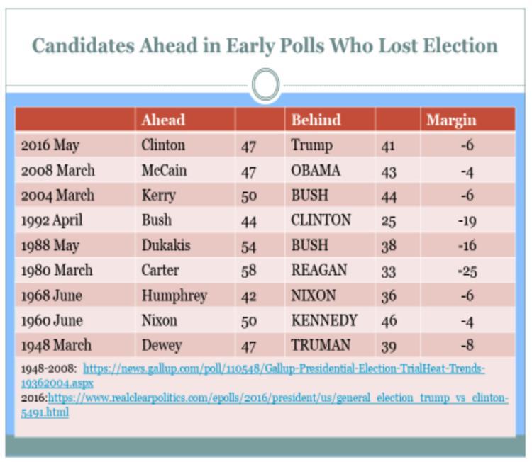
The model has a good hit rate – “Mr Norpoth told the outlet that his model, which he curated in 1996, would have correctly predicted the outcome for 25 of the 27 elections since 1912, when primaries were introduced.“
It is also dismissive of early polls, which currently give Biden a 9 percentage point lead, as seen in this chart – “The terrain of presidential contests is littered with nominees who saw a poll lead in the spring turn to dust in the fall. The list is long and discouraging for early frontrunners.“
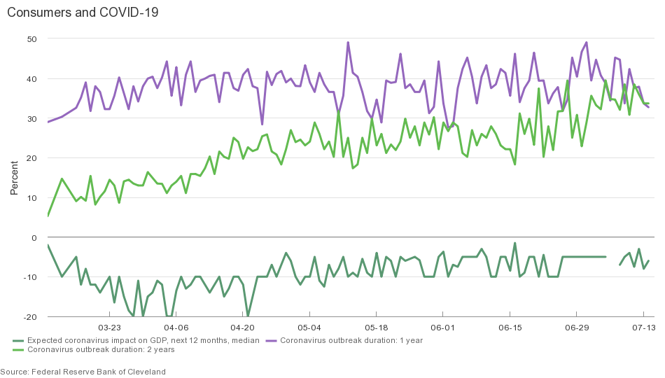
The Cleveland Fed has been maintaining a survey of consumers for their views on how they are responding to COVID-19.
“Consumers continue to see a long road ahead, with nearly two-thirds expecting that the coronavirus outbreak will last either one or two years …
However, we are starting to see some changes in behavior, as fewer consumers report storing more food supplies than had been the case earlier …
And the impact of the coronavirus on GDP over the next twelve months looks to be decreasing in size, from -20% in late March to -10% in late April and -5% in late May.”