Skip to content
A long term chart of portfolio turnover for US based mutual funds. 1975 saw a big rise as trading commissions were de-regulated and bid-ask spreads were moved from 1/8th basis. The next 30 years has seen a precipitous decline. NB. Turnover is defined as the lower of the total amount of securities purchased/sold divided by total net asset value of the fund. Source.
A fascinating article about Peter Thiel . “Wherever there’s a major shift in the American landscape in the past half-decade—be it political or cultural—there, somewhere on the donor list of the political campaign, or among the investors in the controversial technology, is Peter Thiel. “
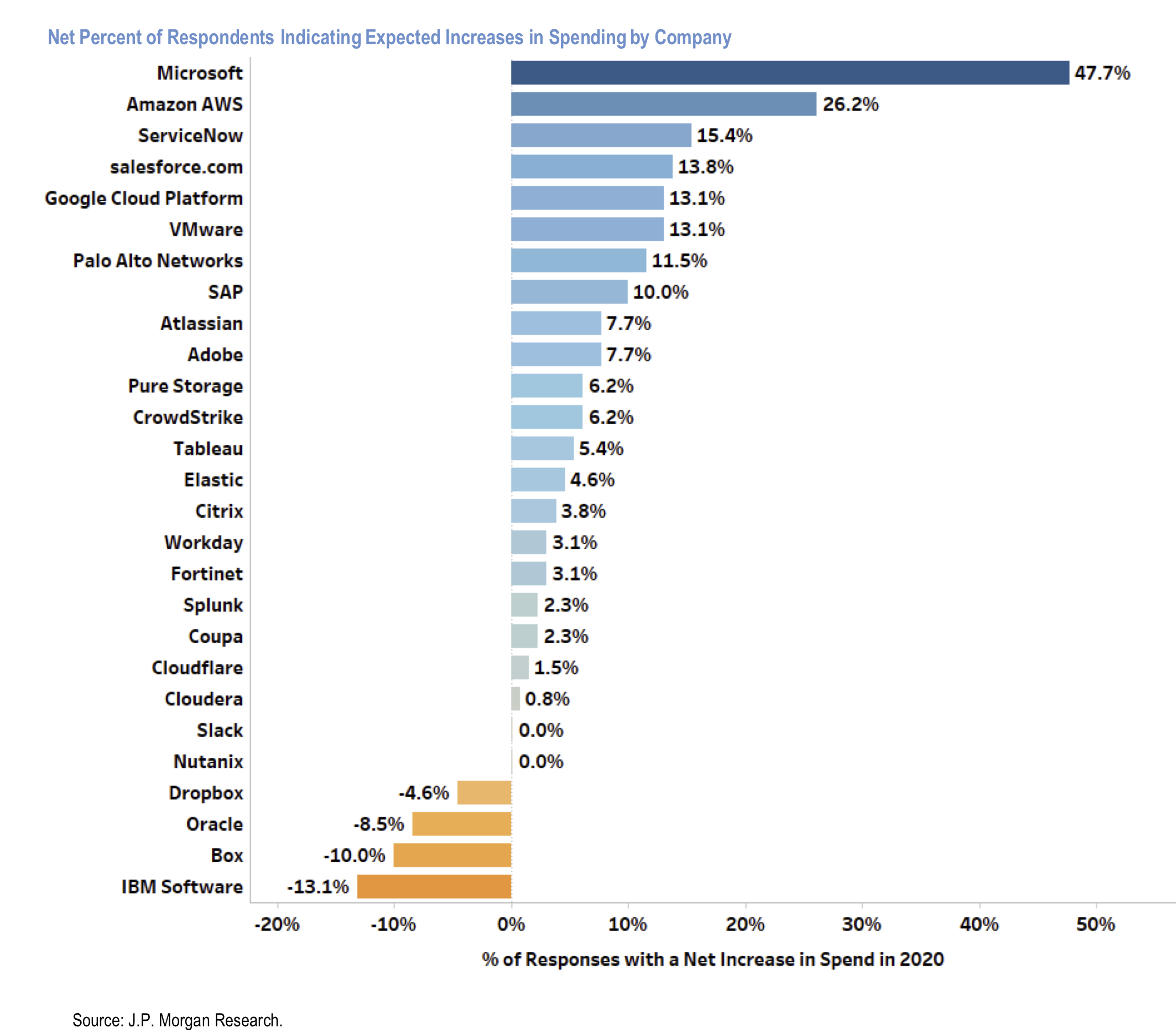
JPM Survey of 130 Chief Investment Officers (CIOs) who command $88bn of annual IT spend. This chart shows spending plans by software provider – depicting net percentage who expect to increase spending. Clear winners are MSFT, AMZN (AWS) and ServiceNow. Clear losers are Dropbox, Oracle, Box and IBM.
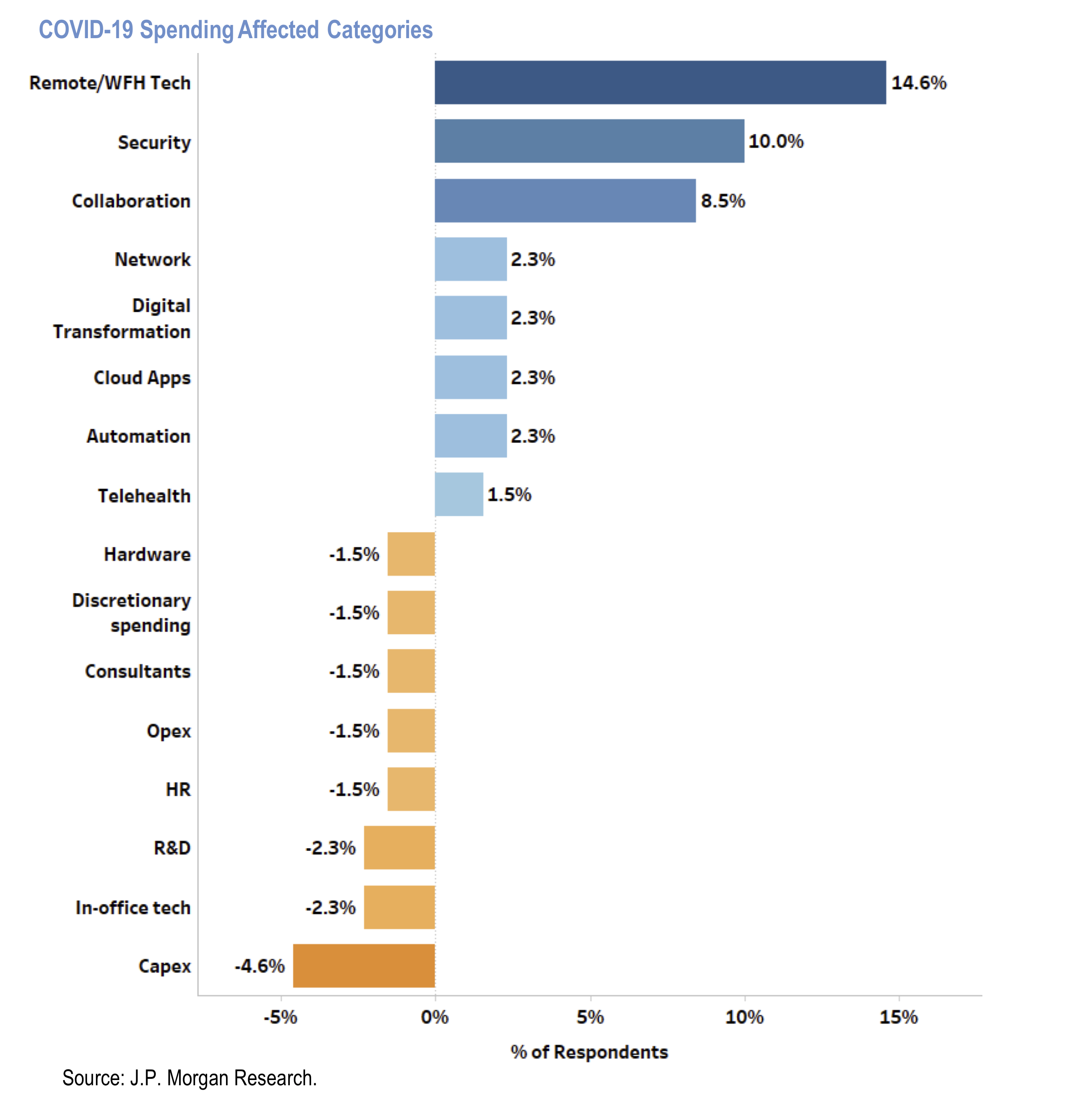
Results of a survey by JPM of 130 chief investment officers (CIOs) commanding $88bn of annual IT spend. This chart shows how CIOs’ foresee categories of IT spend will be affected due to Covid-19 pandemic.
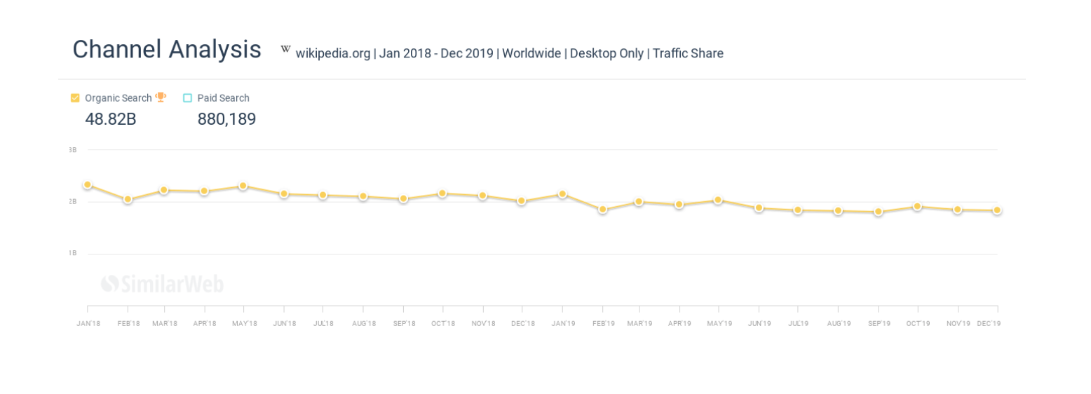
We previously discussed the rise of zero click searches at Google. This is an article about the direct impact of this on Wikipedia. “Over the past 24 months Wikipedia has lost billions of organic monthly visitors ”
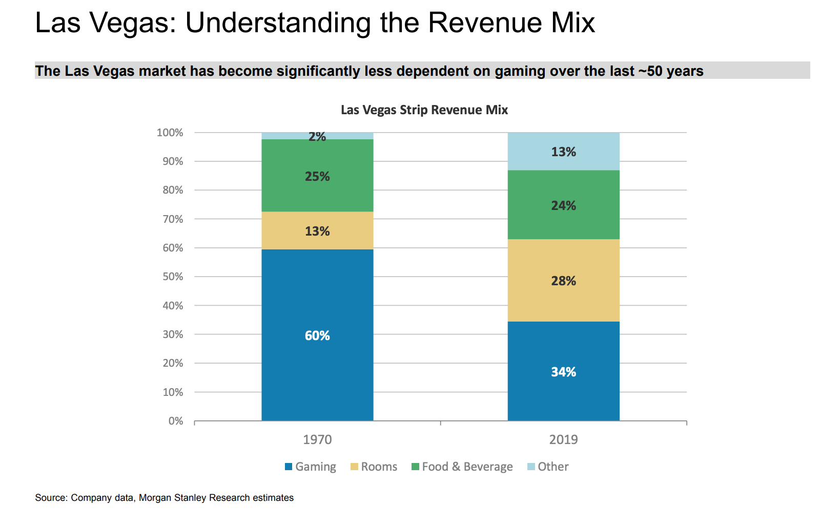
Gambling is a much smaller part today than it was in the 1970s.
Brilliant interview with Marc Andreessen. Full of insights on a multitude of topics. On investing he says – “It’s really, really, really hard to be a good poker player. And if you’re kicking yourself every time you have a bad hand, the bad habits just simply happen. You just need to be able to have a system that lets you think through the process… “
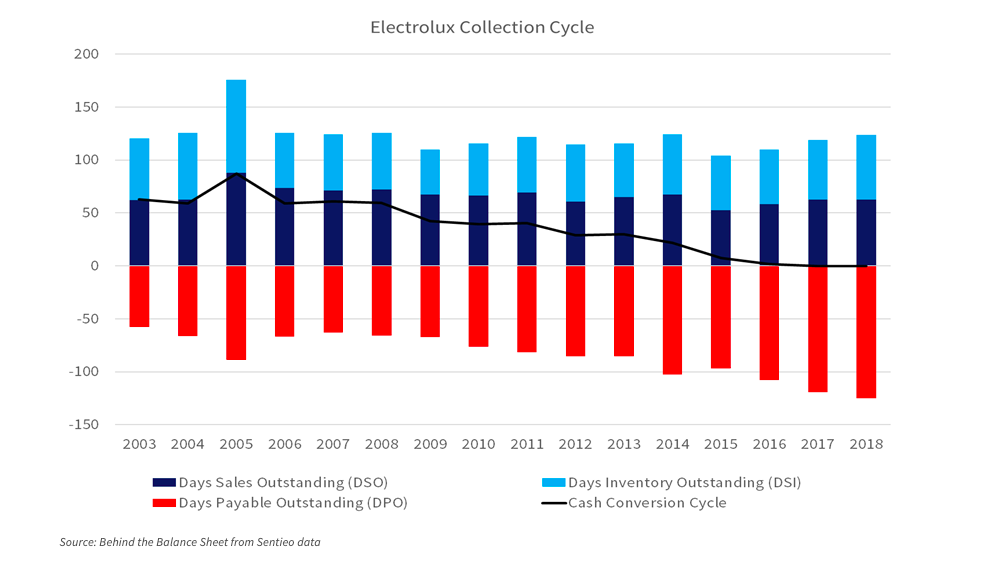
This is a chart of the working capital of Electrolux since 2003. It shows that the total cash collection cycle has fallen from 63 days in 2003 (a peak of 87) to zero today. This was almost entirely achieved by payable days doubling from 60 to 120. In short the company is squeezing suppliers. What happens after Covid? This excellent blog post addresses this and other impacts.
If you have ever invested in Japanese stocks it can feel like learning all over again. This is a really great article written by a westerner fluent in Japanese who has spent his whole professional career in Japan including starting a business.
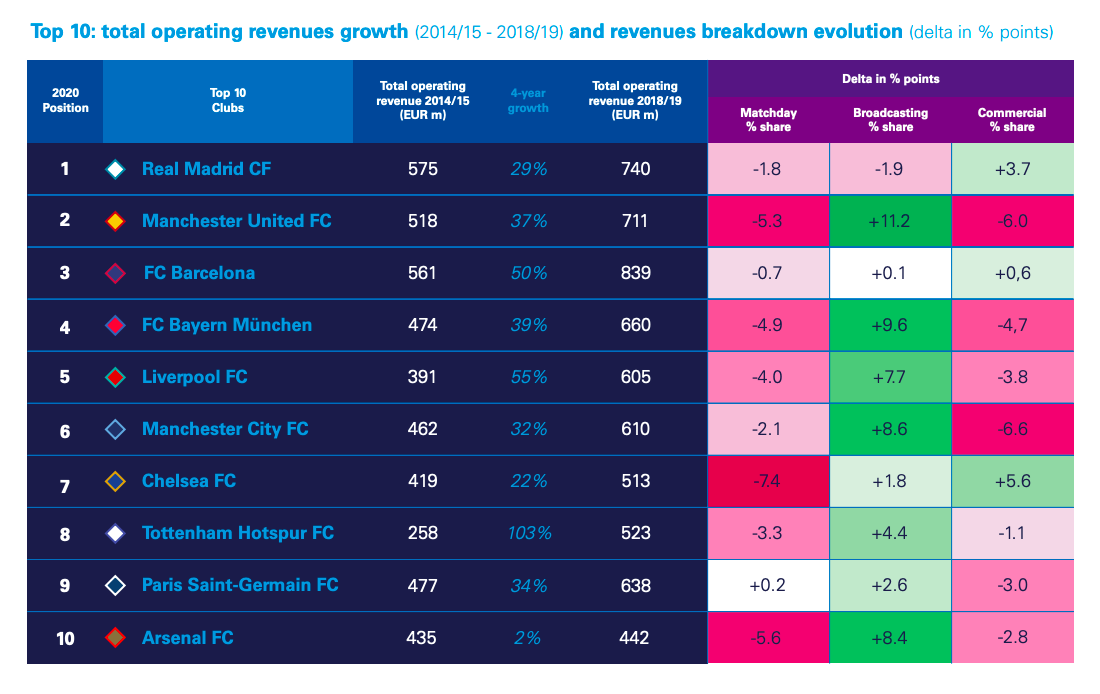
Interesting report from KPMG on valuation of football clubs. There are actually several listed football clubs – Manchester United , AS Roma , Juventus , Borussia Dortmund , Celtic , Lazio to name a few. Attached is an interesting table showing operating revenue evolution as well as how the revenue split between matchday, broadcasting and commercial has evolved.
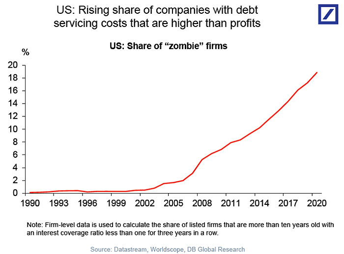
Low rates have spawned a growing army of zombie companies. This chart from DB shows companies where debt service payments exceed profits. These now make up nearly 20% of firms.
A good article on accounting at Netflix. In short, it analyses content amortisation accounting and shows that this line item is being understated, boosting earnings. A staggering stat is that Netflix content spend went from $2bn in 2011 to nearly $14bn last year. This might not be relevant for the share price for now but is still worth knowing about.
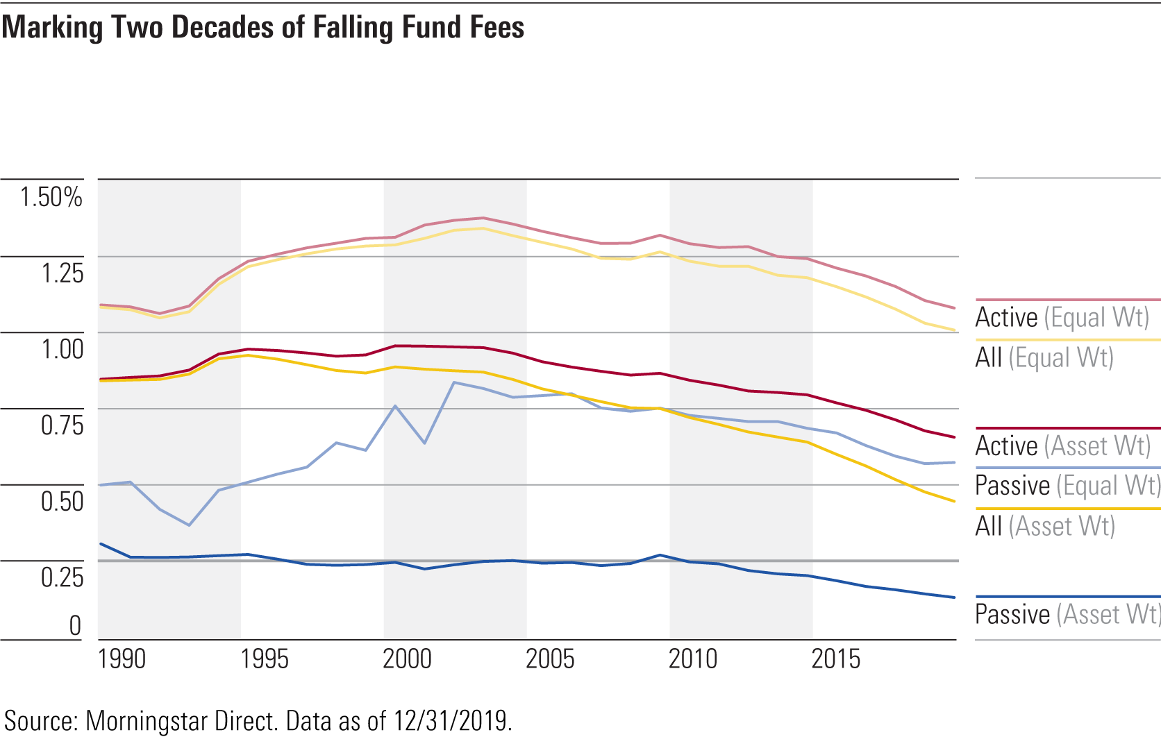
This is an interesting chart showing two decades of falling fees in the US investment management industry. Fees have fallen across the board, particularly for passive funds. More data in the Morningstar piece .
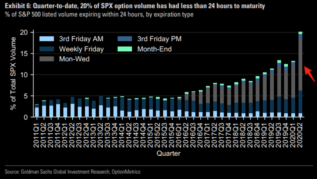
Fascinating chart showing that options volume is being concentrated – at nearly 20% – in options with 24 hour expiry.
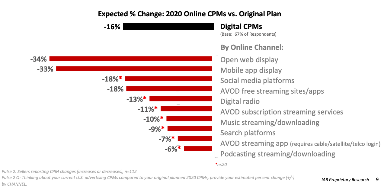
Always worth keeping an eye on digital ad prices. This chart from IAB shows the impact across various online channels. CPMs have been hit by -16%. Interesting to see the range – open web display being hit the hardest while video, podcast and search are more resilient.
Forsquare (covered here before) continues to be a great source of data to track the recovery. Recently this has been put together into a handy Recovery Index . The methodology and premise are described here .
On average a banking relationship in the UK lasts 17 years, longer than most actual relationships. This is a great chart comparing how long it takes in days and clicks to open a new account – challenger banks like Revolut win hands down.
Allocation of the EU €750bn recovery fund by country as a % of GDP. Source.
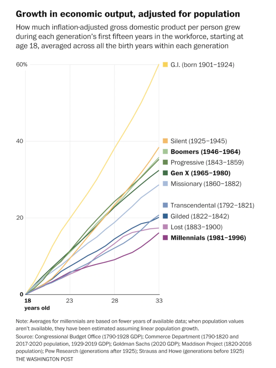
Fascinating article on how millennials have suffered economically. “Chart depicts inflation adjusted GDP growth per person for each generations first 15 years in the work force (from age 18) averaged across birth year for each generation “. h/t The Big Picture .
This is an interesting paper . It shows that sewage SARS-COVID-2 RNA concentrations lead new cases by seven days and hospital admissions by three days. h/t Redburn .
WordPress Cookie Notice by Real Cookie Banner


